หมวดหมู่: Portfolio

  • BDI Hackathon 2026 Recap

    BDI Hackathon 2026 Recap

    I just wrapped up participating in the BDI Hackathon 2026!

    Throughout the camp, I jotted down as many notes as I could. Looking back at them, I thought to myself: this information is way too useful to just keep stored away. So, I decided to polish up my notes into an article to share what I learned with all of you!

    Disclaimer: This article is a condensed summary of my personal notes, highlighting non-confidential insights written in my own words (and edited by AI). Because these reflect my personal understanding, there might be slight errors or misconceptions here and there. Please treat this as a casual personal reflection rather than an official document from any of the organizations mentioned.

    Here is a quick overview of what I picked up across 5 workshops, teamwork sessions, and chats with fellow competitors:

    1. What is this Hackathon?
    2. Before we actually made something
    3. Tools for Application / AI development in 2026
    4. Rapid AI Prototyping
    5. Pitching 101
    6. Learning lessons form Demo day

    If any of these topics catch your interest, follow along!


    1. What is this Hackathon?

    This hackathon was organized by the Big Data Institute (BDI) Thailand. Their goal in this hackathon was to foster practical innovation around:

    • Using AI to solve real-world problems in Thailand.
    • Applying Thai LLMs, Agentic AI, or multi-source data integration.
    • Delivering tangible Proof-of-Concept (PoC), Prototype, or MVP demonstrations.
    • Demonstrating clear User Validation and business/social value.

    The competition was divided into 3 main tracks:

    1. Data for Better Journey (The track my team joined): Designing smart urban tools and decision assistants, leveraging traffic, weather, PM2.5, and event data to optimize city commuting, time management, and route selection.
    2. Data for Better Lifestyle
    3. Data for Better Safety

    What Does BDI Do?

    BDI connects national data assets and turns them into actionable policy intelligence focused on:

    1. Government data backbone
    2. Analytics for public policy
    3. Sovereign AI

    They operate several key platforms:

    • Health Link: Connects health records across hospitals.
    • Travel Link: Aggregates traveler and tourism statistics.
    • PF Link: Integrates environmental data.

    For our project, we used datasets from BDI’s open data platform, Thackle. (I previously analyzed Bangkok public transportation data from this site, you can check out my full write-up at Public Transportation Usage in Thailand Analysis).

    Thai LLM

    Another cool initiative is ThaiLLM, an open, trusted Thai AI ecosystem partially contributed to by BDI. Unlike global models like GPT or Gemini, ThaiLLM models are foundation models fine-tuned specifically for the nuances of the Thai language and culture.

    My Team

    I joined the hackathon with my pharmacist friend. We were actually going through a data science bootcamp together and had previously teamed up for the Thai Parliament Datathon! BDI grouped us with three other talented members: two computer science students and an engineering student.

    Early on, I stepped up into the team leader role: handling planning, conducting meetings, keeping us aligned on timelines, and reviewing final deliverables. To keep everything smooth and organized, I set up a Notion workspace with a progress dashboard and documentation pipeline.

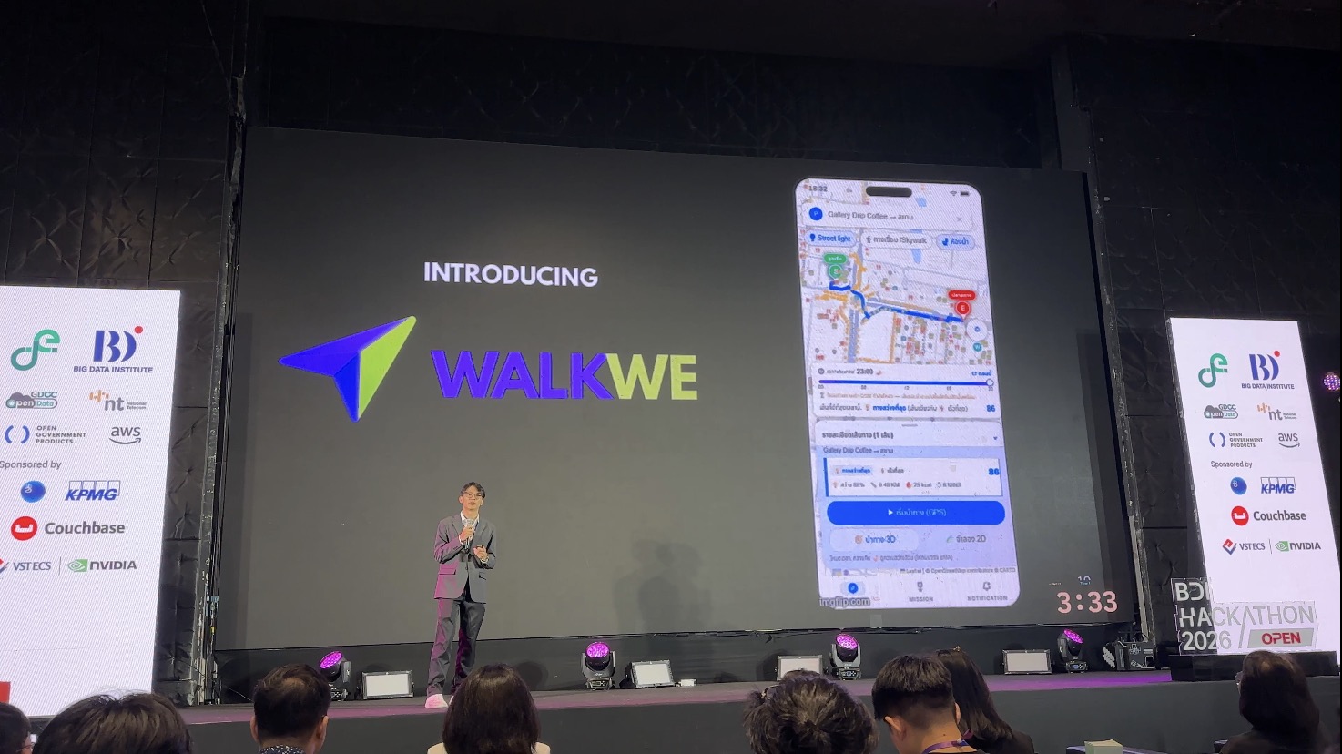
    We managed to build a demo of the pedestrian navigation app called WalkWe. The app provide three main features: shade routing (during the day), light routing (during the night), and micro routing through buildings and skywalk (in the Siam area).

    Competition Format

    • Proposal Round: 30 teams were selected across tracks.
    • Soft Pitching: 21 teams moved forward to refine their prototypes.
    • Demo Day: 5-minute final pitch on stage at Lido Connect, alongside interactive demo booths to showcase live working prototypes.
      Along with the workshops, this project taught me a lot: from navigation tech (OpenStreetMap), survey design, and business development to UX/UI design in Figma and project management.

    Next, I will walk you through sessions and experiences I gained form this event.


    2. Before we actually made something

    two people working in office
    Photo by https://kaboompics.com/ on Pexels.com

    Before jumping into building apps or AI solutions, you have to ask yourself: Are we solving a real problem, or just what we assume is a problem?

    Design Thinking

    This session was led by K. Korawit Kwanaree, MAYDAY! Director who introduced us to the Design Thinking framework. While people from software or engineering backgrounds might already be familiar with it, as someone from a healthcare background, this was a refreshing structured approach for me!

    Why Do We Need Design Thinking?

    Thanks to AI, building a prototype today is faster than ever. Anyone can whip up a personal app for themselves or a friend over a weekend. But building solutions that solve large-scale problems for thousands of people is a completely different ballgame.

    If you rush straight to the solution, you’ll likely waste time and resources building something nobody actually wants or uses. Design Thinking ensures you deeply understand user needs and test assumptions with real humans before writing a line of code.

    (Source: https://www.programstrategyhq.com/post/design-thinking-process)

    Here is a brief summary of the 4 main stages of design thinking:

    1. Empathize (Divergent): Open your mind to all possibilities and get to know your users deeply through literature reviews, real-world observations, interviews, and immersion.
      • Our approach: We walked around Siam Square (our pilot area) to observe pedestrian bottlenecks firsthand and surveyed 159 Bangkok residents. We gathered feedback on dark alleys, blistering sun, broken footpaths, complex skywalks, flooding, and even street dogs and homeless safety concerns!
    2. Define (Convergent): Group and prioritize the pain points to pinpoint the core issue using tools like user journey mapping.
      • Our approach: We categorized Bangkok pedestrian struggles into 6 main pain points: safety/dark alleys, heat, flooding, physical obstructions, lack of walking inspiration, and the need for convenience spots.
    3. Ideate (Divergent): Brainstorm creative solutions to address the defined pain point.
      • Our approach: We decided to build a safe, pedestrian-first navigation application for Bangkok commuters.
    4. Prototype & Testing: Create a working version of the product, test it internally, and invite target users to test and give feedback.

    From Idea to Product—Building What Actually Matters

    This session was led by Vir Chiniwala and Gaille Teo from Open Government Products (OGP) in Singapore. OGP operates like a nimble tech startup inside the public sector, building impactful products like ScamShield (filtering scam calls/SMS), Isomer (government website builder), and Postman (mass communications). They also run the famous Hack for Public Good initiative.

    Avoid the Product Failure Trap

    Most product failures happen before writing any code: When teams pick a cool idea first and build features without validating if anyone needs them. A fancy presentation might look great on demo day, but without a real user pain point, the product has no long-term reason to exist.

    Start with the Problem, Not the Idea

    • ❌ Idea-First: “We need an AI platform to help citizens access public data.”
    • ✅ Problem-First: “Small business owners cannot tell which public datasets are fresh enough to help them decide where to open a new shop.”

    Applying the Framework

    Here is how detailed framework applied with our project:

    1. User Insights & Survey Data

    Before finalizing our problem scope, we surveyed 159 Bangkok commuters and analyzed public transit habits:

    • 85.5% walk at least 3–5 times per week to complete their journeys.
    • Key Gender Distinction: Female commuters reported statistically significantly higher safety concerns in dark/unlit alleys compared to male respondents. Women also expressed greater concern over flooding, harsh sun, and isolated walkways.
    • Walking Frequency & Motivations: Daily walking commuters were worried about all safety issues, but explicitly rejected gamified “walking points” incentives. Occasional walkers (1–2 times/week) were far more interested in incentive features.

    2. Writing a Useful Problem Statement

    A useful problem statement covers 4 key elements:

    1. User: Female office workers (ages 25–34) commuting in inner Bangkok.
    2. Job: Walking home safely from public transit stations (BTS/MRT) or connecting daily routes.
    3. Pain: Fear and anxiety when walking through dark, unlit alleys at night
    4. Cause: Inadequate or malfunctioning streetlights in inner city alleys, lack of publicly accessible real-time lighting data, and generic navigation tools (like Google Maps) only computing distance without considering walkability or light safety.

    Our Problem Statement Formula:
    “We are building a safety-focused navigation tool for women working in inner Bangkok who struggle with navigating dark, unlit alleys because street lighting data isn’t integrated into standard map navigators.”

    3. Exploring the User Journey

    We mapped our user’s experience across 4 phases:

    • Discover: How does the commuter realize a route is unsafe before walking down it?
    • Decide: What information (lighting levels, alley brightness, distance) do they compare to choose a path?
    • Act: How do they navigate along the recommended safe route?
    • Confirm: How do they verify they reached their destination safely?

    4. Testing Product Assumptions & Risk-Evidence Matrix

    Before building features, we evaluated what must be true for our product to matter:

    Low EvidenceHigh Evidence
    High RiskTest First (Validate immediately!):
    • Assumption 1: Streetlight coverage is a reliable metric for perceived safety.
    • Assumption 2: Streetlight data is accurate and updated in real-time.
    Design Around:
    • Incorporate verified city lighting data into navigation algorithms.
    Low RiskLeave Out:
    • Gamified voucher/points system (survey showed target users didn’t want it).
    Test Later (Low priority):
    • Assumption: Women in inner Bangkok actively want a dedicated safe route tool (Strongly backed by our survey!).

    5. Minimum Viable Product (MVP) & Feature Scoping

    An MVP is the smallest first version that helps one user complete one core action. Based on our prioritization matrix:

    • Must Have (MVP): A safe pedestrian navigation app calculating routes based on street lighting data.
    • Test First: Validate if street light density correlates with real safety perception and data accuracy.
    • Defer: Flood maps, skywalk routing, heat/sun shelter indicators.
    • Cut: Point systems and discount vouchers.

    6. Final Self-Assessment Checklist

    Before pitching our solution, we ensured we could answer all 5 OGP self-assessment questions:

    1. Who is the specific user? Female office workers (ages 25–34) walking in inner Bangkok.
    2. What pain are they trying to resolve? Wanting a navigation tool that routes through the safest, best-lit paths at night.
    3. Which stage of the user journey matters first? Discover: knowing street conditions before entering an alley.
    4. What is the riskiest assumption? That streetlight mapping data is accurate and directly correlates with user safety perception.
    5. What is the smallest MVP? A pedestrian route planner powered by street lighting datasets.

    Personal Strategy Alignment: In real pitching, we did not focus solely on safety and streetlight, we also highlighted other factors from survey, such as skywalk, sun shelter, that help us gain more favor from judges.

    Framework I Learned from AWS

    This framework wasn’t in any official presentation slides. I actually learned it directly from what an AWS moderator shared verbally during the workshop! After the session wrapped up, I caught up with her to ask for a bit more clarification because I found it super practical for product development.
    Here is my breakdown of her 5 core questions:

    1. Who is our customer/user? (Be ultra-specific about who you’re building for).
    2. What is their core pain point or opportunity? (What problem hurts them most, or what new value can we unlock?)
    3. How does our platform eliminate that pain point or create that opportunity? (For example: allowing sidewalk street vendors to easily book selling spots digitally).
    4. What is the complete end-to-end user experience? (Mapping out their journey from discovery to final goal).
    5. Why MUST they use it? (What’s the compelling hook?—e.g., because using it directly helps vendors increase their sales).

    You can freely choose one from these three frameworks, or blend them together to fit your project best.

    💡 Key Summary: The Mindset Before Building

    Whether you adopt Design Thinking, OGP’s Problem-First Framework, or AWS’s 5 Core Questions, the ultimate lesson is the same:

    Don’t fall in love with your solution before validating the problem.


    3. Tools for Application / AI development in 2026

    Modern AI development has evolved beyond simple prompt engineering—it requires specialized toolsets for GPU hardware acceleration, design-to-code pipelines, and enterprise cloud infrastructure. Here are the core developer platforms showcased during the workshops:

    1. NVIDIA: GPU-Accelerated Analytics & AI Microservices

    NVIDIA showcased how GPUs aren’t just for 3D rendering or model training. They supercharge raw data engineering and analytics:

    • NVIDIA NIM (Inference Microservices): Containerized microservices optimizing foundation model deployment and inference latency.
    • NVIDIA RAPIDS & Dask: Drop-in GPU replacements for standard data libraries (Pandas, PySpark, XGBoost), delivering 10x to 20x speedups with minimal code changes.
    • Nemotron & AI-Q: Enterprise foundation LLMs and autonomous agent orchestration frameworks built for NVIDIA hardware.

    💡 Personal Takeaway for Beginners:
    Just 3 days before this workshop, I bought a new laptop without a dedicated GPU! I used to think GPUs were only for gaming, but shifting data processing from CPU to GPU turns multi-minute data tasks into seconds. If you’re buying a machine for data work, get one with a dedicated NVIDIA GPU!

    🔗 Official Documentation & Code Repositories:

    2. Google: Gen AI SDK & Stitch Design-to-Code

    For rapid frontend prototyping and multimodal application building, Google highlighted two standout tools:

    • Google Gen AI SDK: A unified, cross-language SDK (Python, TypeScript, Go, Java) with native multimodal file parsing (PDFs, audio, video) and strict JSON schema output enforcement.
    • Google Stitch (Design-to-Code via MCP): A browser-based tool connecting UI mockups to AI coding assistants (like Antigravity) via Model Context Protocol (MCP), converting visual wireframes into responsive code in minutes.

    ⚡ Hackathon Pro-Tip: Pairing Google Stitch with an MCP-enabled AI assistant allows you to convert visual UI sketches into functional frontend prototypes instantly during time-critical hackathons.

    🔗 Hands-on Tutorials & Codelabs:

    3. AWS: 3-Layer AI Portfolio & Agent Core

    AWS structures its AI ecosystem into a flexible 3-layer architecture tailored for both rapid prototyping and enterprise scaling:

    1. Top Layer (Turnkey Applications & Frontier Agents): Ready-to-use tools like Kiro (spec-driven IDE agent), Amazon Q, AWS DevOps Agent, and AWS Security Agent.
    2. Middle Layer (Development Platform — Amazon Bedrock): Foundation models (Amazon Nova, Anthropic Claude, Llama) and Bedrock AgentCore (managed runtime, MCP Gateway, Identity token vault, and observability).
    3. Bottom Layer (Infrastructure & Custom Compute): SageMaker data foundations and dedicated silicon (Trainium, Inferentia, GPUs).

    AWS Security Agent: Automates continuous security checks across design docs, pull requests (PRs), and multi-step penetration testing.

    🔗 Official Guides & Resources:


    4. Rapid AI Prototyping

    App/Code: Base 44 (AI Vibe Coding & App Building)

    Speaker: K.Chayaporn Tantisukarom – General Manager at Skooldio
    Base44 is a popular AI-powered “vibe coding” platform and app builder that allows creators to turn natural language prompts into functional websites, databases, and web applications without writing traditional code from scratch.

    During the workshop, the speaker shared essential principles and checklists for effectively building apps with AI:

    1. Starting Right: Plan First, Build Later

    Before asking AI to write a single line of code, plan your application thoroughly to save development time:

    1. Plan Requirements First: Clearly outline what you want. Prompt the AI with your initial requirements and ask it to expand details for completeness.
    2. Finalize UX/UI Design First: Lock down the visual look and feel before letting AI generate backend logic. A clear visual goal makes AI’s job much easier.
    3. Iterate Until the Vision is Solid: Changing UI design mid-stream increases the risk of code breaking—and if you can’t read code, fixing broken builds becomes frustrating!

    2. Communicating Requirements & Bugs Clearly

    How you describe a bug determines how quickly AI can fix it:

    • ❌ Bad Prompt: "It's broken, fix it please"
      (Too vague! AI has to guess what broke, resulting in a high error rate).
    • ✅ Good Prompt: "In step A, it worked. But after modifying point B, the original output disappeared"
      (Explains exact step-by-step logic. AI immediately knows where to look and fixes the precise root cause).

    3. The 3-Step AI Collaboration Checklist

    Before letting AI modify your codebase, verify these 3 steps:

    1. Checklist 1: Does AI know WHAT we want? Write crystal-clear prompts with full context and goals. (Vague prompts = AI guessing = errors).
    2. Checklist 2: Does AI know WHERE to fix it? Ask AI first: “Which part of the codebase is likely causing this issue?” to keep the fix targeted.
    3. Checklist 3: Does AI know the RIGHT WAY to fix it? Have AI explain its proposed solution or ask “Are there alternative approaches?” before applying code changes.

    ⚠️ Warning: Vague instructions cause AI to misunderstand context or skip steps, wasting API tokens and increasing build errors.

    Couchbase for AI 101: Building Unified Data Foundations for AI

    Speaker: Anthony Gutierrez – Leader, Culture Creator & investor

    Who is Couchbase & What Do They Provide?

    Before diving into their AI features, here is a quick background: Couchbase is a leading enterprise NoSQL database provider. Traditionally, they are best known for providing:

    • Distributed NoSQL Document Database: Storing flexible JSON documents queryable with familiar SQL-like syntax (SQL++).
    • Integrated In-Memory Caching: Ultra-fast key-value caching built natively into the database engine (eliminating the need for a separate caching layer like Redis).
    • Couchbase Capella: A fully managed, cloud-native Database-as-a-Service (DBaaS) platform running on AWS, Azure, and GCP.
    • Mobile & Edge Offline Sync (Couchbase Lite): Embedded mobile databases that automatically sync data between cloud and mobile/IoT devices, allowing apps to function seamlessly offline.

    The Problem Couchbase is Solving for AI

    As non-developers (including me), database architecture can easily sound overwhelming. But here is the essential takeaway from this session:

    The Core Problem:
    80% to 90% of AI Proof-of-Concepts (POCs) fail to reach production.
    Why? Because traditional AI teams stitch together 5 or 6 fragmented databases (e.g., Pinecone for vectors, Postgres for transactions, Redis for caching, S3 for logs). This causes context sprawl, high latency, complex integrations, and sky-high cloud costs.

    Key Highlights:

    1. A Unified AI Database Platform

    Instead of managing multiple single-purpose databases, Couchbase Capella consolidates operational key-value storage, JSON documents, analytics, offline mobile sync, and billion-scale vector search into a single cloud database engine.

    • Outperforms fragmented competitors by nearly 400% in performance.
    • Reduces operational database costs by up to 90%.

    2. Billion-Scale Vector Search (Tailored for RAG & Agents)

    Capella supports semantic vector search (converting text, images, and video into mathematical embeddings) using 3 specialized indexing strategies:

    • Search Vector Index: Optimized for hybrid search (combining vector semantic search with text keywords).
    • Composite Vector Index: Optimized for pre-filtered search (combining metadata filters + vectors).
    • Hyperscale Vector Index: Designed for massive-scale RAG (Retrieval-Augmented Generation), recommendation engines, and multi-agent systems.

    3. Automated Data Pipelines (No More ETL Mess)

    Traditional AI pipelines require building custom ingestion code to chunk, parse, and embed PDFs or documents. Capella automates Ingest \rightarrow Transform \rightarrow Embed \rightarrow Index directly inside the database, eliminating low-value engineering overhead.

    4. Agent Catalog & Governance

    To prevent “tool explosion” and inconsistent AI agent behavior, Couchbase introduces a built-in Agent Catalog:

    • Tool Hub & Prompt Hub: Enables reusable tools and versioned prompts for consistent agent behavior.
    • Agent Tracer: Provides full session traceability and debugging for multi-agent workflows.
    • Integrates seamlessly with popular AI agent frameworks (LangGraph, CrewAI, LlamaIndex, Model Context Protocol / MCP) and LLM platforms (OpenAI, Amazon Bedrock, NVIDIA NIM).

    Explore Couchbase Developer Tutorials

    KIRO: Spec-Driven Development vs. “Vibe Coding”

    Speaker: K. Satsawat Natakarnkitkul – Data & AI Solutions Lead

    💡 Key Takeaway: “Vibe coding ships the prototype, traditional SDLC practices ship the product.”

    Kiro is an AI-powered IDE agent designed to elevate AI coding from hasty prototyping (“vibe coding”) into structured engineering:

    Context Engineering in Kiro:

    • Steering Files (.kiro/steering/): Version-controlled Markdown files stored in Git that capture team guidelines and architecture standards (“tribal knowledge, made explicit”).
    • MCP Server Integration: Connects Kiro directly to project management tools (like Atlassian/Jira) and enterprise data.
    • Powers (One-Click Context Bundles): Packages combining tools, steering rules, and vendor documentation (e.g., Stripe, Datadog, Figma) into single-install workflows.

    5. Pitching 101: How to Craft an Impactful Pitch

    Pitching in a hackathon is about telling a compelling story that makes judges care about your solution. This session was led by K. Man Chavayot Pomcum, CEO & Co-founder of Codekit, who shared core principles, slide structures, and presentation techniques during the workshop. I will share the knowledge along with applications from our team.

    “Forget the plan, it’s all about the prototype.” — Guy Kawasaki

    1. Do’s and Don’ts of Pitch Decks

    Do’s

    • Tailor to Your Audience: Know who is judging (Government officials, Investors, or Tech leads) and answer what matters most to them.
    • Visual-First Comprehension: Use high-quality diagrams, charts, and product screenshots. Visuals help judges analyze your idea instantly.
    • Keep it Simple & Clean: Clear slides outperform cluttered ones every time.
    • Include Event Branding: Adding the official event or organizer logo (e.g., BDI) shows polish and respect.

    Dont’s

    • No Generic Templates: Avoid default PowerPoint templates; they look low-effort and blend in with dozens of other teams.
    • Don’t Rush: Speak at a steady pace. It is much better to deliver 3 key points clearly than to rush through 10 slides.
    • No Information Overload: If a slide doesn’t add direct value to your core message, delete it!

    2. The Ideal 8-Slide Hackathon Pitch Structure

    While standard startup decks have 10–12 slides, a 3 to 5-minute hackathon pitch needs to be razor-sharp. Here is the recommended 8-slide flow:

    1. Title / Cover Slide: Clear product name and hook line.
    2. Problem Statement: Define the exact pain point sharply and explain why traditional methods fail.
    3. Solution Demo: Show your core feature solving the problem. (Sell results and benefits, not just technical features!)
    4. Impact & Evidence (Be Honest!): Present real survey stats, user feedback, or prototype test results. Do not fake numbers—judges spot exaggerated claims instantly.
    5. Real-World Adoption: Outline your pilot plan and target stakeholders (e.g., B2G municipal partnerships or local neighborhood pilots).
    6. Scalability & Feasibility: Detail resource requirements, projected costs, and growth potential.
    7. Future Vision: Highlight roadmap features and long-term potential.
    8. Team Slide: Showcase team members and their core strengths.

    🔗 Need Pitch Deck Inspiration? Check out 60 Great Pitch Deck Examples (Superside)

    3. Slide Design & Visual Enhancement Techniques

    The Power of Images & Fonts

    • Use High-Quality Photography: Use royalty-free photo sites (Unsplash, Pexels, Pixabay) to evoke emotion.
    • Select Readable Fonts: Clean, modern typefaces make slides punchy

    Before vs. After Comparison Filters

    Using a “Before vs. After” slide format immediately highlights the value your product brings:

    Before vs. After Comparison Filters

    Transition & Rhythm Slides

    Use clean transition slides to break up heavy content. Keep your brand color palette minimal (2–3 primary colors) for a professional look:

    4. Time-Saving & Pitching Hacks

    1. The Cover Page Hack

    • Skip generic team introductions at the start! Leave your cover slide on screen before the timer starts. Use your opening seconds to launch straight into your hook rather than introducing names nobody will remember.

    2. Hooking the Audience

    Grab the judges’ attention within the first 15 seconds using one of four hook techniques:

    • Eye-Opening Stats: “97% of commuters struggle with…”
    • Direct Questions: “How many children went missing in 2020?”
    • Relatable Story / Pain: Share a real human story that illustrates the struggle.
    • Inspiring Quote: Ground your pitch in a memorable quote.

    Images from: 60 Great Pitch Deck Examples (Superside)

    3. Demonstrating Your Prototype (Solution Demo)

    • Show, Don’t Just Tell: Use short, smooth screen recording GIFs on slides to demonstrate live UI interactions.
    • ⚠️ Golden Rule: NEVER play a pre-recorded video instead of pitching live on stage! Use video clips only as a visual background behind your live voice.

    WalkWe’s Demo

    4. Showcase Traction & Social Proof

    Showing real survey data, user signups, or pilot test results makes your deck 10x more convincing:

    Images from: 60 Great Pitch Deck Examples (Superside)

    5. Mastering Q&A: The 3-Step Answer Framework

    When judges ask tough questions, avoid getting defensive. Use the 3-Step Answer Formula:

    1. Acknowledge: Validate the question.
      (e.g., “That is a very interesting question.”)
    2. Answer: Answer directly without fluff.
      (e.g., “While we don’t currently have data on candidate trends or political party popularity to give a definitive answer…”)
    3. Bridge: Connect your answer back to product value.
      (e.g., “…we must admit that the outcome of the upcoming prime ministerial election is crucial to our project, as government policy direction will directly impact our…”)

    The 5 Core Takeaways for Pitching Success

    1. Less is Always More: Keep slides uncluttered.
    2. Be Honest with Numbers: Never fake traction or pretend to know data you don’t.
    3. It’s a Show: Focus on storytelling and clear value over dense technical specs.
    4. Great Slides Can’t Save a Bad Idea: Focus on solving a real problem first.
    5. Practice, Practice, Practice: Rehearse timed pitches down to the exact second!

    6. Lessons Learned from Demo Day

    It was a huge honor that BDI selected our project to be presented live on stage and showcased at our demo booth at Lido Connect in Siam Square!

    Sitting in the audience and watching all the finalist teams pitch was one of the most inspiring parts of the entire hackathon. Every single team brought a unique flair—from creative storytelling and emotional hooks to impressive live data dashboards.

    Here are the key pitching insights and inspirations I took away from watching the finalists:

    Key Pitching Inspirations & Reflections

    • Creative Character Hooks: Instead of standard AI personas or generic stock avatars, one team used a well-known, recognizable character with a creative twist to instantly grab the room’s attention.
    • Grounding Claims in Research: For heavy or serious topics, citing published academic papers or official studies added immediate authority and trust.
    • Early Institutional Backing (A Huge Lesson for Us!): Personal Reflection: Our team planned to contact external organizations and institutions after we built our demo. But due to tight timelines, those partnerships never happened. In contrast, the top-performing teams reached out to university professors and industry organizations on Day 1 when they only had a proposal. That deep institutional backing made their pitches stand out significantly.
    • Authentic Personal Storytelling: Incorporating personal experiences makes a pitch infinitely more believable. For instance, a presenter building a cycling safety app shared his 10-year personal journey riding a bicycle through Bangkok traffic—instantly connecting with the room.
    • Real-World Prototype Data & Dashboards (The Winner’s Edge!):
      Deploying a working prototype early, gathering real user feedback, and presenting a live analytics dashboard on stage is incredibly convincing for judges. The winning team was the only group to showcase real-world pilot analytics on their slides.
    • Demonstrating Persona Diversity: For products serving broad demographics, walking through distinct user journeys (e.g., contrasting Gen X, Gen Y, and Gen Z needs) helped judges visualize exactly how different users benefit.
    • Tackling User Retention & App Abandonment: Personal Reflection: One team highlighted a harsh truth I had never thought about: user abandonment. Most people (myself included!) get super excited discovering a cool new app, use it once, and then completely forget it exists. They proposed using home screen widgets as a daily re-engagement hook. Even though I wasn’t entirely convinced widgets alone solve abandonment, addressing retention upfront was a fantastic insight.
    • Heartfelt Emotional Storytelling: A team pitching a healthcare rights platform opened with a short, moving documentary-style video about caring for disabled family members. It created a powerful, empathetic connection that stayed with the judges throughout their pitch.

    Final Thoughts

    Participating in the BDI Hackathon 2026 was an incredible ride—from walking Bangkok’s alleys for user research to refining product frameworks and presenting at Lido Connect. Whether you’re building smart urban tools, agentic AI, or enterprise apps, the biggest secret is simple: understand your users deeply, iterate fast, and tell a great story.

    Thanks for reading! If you enjoyed this recap or are working on similar civic tech and AI projects, feel free to reach out or drop a comment!

  • Replicating and Modernizing Clinical Data Science: A Deep Dive into HbA1c Screening and Hospital Readmissions

    ศึกษางานวิจัย: ความสัมพันธ์ระหว่างการวัด HbA1c และการกลับมารักษาซ้ำในโรงพยาบาล

    Disclaimer

    1. โปรเจกต์นี้พัฒนาขึ้นเพื่อวัตถุประสงค์ทางการศึกษา โดยได้นำ Agentic AI มาใช้เพื่อช่วยในการวางแผน ทำความเข้าใจเกี่ยวกับกระบวนการวิเคราะห์ และ Vibe coding อย่างไรก็ตามผู้เขียนได้ทำการตรวจสอบแนวคิด Pipeline, Scripts ทั้งหมดด้วยตัวเอง พร้อมกับการค้นคว้าข้อมูลเพิ่มเติม และเรียนรู้ด้านชีวสถิติ (Biostatistics) ไปพร้อม ๆ กัน ตลอดกระบวนการทำงาน
    2. ในการสรุปบทความนี้ ผู้เขียนได้ทำการตรวจสอบ คัดเลือก และอนุมัติเนื้อหา รูปภาพประกอบ (Figures) รวมถึงการตีความทางสถิติต่าง ๆ ที่นำเสนอทั้งหมดด้วยตัวเอง
    3. Script สำหรับการจำลองผล อยู่ที่ส่วนท้ายของหน้าเว็บ เพื่อวัตถุประสงค์ในการศึกษาเรียนรู้ ไม่ควรนำไปใช้ในสภาพแวดล้อมที่ใช้งานจริงโดยที่ยังไม่ได้ผ่านการตรวจสอบอย่างละเอียดเพิ่มเติม

    สิ่งที่จะพบในโปรเจกต์

    1. อัตราการเข้าโรงพยาบาลซ้ำในผู้ป่วยเบาหวานคืออะไร?
    2. การศึกษาครั้งสำคัญในปี 2014 โดย Strack และคณะ
    3. ระเบียบวิธีวิเคราะห์ข้อมูลการเข้าโรงพยาบาลซ้ำของผู้ป่วยใน
      • การเตรียมข้อมูลและการสร้างกลุ่มตัวอย่างเปรียบเทียบด้วย R
      • การสร้างโมเดล Logistic Regression แบบ Nested Models 1 ถึง 5 ด้วย R
      • การเปรียบเทียบโมเดลและการวิเคราะห์ค่าความแปรปรวนด้วย R
    4. การวิจารณ์และการปรับปรุงการแสดงผลข้อมูลให้ทันสมัย
      • การคำนวณค่า Covariance-Based Standard Error ในโมเดลที่มี Interaction Terms
      • Faceted Forest Plot of Odds Ratios (using Global 3-df Wald Tests)
    5. Findings & The Statistical Paradox
      • ความย้อนแย้งในกลุ่มผู้ป่วยโรคระบบหมุนเวียนโลหิต
      • ข้อค้นพบในกลุ่มเข้าโรงพยายาลจากการบาดเจ็บ
      • ข้อค้นพบเกี่ยวกับโรคเบาหวานและโรคระบบทางเดินหายใจ
    6. การอภิปรายและแนวทางการพัฒนาเพิ่มเติมในอนาคต
      • ข้อจำกัดของข้อมูลย้อนหลังและบริบทของกฎหมาย HITECH
      • การจับคู่ข้อมูลด้วย Propensity Score
      • Machine Learning & SHAP Interpretability
      • Survival Analysis (Time-to-Event Cox Model)
    7. ข้อสรุปและสคริปต์สำหรับการจำลองผลฉบับเต็มบน GitHub

    Introduction

    ในฐานะผู้สนใจข้อมูลด้านสุขภาพ และวิทยาศาสตร์ข้อมูล (data science) ผมอยากทำ Project ที่ใช้ทักษะด้านการวิจัยทางคลินิกเข้ากับ data science จึงได้เลือก dataset ที่ถูกนำไปใช้ในงานวิจัยจาก Kaggle: the 2014 study by Strack et al มาทำซ้ำเพื่อศึกษาและฝึกฝนทักษะ จากงานวิจัยดังกล่าว สมมติฐานคือ:

    การตรวจ HbA1c (glycated hemoglobin) ระหว่างผู้ป่วยในพักรักษาตัวในโรงพยาบาล (inpatient stay) มีความสัมพันธ์กับอัตราการกลับมารักษาซ้ำภายใน 30 วัน (30-day readmission) ที่ลดลงหรือไม่?

    อัตราการกลับมารักษาซ้ำในผู้ป่วยเบาหวานคืออะไร?

    อัตราการกลับมารักษาซ้ำภายใน 30 วัน (30-day readmission) คือดัชนีชี้วัดคุณภาพสำคัญของการดูแลผู้ป่วยใน (inpatient care) ภายใต้โปรแกรม HRRP โรงพยาบาลจะถูกปรับเงินหากมีอัตรา readmission ในโรคเฉพาะกลุ่ม (เช่น หัวใจล้มเหลว, COPD หรือภาวะแทรกซ้อนจากเบาหวาน) สูงเกินเกณฑ์ ดังนั้นการวางกลยุทธ์เพื่อลด readmission จึงสำคัญอย่างยิ่งต่อความปลอดภัยของผู้ป่วยและการบริหารจัดการต้นทุน

    ผลการศึกษาในปี 2014 โดย Strack และคณะ

    งานวิจัยนี้ได้วิเคราะห์ฐานข้อมูลทางคลินิกขนาดใหญ่ (Health Facts) ที่ติดตามข้อมูลของผู้ป่วยเบาหวานจำนวน 70,000 ราย ตลอดระยะเวลา 10 ปี (1999–2008) โดยคณะผู้ศึกษาตั้งสมมติฐานว่า การตรวจระดับน้ำตาลสะสม (HbA1c) เป็นตัวแทนที่แสดงถึง 'ความใส่ใจในการดูแลรักษาโรคเบาหวาน' ในระหว่างที่ผู้ป่วยนอนโรงพยาบาล ซึ่งนำไปสู่การควบคุมระดับน้ำตาลที่ดีขึ้น การปรับเปลี่ยนแนวทางการรักษา และช่วยลดอัตราการกลับมานอนโรงพยาบาลซ้ำในท้ายที่สุด

    สิ่งที่คาดหวังจากการจำลองการศึกษานี้

    ต้องการตรวจสอบว่าความสัมพันธ์ทางสถิติตามที่รายงานไว้นั้นมีความน่าเชื่อถือจริงไหม และตั้งใจจะวิจารณ์การเลือกวิธีแสดงผลข้อมูล (Data visualization) ของงานวิจัยต้นฉบับ พร้อมทั้งนำเสนอ Forest plot รูปแบบใหม่ที่ปรับปรุงให้ดีขึ้น ซึ่งจะช่วยเผยให้เห็นความย้อนแย้งทางสถิติ (Statistical paradox) ที่ซ่อนอยู่


    ระเบียบวิธีวิเคราะห์ข้อมูล

    Data analysis pipeline:

    Data source

    Dataset นี้ เป็นข้อมูลการเข้ารับการรักษาในโรงพยาบาล (Clinical encounters) จำนวน 101,766 ครั้ง จากโรงพยาบาล 130 แห่งในสหรัฐอเมริกา

    ชุดข้อมูลมีให้ดาวน์โหลดบน Kaggle: Diabetes 130-US hospitals Schema.

    การเตรียมและการทำความสะอาดข้อมูล

    การคัดเลือกกลุ่มตัวอย่าง (Cohort)

    Using R (preprocess.R), I applied the paper’s cohort selection filters:

    1. นำการเสียชีวิตและการ discarge ผู้ป่วยสู่ Hospice ออก: discharge codes 11, 13, 14, 19, 20 และ 21 เพื่อวิเคราะห์เฉพาะผู้ป่วยที่อาจได้รับการ readmit เท่านั้น (discharge codes แปลผลตาม metadata "IDS_mapping.csv")
    2. เลือก encounters ที่เป็นอิสระต่อกัน: เก็บเฉพาะ encounter แรกของผู้ป่วยแต่ละรายที่ไม่ซ้ำกัน (min(encounter_id)) เพื่อรักษา statistical independence
    3. กรองข้อมูลที่ไม่สมบูรณ์ (Invalid data): นำข้อมูลที่มีเพศไม่ถูกต้องออกจากการวิเคราะห์

    cohort ที่ผ่านกระบวนการ preprocess แล้ว จำนวน 69,987 records ซึ่งใกล้เคียงกับต้นฉบับในงานวิจัย 69,984 records โดยมีความแตกต่างเพียง 3 records เท่านั้น ความแตกต่างเล็กน้อยนี้อาจเกิดจากผู้ป่วย 3 รายที่มีอายุเกิน 60 ปี ซึ่งเสียชีวิตระหว่าง encounter แรก แต่ pipeline ใหม่นี้ยังคง encounter ถัดไปของผู้ป่วยเหล่านั้นไว้

    Demographic Category Replicated Cohort ($N=69,987$) Stated Paper Cohort ($N=69,984$) Discrepancy
    Age: Under 30 1,808 1,808 0
    Age: 30 to 60 21,871 21,871 0
    Age: Over 60 46,308 46,305 +3
    Discharged to Home 44,320 44,339 -19
    Otherwise Discharged 25,667 25,645 +22
    Admitted from ER 37,271 37,277 -6
    Admitted via Referral 22,792 22,800 -8

    Feature Engineering & Standardization

    • Discharge Disposition: ยุบ 29 หมวดหมู่ให้เหลือเป็น binary flag: Home และ Other (การย้ายไปยัง rehab, nursing home, หรือ hospice) เพื่อใช้เป็นป้องกันความไม่เสถียรของ model จากข้อมูล Category ที่จำนวนน้อยเกินไป
    • Age: จัดกลุ่มช่วงอายุทุก 10 ปี เป็นสามหมวดหมู่ (<30, [30, 60), [60, 100)) โดยอิงจาก risk inflection points ที่แสดง Figure 2 ของบทความ

    logit ของอัตราการกลับมารักษาซ้ำที่พล็อตด้วย interval 10 ปี แสดงให้เห็นความชันที่แตกต่างกันสามช่วง: ความเสี่ยงต่ำคงที่ (60), ความเสี่ยงที่เพิ่มขึ้นในระดับปานกลาง (30-60), และความเสี่ยงสูงที่ชันขึ้น (>60)

    • Race:
      In this clinical dataset, the distribution of patient races is highly skewed:
      • Caucasian: ~74.7% (52,305 patients)
      • African American: ~18.0% (12,627 patients)
      • Missing: ~2.7% (1,917 patients)
      • Other (combining Asian, Hispanic, and “Other”): ~4.5% (3,138 patients)

    จัดกลุ่มข้อมูลประชากรที่มีจำนวนน้อย (Asian, Hispanic) เข้าในหมวดหมู่ Other เพื่อป้องกัน estimates ที่ไม่น่าเชื่อถือจากความ disproportion ของจำนวนในแต่ละ category และ quasi-complete separation ระหว่างการทำ regression modeling

    • กลุ่ม HbA1c: จัดกลุ่มตามผล A1C และการเปลี่ยนแปลงยาสำหรับโรคเบาหวาน:
    1. ไม่มีการวัด (Reference)
    2. ระดับ HbA1C ปกติ (Result normal or <8% with no medication changes)
    3. HbA1c สูง และเปลี่ยนยา (Result >8% and medication changed)
    4. HbA1c สูง ไม่เปลี่ยนยา (Result >8% and medication not changed)

    2 encounter ได้แก่ Low, not changed และ Not measured, changed ไม่ถูกนำมาวิเคราะห์ เนื่องจากการเปลี่ยนยาในผู้ป่วยที่ไม่ได้รับการตรวจ HbA1c นั้นมักเกิดจากติดตาม fingerstick glucose monitoring ซึ่งเป็นอีก clinical pathway หนึ่ง ผู้เขียนต้องการแยกการตอบสนองต่อผลการตรวจที่ HbA1c ที่สูง (HbA1c > 8%) เท่านั้น

    Technical Insight: การ Standardize ICD-9 Diagnosis

    การวินิจฉัยหลัก (diag_1) มี ICD-9 codes ที่แตกต่างกันกว่า 800 รหัส โดยได้เขียน custom mapper ที่อิงตามงานวิจัยต้นแบบ และตรวจสอบความถูกต้องกับเอกสารอ้างอิง complete_icd-9_manual.pdf เพื่อยุบรวมเป็น 9 กลุ่มการวินิจฉัยหลัก:

    # Preprocessing snippet from preprocess.R
    group_diagnosis <- function(diag_1) {
    diag_short <- substr(diag_1, 1, 3)
    diag_num <- suppressWarnings(as.numeric(diag_short))
    case_when(
    !is.na(diag_num) & ((diag_num >= 390 & diag_num <= 459) | diag_num == 785) ~ "Circulatory",
    !is.na(diag_num) & ((diag_num >= 460 & diag_num <= 519) | diag_num == 786) ~ "Respiratory",
    !is.na(diag_num) & ((diag_num >= 520 & diag_num <= 579) | diag_num == 787) ~ "Digestive",
    !is.na(diag_num) & diag_num == 250 ~ "Diabetes",
    !is.na(diag_num) & (diag_num >= 800 & diag_num <= 999) ~ "Injury",
    !is.na(diag_num) & (diag_num >= 710 & diag_num <= 739) ~ "Musculoskeletal",
    !is.na(diag_num) & ((diag_num >= 580 & diag_num <= 629) | diag_num == 788) ~ "Genitourinary",
    !is.na(diag_num) & (diag_num >= 140 & diag_num <= 239) ~ "Neoplasms",
    TRUE ~ "Other"
    )
    }

    การวิเคราะห์เชิงพรรณนา (Descriptive Profiling)

    ตารางที่ 3 เปรียบเทียบ cohort ที่ผ่านการ preprocess กับต้นฉบับของงานวิจัย แสดงให้เห็นถึงความแม่นยำของการทำซ้ำงานวิจัยนี้:

    Demographic / Variable Category Replicated Count Paper Count Difference
    Gender Female 37,239 37,234 +5
    Male 32,748 32,750 -2
    Age Group Under 30 1,808 1,808 0
    30-60 21,871 21,871 0
    Older than 60 46,308 46,305 +3
    Discharge Status Home 44,320 44,339 -19
    Otherwise (Other) 25,667 25,645 +22
    HbA1c Group Not measured 57,141 57,080 +61
    ระดับ HbA1C ปกติ 6,607 6,637 -30
    High, changed 4,058 4,071 -13
    High, not changed 2,181 2,196 -15

    การสร้าง Logistic Regression Model และการทดสอบทางสถิติ

    วิเคราะห์ 5 nested models เพื่อทดสอบผลกระทบของ covariates และ interactions:

    Model 1: Core Model with Gender

    ใน Model 1 ได้รวมตัวแปรทุกตัวใน dataset ยกเว้นกลุ่มการวัด HbA1c โดยทุก predictor group มีอย่างน้อยหนึ่งตัวแปรที่มีนัยสำคัญทางสถิติที่ระดับความเชื่อมั่น 0.05 ยกเว้น gender:

    Gender Male (vs. Female): Estimate=0.0287,SE=0.0270,z=1.06,p=0.288\text{Estimate} = 0.0287, \text{SE} = 0.0270, z = 1.06, p = 0.288.

    เนื่องจาก gender ไม่ได้เปลี่ยนแปลง deviance อย่างมีนัยสำคัญ จึงถูกตัดออกเพื่อกำหนด core baseline model ของเรา

    Model 2: Core Baseline Model

    Baseline model รวมตัวแปรสำคัญด้านข้อมูลประชากร (demographics), ความรุนแรงของโรค (severity), สาขาที่รับผู้ป่วย (admitting specialty), และระยะเวลาในโรงพยาบาล:

    # Model 2 syntax in R
    core_model <- glm(
    readmitted_30 ~ age_group + race_group + admission_source +
    discharge_disposition + primary_diagnosis + medical_specialty_group + time_in_hospital,
    data = df_clean,
    family = binomial(link = "logit")
    )

    Partial Results from Model 2

    Predictor Group Reference Replicated Estimate Std. Error z-value p-value Odds Ratio
    Intercept — -2.8944 0.0876 -33.04 < 0.001 0.055
    Age: Over 60 [30, 60) 0.2045 0.0319 6.41 < 0.001 1.227
    Discharge: Other Home 0.5406 0.0292 18.49 < 0.001 1.717
    Diag: Respiratory Diabetes -0.2830 0.0623 -4.54 < 0.001 0.753
    Time in Hospital Continuous 0.0309 0.0045 6.87 < 0.001 1.031

    Model 3: Core Baseline + HbA1c (Main Effect)

    Model 3 ต่อยอดจาก Model 2 โดยเพิ่ม predictor hba1c_group เข้ามา โดยใช้กลุ่ม Not measured เป็น reference baseline เพื่อเปรียบเทียบกับอีกสามกลุ่มการวัด HbA1c และการเปลี่ยนแปลงยา ได้แก่: Normal, High, changed, และ High, not changed

    ได้ทำการวิเคราะห์ Analysis of Deviance (likelihood ratio test) เพื่อประเมินว่าการเพิ่ม hba1c_group เข้ามาช่วยปรับปรุง model fit โดยรวมอย่างมีนัยสำคัญหรือไม่:

    Comparison: Core Model vs. Core + HbA1c

    • Simpler Model: Model 2 (Core predictors)
    • Complex Model: Model 3 (Core predictors + hba1c_group)
    Model Resid. Df Resid. Dev Df Diff Deviance Drop p-value (Pr(>Chi)) Significance
    A Core Model 69,964 41,482 — — — —
    B Core + HbA1c 69,961 41,474 3 8.6377 0.03452 * ($p < 0.05$)

    สรุป: การเพิ่ม main effect ของ hba1c_group ช่วยปรับปรุง model fit ได้อย่างมีนัยสำคัญเมื่อเทียบกับ core model (p=0.0345∗p = 0.0345^*) แสดงให้เห็นว่าการวัด HbA1c มีความสัมพันธ์โดยรวมกับความเสี่ยงในการ readmission ที่ลดลง

    Model 4: Core Baseline + Significant Interactions (without HbA1c)

    ในการเพิ่มความสัมพันธ์ระหว่างลักษณะของผู้ป่วยลงใน model, Model 4 ได้เพิ่ม pairwise interaction terms ที่มีนัยสำคัญระหว่าง baseline covariates เข้ามา

    การเลือก Interactions ที่มีนัยสำคัญ

    เมื่อมี 7 กลุ่มตัวแปร baseline ใน core model จะมี pairwise combinations ที่เป็นไปได้ทั้งหมด 21 คู่ นักวิจัยเลือกเฉพาะ 7 interaction pairs ที่จำเพาะเจาะจง โดยอิงจาก clinical hypotheses และความมีนัยสำคัญทางสถิติโดยใช้ likelihood ratio tests (Analysis of Deviance)

    แต่ผลจากการ Validate การเลือกนี้ แสดงให้เห็นว่า interactions ที่มีนัยสำคัญส่วนใหญ่ตรงกับผลของงานวิจัยต้นฉบับ ยกเว้น ความสัมพันธ์ต่อไปนี้: medical_specialty_group * time_in_hospital และ primary_diagnosis * medical_specialty_group

    Interaction Pair Stated $p$-value (Paper) Replicated $p$-value (Cohort) Df Significant in Paper ($p < 0.01$)? Significant in Replication ($p < 0.01$)? Status / Practical Interpretation
    primary_diagnosis * time_in_hospital $P < 0.001$ 0.00006 8 Yes Yes Perfect match. Readmission risk over time varies significantly depending on the clinical diagnosis.
    discharge_disposition * primary_diagnosis $P = 0.005$ 0.00025 8 Yes Yes Perfect match. The impact of discharge status (Home vs. Other) depends heavily on the primary diagnosis.
    age_group * medical_specialty_group $P < 0.001$ 0.00028 10 Yes Yes Perfect match. Patient age profile varies dramatically by the admitting physician’s specialty.
    discharge_disposition * time_in_hospital $P < 0.001$ 0.00030 1 Yes Yes Perfect match. The relationship between length of stay and discharge destination is highly significant.
    race_group * discharge_disposition $P < 0.001$ 0.00208 3 Yes Yes Perfect match. Demographics interact with discharge destination patterns.
    discharge_disposition * medical_specialty_group $P = 0.001$ 0.00221 5 Yes Yes Perfect match. Admitting specialty influences discharge patterns and associated frailty levels.
    medical_specialty_group * time_in_hospital $P = 0.001$ 0.02692 5 Yes No Slight Mismatch. Significant at $p < 0.05$, but fails the stricter $p < 0.01$ threshold in our replication.
    primary_diagnosis * medical_specialty_group Not included 0.00035 40 No Yes Excluded by authors. Although highly significant in both cohorts, including a term with 40 degrees of freedom risks overfitting the model.

    เหตุผลทางคลินิกและทางสถิติ:

    • Discharge Destination Interactions: การจำหน่ายผู้ป่วยกลับบ้านเทียบกับสถานพยาบาลอื่น (rehab, nursing home, หรือ hospice) แสดงถึง clinical pathways และความเปราะบาง (frailty) ของผู้ป่วยที่แตกต่างกันอย่างมาก ดังนั้นจึงสมเหตุสมผลที่สถานที่จำหน่ายผู้ป่วย มี interaction กับความรุนแรงของอาการ (วัดโดย time_in_hospital), ข้อมูลประชากรของผู้ป่วย (race_group), และความเชี่ยวชาญของแพทย์ที่ดูแลรักษา
    • เหตุผลในการเลือกใช้ฟังก์ชั่น anova() ใน R: สำหรับ linear regression นั้น ANOVA เปรียบเทียบ Sum of Squared Errors (SSE) โดยใช้ F-test อย่างไรก็ตาม ใน logistic regression framework ของ R นั้น anova(..., test="Chisq") จะทำการวิเคราะห์ Analysis of Deviance (likelihood ratio test ไม่ใช่ F-test) โดยใช้ Chi-square distribution ของ deviance drop เพื่อประเมินว่า parameters เพิ่มเติมที่ถูกนำเข้ามาโดย interaction term ช่วยปรับปรุง model fit อย่างมีนัยสำคัญหรือไม่

    การตั้งค่า Logistic Model ใน R

    syntax ของ R ที่ทำการ fit ตัวแปร baseline และ 7 pairwise interaction terms ที่เลือกไว้:

    # Model 4 setup in R
    interactions_model <- glm(
    readmitted_30 ~ age_group + race_group + admission_source +
    discharge_disposition + primary_diagnosis + medical_specialty_group + time_in_hospital +
    discharge_disposition:race_group +
    discharge_disposition:medical_specialty_group +
    discharge_disposition:primary_diagnosis +
    discharge_disposition:time_in_hospital +
    medical_specialty_group:time_in_hospital +
    medical_specialty_group:age_group +
    primary_diagnosis:time_in_hospital,
    data = df_clean,
    family = binomial(link = "logit")
    )

    Model 4 Fit & Quality Summary

    Model 4 ให้ผลการ model fit ที่ดีขึ้นอย่างมีนัยสำคัญเมื่อเทียบกับ core baseline models:

    • Null Deviance: 42,283 (on 69,986 DF)
    • Residual Deviance: 41,331 (on 69,924 DF) — a deviance drop of 151 compared to Model 2.
    • AIC: 41,457 — a decrease from Model 2 (41,528) and Model 3 (41,526), confirming that the added complexity of these interactions is statistically justified.
    • Fisher Iterations: 5 (converged successfully).

    Model 5: The Final Model (Interactions + HbA1c)

    Model 5 (Final Model) ต่อยอดจาก Model 4 โดยนำ main effect ของ hba1c_group กลับมาใส่อีกครั้ง พร้อมกับ interaction ที่สำคัญระหว่าง primary diagnosis ของผู้ป่วยและการวัด HbA1c: primary_diagnosis * hba1c_group

    # Model 5 (Final Model) setup in R
    final_model <- glm(
    readmitted_30 ~ age_group + race_group + admission_source +
    discharge_disposition + primary_diagnosis + medical_specialty_group + time_in_hospital +
    hba1c_group +
    discharge_disposition:race_group +
    discharge_disposition:medical_specialty_group +
    discharge_disposition:primary_diagnosis +
    discharge_disposition:time_in_hospital +
    medical_specialty_group:time_in_hospital +
    medical_specialty_group:age_group +
    primary_diagnosis:time_in_hospital +
    primary_diagnosis:hba1c_group,
    data = df_clean,
    family = binomial(link = "logit")
    )

    การเปรียบเทียบโมเดลและการวิเคราะห์ค่าความแปรปรวนด้วย R

    การวิเคราะห์ Analysis of Deviance (likelihood ratio test) ยืนยันการพัฒนาขึ้นของ model fit และตรวจสอบยืนยันว่าทั้ง baseline interactions และ HbA1c-specific interactions มีความสมเหตุสมผลทางสถิติ:

    Model Comparison Resid. Df Resid. Dev Df Diff Deviance Drop $p$-value ($Pr(>\chi^2)$)
    1. Core Baseline (Model 2) 69,964 41,482 — — —
    2. Core + HbA1c (Model 3) (vs. Model 2) 69,961 41,474 3 8.64 0.0345 *
    3. Baseline + Interactions (Model 4) (vs. Model 2) 69,924 41,331 40 151.00 < 0.001 ***
    4. Final Model with HbA1c Interactions (Model 5) (vs. Model 4) 69,897 41,279 27 51.91 0.0027 **

    Model Summary

    Model 5 คือ final specification โดยไม่รวมตัวแปร gender ที่ไม่มีนัยสำคัญ ขณะที่รวม baseline covariates, main effect ของ hba1c_group, significant baseline interactions, และ interaction terms ระหว่าง primary diagnosis กับ HbA1c เข้าไว้ด้วยกัน Model นี้แสดงถึง model ที่ fit ดีที่สุดและผ่านการตรวจสอบทางสถิติ nested sequence


    Data Visualization & Critique

    การวิจารณ์ Stated Probability Plots (Figures 1 and 3)

    งานวิจัยต้นฉบับแสดงกราฟเส้นแนวนอน โดยมีแกน y เป็นความน่าจะเป็นของอัตราการเข้าโรงพยาบาลซ้ำ, แกน x เป็นกลุ่ม HbA1c, แต่ละเส้นแยกตาม primary diagnosis แต่ละกราฟดังนี้:

    • Figure 1: มุ่งเน้นเฉพาะ 3 การวินิจฉัยหลักที่พบบ่อยที่สุดและมีนัยสำคัญทางสถิติจากการทดสอบ three-degree-of-freedom (3-df): ได้แก่ Diabetes, Circulatory, Respiratory (แกน Y: 0.02 ถึง 0.11)
    • Figure 3: แสดงความน่าจะเป็นของการ readmission ที่คำนวณได้สำหรับทั้ง 9 หมวดหมู่ primary diagnosis ในการศึกษา โดยแบ่งออกเป็นสองกราฟ
    • Figure 3a: Diabetes, Other, Digestive, Respiratory, Circulatory (แกน Y: 0.00 ถึง 0.12)
    • Figure 3b: Diabetes, Genitourinary, Injury, Musculoskeletal, Neoplasms (แกน Y: 0.00 ถึง 0.25)

    ปัญหาของการแสดงผลข้อมูลนี้

    การจัดวางแบบนี้ก่อให้เกิดความผิดเพี้ยนขแง scale เนื่องจากแกน Y มีช่วงที่แตกต่างกัน ทำให้ความชันของเส้น baseline curve เดียวกัน (Diabetes) ดูชันกว่ามากใน Figure 1 เมื่อเทียบกับ Figure 3b ซึ่งทำให้ผู้อ่านเข้าใจผิดเกี่ยวกับ effect sizes ที่แท้จริง

    The Modernized Faceted Forest Plot

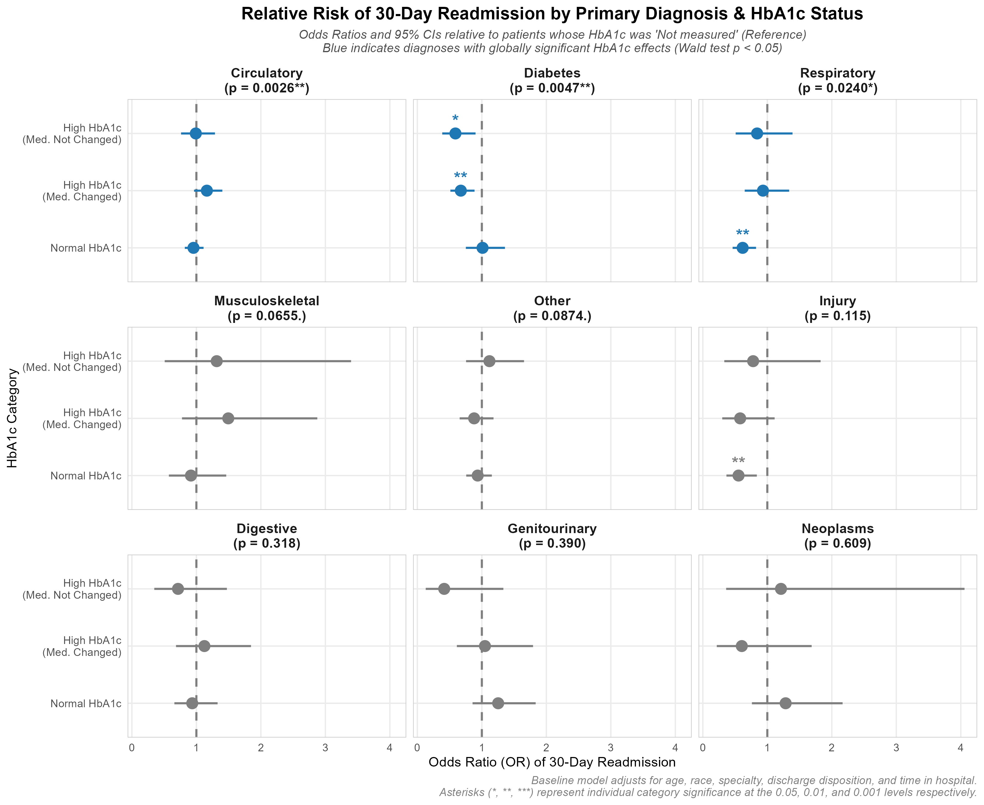
    เพื่อแก้ไขปัญหาความผิดเพี้ยนของ scale เหล่านี้ จึงได้พัฒนา faceted forest plot ของ Odds Ratios (OR) โดยเปรียบเทียบโดยตรงกับกลุ่ม reference ที่ไม่ได้รับการตรวจ (Not measured) ภายในแต่ละการวินิจฉัย:

    Dynamic Global & Individual Testing

    1. Global 3-df Wald test p-values คำนวณโดยใช้ car::linearHypothesis() และแสดงผลใน facet headers
    2. กราฟที่มีนัยสำคัญ (p < 0.05) จะแสดงเป็นสีน้ำเงิน ในขณะที่กราฟที่ไม่มีนัยสำคัญจะแสดงเป็นสีเทา
    3. '*' แสดงนัยสำคัญของแต่ละหมวดหมู่ จะถูกพล็อตไว้เหนือจุดข้อมูลโดยตรง

    Technical Insight: ทำความเข้าใจ Global 3-df Wald Test
    เมื่อประเมินตัวแปรที่มีหลายหมวดหมู่อย่าง hba1c_group (ซึ่งมี 4 ระดับ: Not measured เป็น reference, Normal, High, changed, และ High, not changed) การตรวจสอบ p-values ของแต่ละหมวดหมู่แยกกันจะเพิ่มความเสี่ยงของ Type I error (false positives) เพื่อแก้ไขปัญหานี้ จึงใช้ joint hypothesis test หรือ Wald test เพื่อประเมินว่าตัวแปรมีผลกระทบอย่างมีนัยสำคัญในภาพรวมหรือไม่

    • ทำไมถึงใช้ 3 Degrees of Freedom (3-df)?: เนื่องจาก hba1c_group มี 4 ระดับ regression model จึงประมาณค่า dummy coefficients ที่แตกต่างกัน 3 ค่า Wald test ทำการทดสอบ null hypothesis ร่วมกันว่า coefficients ทั้ง 3 ค่าเป็นศูนย์พร้อมกัน H0:βNormal=βHigh, changed=βHigh, not changed=0H_0: \beta_{\text{Normal}} = \beta_{\text{High, changed}} = \beta_{\text{High, not changed}} = 0 การทดสอบ parameters อิสระทั้ง 3 ตัวนี้ให้ค่าสถิติทดสอบที่เป็นไปตาม Chi-square distribution ที่มี 3 degrees of freedom พอดี
    • การทดสอบ Subgroup Interactions: สำหรับการวินิจฉัยที่ไม่ใช่ baseline (เช่น Circulatory) Wald test จะประเมินว่า interaction terms ที่จำเพาะต่อการวินิจฉัยทั้ง 3 ตัว:
      βNormal×Diag\beta_{\text{Normal} \times \text{Diag}}
      βHigh, changed×Diag\beta_{\text{High, changed} \times \text{Diag}}
      βHigh, not changed×Diag\beta_{\text{High, not changed} \times \text{Diag}}
      เป็นศูนย์พร้อมกันหรือไม่ ซึ่งช่วยตรวจสอบว่า HbA1c effect สำหรับการวินิจฉัยนั้นๆ มีความแตกต่างทางสถิติจากกลุ่ม baseline Diabetes หรือไม่

    Technical Insight: การคำนวณ Standard Error ด้วย Covariance Matrix
    เนื่องจาก interaction terms ระหว่าง primary diagnosis $\times$ HbA1c ใน final model ทำให้ log-Odds Ratio สำหรับการวินิจฉัยที่ไม่ใช่ reference เป็น linear combination ของ coefficients: βHbA1c+βHbA1c×Diagnosis\beta_{\text{HbA1c}} + \beta_{\text{HbA1c} \times \text{Diagnosis}} โดยคำนวณ standard error โดยใช้ covariance matrix:

    # Covariance-based standard error calculation in R (visualization_improved.R)
    log_or <- coefs[coef_hba1c] + coefs[coef_interaction]
    # Var(A + B) = Var(A) + Var(B) + 2 * Cov(A, B)
    var_log_or <- vc_mat[coef_hba1c, coef_hba1c] +
    vc_mat[coef_interaction, coef_interaction] +
    2 * vc_mat[coef_hba1c, coef_interaction]
    se_log_or <- sqrt(var_log_or)
    odds_ratio <- exp(log_or)
    ci_lower <- exp(log_or - 1.96 * se_log_or)
    ci_upper <- exp(log_or + 1.96 * se_log_or)
    # Individual two-tailed p-value
    indiv_p <- 2 * pnorm(-abs(log_or / se_log_or))

    Findings & The Statistical Paradox

    Modernized forest plot เผยให้เห็นความย้อนแย้งทางสถิติ (statistical paradox) ที่น่าสนใจ: นัยสำคัญของ global interaction ไม่ได้สอดคล้องกับนัยสำคัญของแต่ละหมวดหมู่เสมอไป

    1. ความย้อนแย้งในกลุ่มผู้ป่วยโรคระบบหมุนเวียนโลหิต

    • Global Test: χ2(3)=14.26,p=0.0026∗∗\chi^2(3) = 14.26, p = 0.0026^{**}(Blue Panel)
    • Individual Odds Ratios:
    • High, changed: OR=1.16,p=0.116\text{OR} = 1.16, p = 0.116
    • High, not changed: OR=0.99,p=0.946\text{OR} = 0.99, p = 0.946
    • Normal: OR=0.96,p=0.550\text{OR} = 0.96, p = 0.550
    • The Paradox: Even though Circulatory is globally significant, not a single individual HbA1c category is statistically different from the untested reference group (all 95% CIs cross 1.0). The global significance is driven entirely by the comparison to the Diabetes baseline: Circulatory patients’ readmission risk trends upward for high HbA1c, while Diabetes trends downward.

    2. ข้อค้นพบในกลุ่มเข้าโรงพยายาลจากการบาดเจ็บ

    • Global Test: χ2(3)=5.94,p=0.1148\chi^2(3) = 5.94, p = 0.1148 (Grey Panel)
    • Individual Category Estimates:
    • Normal: OR=0.55,p=0.0051∗∗\text{OR} = 0.55, p = 0.0051^{**} (Highly Significant)
    • แม้ว่าแนวโน้มโดยรวมของกลุ่ม Injury จะไม่แตกต่างจาก baseline มากพอที่จะผ่านนัยสำคัญของ global interaction แต่ผู้ป่วย Injury ที่ได้รับการตรวจ HbA1c และผลออกมาปกติ มีความเสี่ยงในการ readmission ต่ำกว่าถึง 45% (OR=0.55\text{OR} = 0.55) เมื่อเทียบกับผู้ที่ไม่ได้รับการตรวจ
      กลุ่มการวินิจฉัย Injury มีผู้ป่วยทั้งหมด 4,649 ราย ในขณะที่หมวดหมู่ reference ที่ไม่ได้รับการตรวจ (Not measured) มี 4,117 ราย (88.56%) สัดส่วนผู้ป่วยที่ไม่ได้รับการตรวจที่สูงนี้ก่อให้เกิดความไม่สมสัดส่วนในข้อมูล (เหลือผู้ป่วยที่ได้รับการตรวจน้อยมาก) ซึ่งอาจนำไปสู่การประมาณค่าทางสถิติที่ไม่น่าเชื่อถือสำหรับกลุ่มย่อยที่ได้รับการตรวจ ดังนั้น ผลการวิจัยนี้จึงจำเป็นต้องมีการศึกษาเพิ่มเติมเพื่อยืนยันความถูกต้อง

    3. ข้อค้นพบเกี่ยวกับโรคเบาหวาน

    • Global Test: χ2(3)=12.97,p=0.0047∗∗\chi^2(3) = 12.97, p = 0.0047^{**} (Blue Panel)
    • Individual Category Estimates:
    • High, changed: OR=0.67,p=0.0048∗∗\text{OR} = 0.67, p = 0.0048^{**} (Highly Significant)
    • High, not changed: OR=0.59,p=0.0148∗\text{OR} = 0.59, p = 0.0148^* (Significant)
    • Normal: OR=1.01,p=0.944\text{OR} = 1.01, p = 0.944 (Not significant)
    • สำหรับการรับผู้ป่วยที่มีการวินิจฉัยหลักเป็น Diabetes นั้น การวัด HbA1c มีความสัมพันธ์กับการลดลงอย่างมีนัยสำคัญของการ readmission เฉพาะเมื่อผลออกมาสูง (ซึ่งกระตุ้นให้มีการเปลี่ยนแปลงยาอย่างแข็งขัน) การตรวจ HbA1c ที่ได้ผลปกติไม่ได้เปลี่ยนแปลงอัตราการ readmission

    4. ข้อค้นพบเกี่ยวกับโรคคระบบทางเดินหายใจ

    • Global Test: χ2(3)=9.43,p=0.0240∗\chi^2(3) = 9.43, p = 0.0240^* (Blue Panel)
    • Individual Category Estimates:
    • Normal: OR=0.62,p=0.0011∗∗\text{OR} = 0.62, p = 0.0011^{**} (Highly Significant)
    • สำหรับผู้ป่วย Respiratory การลดลงของการ readmission จำกัดอยู่เฉพาะในกลุ่ม Normal HbA1c (OR=0.62\text{OR} = 0.62) ในขณะที่กลุ่ม HbA1c สูงไม่แสดงให้เห็นถึงประโยชน์ที่มีนัยสำคัญ

    Discussions

    Clinical Nuances & Cohort Context

    • Preprocessing: จากข้อมูล clinical encounters ดิบกว่า 100,000 รายการ มีเพียง 69,987 records เท่านั้นที่ผ่านเกณฑ์การคัดเลือกที่เข้มงวด การกรองนี้มีความจำเป็นเพื่อมุ่งเน้นเฉพาะ encounters ที่เป็นอิสระและไม่ใช่ procedure-based สำหรับผู้ป่วยไม่เสียชีวิตจากการรักษาในโรงพยาบาล
    • การตรวจ HbA1c ในอดีต: Cohort ของการศึกษานี้รวบรวมข้อมูลที่ล้าสมัย (ปี 1999–2008) การตรวจ HbA1c ถูกสั่งในเพียง 18.4% ของการพักรักษาในโรงพยาบาล ซึ่งบ่งชี้ว่าการ screening ผู้ป่วยใน น้อยเกินไปในอดีต แต่ระยะเวลาพักรักษาเฉลี่ย 4.27 วัน ถือเป็นช่วงเวลาที่เพียงพออย่างมากสำหรับการทำการตรวจและรับผลตรวจ HbA1c
    • ข้อจำกัดของข้อมูล EHR: เป็นไปได้ว่าการตรวจ HbA1c ถูกประเมินในทางปฏิบัติแต่ไม่ได้ถูกบันทึกลงใน electronic health record (EHR) database หรือผู้ปฏิบัติงานอาจมีการเข้าถึงข้อมูล blood glucose metrics อื่นที่ไม่ได้บันทึกไว้ (เช่น fingerstick logs) ซึ่งมีผลต่อแนวทางในการปรับยา นอกจากนี้ แนวปฏิบัติมาตรฐานที่แนะนำให้หยุดยาเบาหวานสำหรับผู้ป่วยนอกเมื่อรับเข้าโรงพยาบาลนั้น เพิ่งจะนำมาใช้ในช่วงท้ายของระยะเวลาการศึกษาเท่านั้น
    • บริบทในปัจจุบัน (The HITECH Act): นับตั้งแต่ HITECH Act ปี 2009 และการนำแรงจูงใจด้านคุณภาพของโรงพยาบาลมาใช้ (เช่น HEDIS/CMS measures) การ screening HbA1c ในผู้ป่วยในสมัยใหม่ได้เพิ่มสูงขึ้นอย่างรวดเร็วจกว่า 70–80% สำหรับผู้ป่วยในที่เป็นโรคเบาหวาน ซึ่งแสดงถึงการเปลี่ยนแปลงครั้งใหญ่ในมาตรฐานการดูแลรักษาเมื่อเทียบกับในอดีต
    • ความใส่ใจต่อระดับน้ำตาลในเลือดและการ Readmission: ในแง่ของอัตราการ readmission การวัด HbA1c เพียงอย่างเดียวมีความสัมพันธ์กับอัตราการ readmission ที่ลดลงในผู้ป่วยที่มีการวินิจฉัยหลักเป็นโรคเบาหวาน ในขณะที่โรคระบบทางเดินหายใจและระบบไหลเวียนโลหิตไม่มีความสัมพันธ์ดังกล่าว ซึ่งบ่งชี้ว่าการให้ความสนใจกับการดูแลโรคเบาหวานมากขึ้นระหว่างการพักรักษาในโรงพยาบาล (โดยเฉพาะสำหรับผู้ป่วยกลุ่มเสี่ยงสูงเหล่านี้) สามารถส่งผลกระทบทาง clinical ที่สำคัญต่อผลลัพธ์การ readmission

    Methodological Limitations

    • การออกแบบการศึกษาแบบ Retrospective และไม่ได้ทำการสุ่ม: ต่างจาก randomized clinical trial (RCT) การศึกษานี้อาศัย retrospective observational database เนื่องจากแพทย์ไม่ได้สั่งตรวจ HbA1c แบบสุ่ม ผู้ป่วยที่ได้รับการตรวจจึงมีแนวโน้มที่จะมี baseline risks ที่แตกต่างกัน ซึ่งนำไปสู่ selection bias
    • ความสัมพันธ์เชิงสถิติ vs. การอนุมานเชิงสาเหตุ: ด้วยเหตุนี้ การวิเคราะห์ regression นี้จึงเผยให้เห็นความสัมพันธ์ทางสถิติมากกว่าความสัมพันธ์เชิงสาเหตุโดยตรง อย่างไรก็ตาม ความสัมพันธ์เหล่านี้ให้พื้นฐานเชิงประจักษ์ที่แข็งแกร่งสำหรับการพัฒนาและทดสอบ clinical protocols ที่มีโครงสร้างชัดเจน

    การอภิปรายและแนวทางการพัฒนาเพิ่มเติมในอนาคต

    เพื่อก้าวผ่านข้อจำกัดที่มีอยู่ในการออกแบบการศึกษาปี 2014 และ nested logistic regression จึงมีการเสนอการขยายเชิงระเบียบวิธีที่สำคัญสามข้อ ดังนี้:

    1. การจับคู่ข้อมูลด้วย Propensity Score

    เนื่องจากการศึกาษานี้เป็น retrospective clinical database และไม่ใช่ randomized controlled trial แพทย์จึงไม่ได้สั่งตรวจ HbA1c แบบสุ่ม ผู้ป่วยที่ป่วยหนักกว่าหรือผู้ที่แสดงอาการควบคุมระดับน้ำตาลในเลือดได้ไม่ดีมักได้รับการตรวจบ่อยกว่า ซึ่งนำไปสู่ selection bias

    • ข้อเสนอแนะ: การนำ Propensity Score Matching (PSM) มาใช้เพื่อจับคู่ผู้ป่วยที่ได้รับการตรวจและไม่ได้รับการตรวจที่มี baseline covariates เหมือนกัน (ข้อมูลประชากร, comorbidities, ระยะเวลาในโรงพยาบาล) จะช่วยให้สามารถแยกผลกระทบเชิงสาเหตุที่แท้จริงของการตรวจ HbA1c ในผู้ป่วยในต่อการ readmission ได้

    2. Machine Learning & Model Interpretability

    Logistic regression สันนิษฐานว่าความสัมพันธ์ของ log-odds เป็นเชิงเส้นตรง และประสบปัญหาในการจับ interactions ที่ซับซ้อนและมี order สูงโดยไม่ต้องระบุด้วยตนเอง

    • ข้อเสนอแนะ: การ train tree-based machine learning model (เช่น XGBoost) และการสร้าง SHAP (Shapley Additive exPlanations) values จะช่วยให้เราสามารถจับ non-linear risks และระบุการมีส่วนร่วมที่แน่ชัดของยาและ comorbidity scores ต่อการ readmission ได้

    3. Survival Analysis (Time-to-Event Modeling)

    การวิเคราะห์การ readmission ในรูปแบบ binary 30-day flag จะมองข้ามช่วงเวลาของการ readmission และถือว่าผู้ป่วยที่ถูก readmit ในวันที่ 31 เหมือนกับผู้ป่วยที่ไม่เคยถูก readmit เลย

    • ข้อเสนอแนะ: การเปลี่ยนไปใช้ Cox Proportional Hazards model ช่วยให้เราวิเคราะห์ผลลัพธ์แบบ time-to-event ได้ โดย model นี้จะถือว่าผู้ป่วยที่ไม่เคยถูก readmit (หรือได้รับการจำหน่ายอย่างปลอดภัยหลังจากช่วงเวลาการสังเกต) เป็น right-censored ซึ่งช่วยรักษารายละเอียดทางเวลาและ statistical power ไว้

    Conclusion

    • ประโยขน์ทางคลินิกของ Screening HbA1c: การวัด HbA1c ในผู้ป่วยในเป็น predictor ที่มีคุณค่าสูงสำหรับอัตราการ readmission ภายใน 30 วัน โดยเฉพาะอย่างยิ่งสำหรับผู้ป่วยที่รับเข้าโรงพยาบาลด้วยการวินิจฉัยหลักเป็นโรคเบาหวาน
    • Reducing Rates & Healthcare Costs: By identifying poorly controlled glycemic status during hospital stays and prompting active treatment adjustments, inpatient screening serves as a powerful catalyst for reducing costly readmissions and improving diabetic patient care.
    • รากฐานเชิงประจักษ์: แม้ว่าการศึกษาจะมีข้อจำกัดจากการออกแบบแบบ retrospective และไม่ได้ทำการสุ่ม แต่ผลการวิจัยให้รากฐานเชิงประจักษ์ที่แข็งแกร่งสำหรับการพัฒนา hospital protocols เพื่อทดสอบ clinical hypothesis นี้โดยตรง

    Scripts

    Full scripts are available at

    • preprocess.R: Data filtering, ICD-9 diagnosis mapping, and cohort cleaning.
    • analysis.R: Fits nested logistic regression models and calculates ANOVA deviance tables.
    • visualization.R: Replicates the original paper’s Figures 1, 2, and 3.
    • visualization_improved.R: The modernized visualization script implementing Wald tests and the faceted forest plot.
    • run_pipeline.R: Master orchestrator script that runs the entire pipeline end-to-end and outputs a verification summary report.

    ขอบคุณที่อ่านจนจบ โปรเจกต์นี้แสดงให้เห็นถึงพลังของการแปลงข้อมูลดิบที่ซับซ้อนให้กลายเป็น clinical insights ที่ละเอียดและนำไปปฏิบัติได้จริง คอยติดตาม data science project ถัดไปของผมด้วยนะครับ

  • Pharmacovigilance Pipeline: FAERS Data Analysis

    การเฝ้าระวังความปลอดภัยของยา: การวิเคราะห์ข้อมูลจากระบบ FAERS


    Disclaimer:

    1. The findings from this project are for educational purposes only and should not be used for clinical decision-making.
    2. Analysis scripts are provided at the bottom of the page and are written for the purpose of learning and should not be used for production without further testing

    Key Achievements 🏆​

    • Processed 20+ years of FAERS XML data (2004–2025) across 84 quarterly releases
    • Detected 111,918 drug-reaction signals; identified GLP-1 class-wide GI safety profile
    • Built multi-dimensional interactive visualizations filterable by gender, age, and indication

    Tools & Skills

    LayerTools
    1. ETL Python (xml.tree)
    2. Data CleaningPostgreSQL
    3. Analysis R (Tidyverse, DBI, RPostgres)
    4. Visualizationggplot, Plotly
    5. MethodsPRR, ROR, Chi-square, IC

    สิ่งที่จะพบในโปรเจกต์

    1. What is pharmacovigilance?

    2. Introducing to the US crucial database for Pharmacovigilance: FAERS

    3. FAERS data analysis methodology.

    • ETL (Extract, Transform, Load) using Python
    • Data cleaning using PostgreSQL
    • Descriptive profiling using R (tidyverse, DBI, RPostgres)
    • Signal detection using R

    4. Findings & Conclusion

    • Discriptive profiling findings
    • Statistical signal detection findings using R (ggplot2+plotly)
      • Heatmaps to explore drug-reaction matrices
      • Interactive volcano plots of the Information Component lower bound (IC025) against the Log10 Chi-square statistic
      • Interactive GLP-1 Safety Signals forest plot
      • Interactive GLP-1 Safety Signals by sub-population

    5. Discussions

    • Limitations and future work

    6. Full analysis scripts on GitHub


    Introduction

    This project applies ent-to-end pharmacovigilance analysis to the FDS’s FAERS database, 20+ years of real-world adverse event data to detect and characterize drug safety signals

    As a pharmacist transitioning into healthcare data, I built this pipeline from scratch: raw XML ingestion, SQK-based normalization, and signal detection in R,culninating in interactive clinical visualizations.

    What is pharmacovigilance?

    Pharmacovigilance is the science of monitoring the safety of medicines after they reach the market. As part of this, the U.S. Food and Drug Administration (FDA) maintains the Adverse Event Reporting System (FAERS), a massive database tracking reported drug side effects.

    What is FAERS database?

    The FDA Adverse Event Reporting System (FAERS) is a publicly available, national database containing millions of reports on adverse events (side effects) and medication errors.

    These reports are submitted voluntarily by healthcare professionals and consumers, as well as mandatorily by pharmaceutical manufacturers.

    What would be expected from this analysis?

    FAERS data can uncover hidden safety patterns that wern’t caught during initial clinical trials. For example, drug combination side effects or rare side effects in specific demographics. But this analysis focuses solely on drug-reaction pairs. Because I want to start with simple task first, which will lead to more complex analysis later on.


    ระเบียบวิธีวิเคราะห์ข้อมูล

    FAERS Analysis pipeline workflow:

    Data source

    The raw data comes from the FDA’s FAERS quarterly data releases, provided as massive, deeply nested XML files containing millions of patient and drug records from 2004Q1-2025Q4.

    Data available here: FAERS Database

    การเตรียมและการทำความสะอาดข้อมูล

    1. ETL (Extract, Transform, Load)

    I started with reading related documentations and sampling XML files to understand the structure and content of the data. Then, with the help of AIs, I developed `faers_etl.py` script using `xml.etree.ElementTree` library. I tested it on small subsets of the data first, and increased the data size to handle the massive XML files without crashing. Finally, I loaded the processed data into a structured PostgreSQL database.

    The primary challenge with FAERS XML files is their size (2.2 GBs in total). Loading the entire DOM into memory would cause a crash (I had already crashed and burned my quota on Colab). My solution uses `iterparse` to process the file report-by-report, clearing the memory immediately after each insertion:

    def process_file(xml_path: Path, conn):
    # Stream-parse one XML file — memory-safe for large files
    context = ET.iterparse(xml_path, events=("end",))
    for event, elem in context:
    if elem.tag != "safetyreport":
    continue
    # Parse and insert into DB
    report = parse_safety_report(elem)
    _insert(cur, "safety_report", report)
    # CRITICAL: Discard the element from memory immediately
    elem.clear()

    2. Data cleaning

    Utilizing SQL (`faers_clean.sql`), I performed extensive data normalization and cleaning:

    1. Date & Age Standardization: Converted string dates to standard formats, handled low-precision dates, and normalized various age units (months, days) into a single `ageyears` column.
    2. Label Decoding: Translated cryptic numeric codes into readable text (e.g., patient sex, reaction outcomes).
    3. Drug & Indication Normalization: Extracted missing active ingredients from product names using regex, stripped chemical salt suffixes, and standardized medical indications.
    4. Sender Normalization: Consolidated various pharmaceutical company subsidiaries into standardized parent company names.
    5. Severity Reconciliation: Created a reliable master “seriousness” flag to fix logical inconsistencies in the raw FDA data.
    6. Deduplication: Built a clinical “fingerprint” (matching demographics, dates, drugs, and reactions) to identify and remove duplicate reports submitted by multiple sources.
    7. Final Analytical View: Compiled all the cleaned and filtered data into a final view (`v_analysis`) to serve as a reliable source of truth for the next statistical phase.

    One of the most complex tasks was identifying duplicate reports sent by different sources (e.g., a doctor and a manufacturer). I developed a “clinical fingerprint” strategy that matches reports based on a combination of demographics and medical data:

    -- 10.1 Create a clinical fingerprint for each safety_report
    -- A fingerprint consists of demographics, country, date, and aggregated suspect drugs + reactions.
    CREATE TEMP TABLE report_fingerprint AS
    SELECT
    sr.safetyreportid,
    sr.occurcountry,
    sr.receivedate,
    p.patientsex,
    p.ageyears,
    -- Aggregate suspect drugs into a single sorted string
    (SELECT STRING_AGG(DISTINCT d.substance_std, '|' ORDER BY d.substance_std)
    FROM drug d
    WHERE d.safetyreportid = sr.safetyreportid AND d.drugcharacterization = 1) AS suspect_drugs,
    -- Aggregate reactions into a single sorted string
    (SELECT STRING_AGG(DISTINCT r.reactionmeddrapt, '|' ORDER BY r.reactionmeddrapt)
    FROM reaction r
    WHERE r.safetyreportid = sr.safetyreportid) AS reactions
    FROM safety_report sr
    JOIN patient p ON sr.safetyreportid = p.safetyreportid
    WHERE sr.duplicate IS NULL; -- Ignore already flagged duplicates

    การวิเคราะห์เชิงพรรณนา (Descriptive Profiling)

    I utilized R with packages (tidyverse, DBI, RPostgres) to plot descriptive profiling for better understanding of the dataset. Key insights from the data profiling include:

    • Sex Distribution: Females report adverse events significantly more often than males (47.3% vs 31.0%). A notable portion (21.8%) of reports are missing sex data.
    • Age Distribution: Among reports with known ages, Adults (18-64) are the largest affected group (31.3%), followed by the Elderly (65-74) and Very elderly (>75). A large proportion (41.9%) of reports unfortunately lack age data.
    • Geographic Mapping: Since FAERS database collects data in the US, the vast majority of adverse event reports originate from the United States, with secondary reporting clusters in Europe and East Asia.
    • Severity Breakdown: While many serious reports fall under a non-specific “Other” category (38.8%), a substantial portion resulted in Hospitalization (18.6%) and Death (6.5%), emphasizing the critical nature of the reported events.
    • Top Senders: Pharmaceutical companies SANOFI and ABBVIE are the top reporting organizations by a wide margin in this dataset. Sanofi and AbbVie top FAERS reporting primarily due to their massive patient volumes and market dominance in biologics, particularly with flagship drugs like Dupixent and Humira.
    • Fatal Reactions: The most frequent reactions associated with fatal outcomes range from severe acute conditions like “Duodenal ulcer perforation” and broader systemic issues like “Systemic lupus erythematosus”.

    Signal detection

    In pharmacovigilance, we look for “disproportionate signals”: when a specific side effect is reported for a drug more often than expected by chance.

    For readers who are not familiar with pharmacovigilance, here is a quick guide:

    Signal detection principle

    Important question: Is this drug-event combination reported more than expected?

    To answer this, we construct a 2×2 contingency table:

    Drug-event pairTarget ReactionOther ReactionsTotal
    Target Drugaba +b
    Other Drugscdc + d
    Totala + cb + dn

    Where:

    • a: Number of reports for the target drug with the target reaction
    • b: Number of reports for the target drug with other reactions
    • c: Number of reports for other drugs with the target reaction
    • d: Number of reports for other drugs with other reactions
    • n: Total number of reports

    Let’s apply these variables to the metrics for signal detection.

    Metrics for signal detection

    1. PRR (Proportional Reporting Ratio)

    PRR asks: “Is this side effect reported proportionally more for this drug than for all others?”

    PRR=a(a+b)÷c(c+d)PRR=\frac{a}{(a+b)}\div\frac{c}{(c+d)}

    PRR is the ratio between:

    • Proportion of reports for a specific drug-event pair
    • Proportion of reports for other drugs with the same event

    Interpret as:

    • PRR = 1: No association
    • PRR > 1: signal detected
    • PRR < 1: signal not detected/protective effect (rare)

    2. ROR (Reporting Odds Ratio)

    ROR asks: “How much more likely is this drug-reaction pair to appear in the data compared to any other drug-reaction combination?”

    ROR=ab÷cdROR=\frac{a}{b}\div\frac{c}{d}
    • Is a cross-product ratio
    • From the case-control perspective
    • Interpret as:
      • ROR = 1: No association
      • ROR > 1: signal detected
      • ROR < 1: signal not detected/protective effect (rare)

    3. Chi-square χ² (with Yates’ continuity correction): Test of independence

    χ² asks: “Is the association between this drug and this reaction statistically real, or could it just be random chance?”

    χ2=N×(|ad−bc|−N/2)2(a+b)(c+d)(a+c)(b+d)χ² = \frac{N × (|ad – bc| – N/2)²}{(a+b)(c+d)(a+c)(b+d)}
    • Test whether a,b,c,d are independent (null hypothesis)
    • Interpret as:
      • χ² <= 4: fail to reject null hypothesis at ~95% confidence level -> signal is not statistically significant
      • χ² > 4: reject null hypothesis at ~95% confidence level -> signal is statistically significant

    4. Information Component (IC; with Bayesian correction): Test of disproportionality

    IC asks: “How much more often is this drug-reaction pair reported than we’d expect if the two were completely unrelated?”

    IC=log2[(a+0.5)/(a+b+0.5)×(a+c+0.5)N+1]IC = log₂[(a + 0.5) / \frac{(a+b+0.5) × (a+c+0.5)}{N+1}]
    • Measures information gain from the observation (Log2 ratio between observed and expected counts of the event-drug pair)
    • Interpret as:
      • IC = 0: no information gain (Observed = Expected)
      • IC > 0: signal detected, IC = 1: 2x more than expected, IC = 2: 4x more than expected, …
      • IC < 0: signal not detected/protective effect (rare)

    5. IC025: Signal Stability

    IC025 asks: “Even in the worst-case statistical scenario, is this signal still strong enough to be considered real and not a random chance from small sample sizes?”

    ICvar=1log(2)2×1a+0.5−1N+1IC_{var} = \frac{1}{log(2)²} × \frac{1}{a+0.5} – \frac{1}{N+1}
    IC0.025=IC−1.96×ICvarIC₀.₀₂₅ = IC – 1.96 × \sqrt{IC_{var}}
    • Lower bound of 95% Confidence Interval of IC
    • Interpret as:
      • IC025 < 0: signal are not statistically significant at 95% confidence level
      • IC025 >= 0: signal detected with 95% confidence level

    For signal detection methods selection, I borrowed methodology from many organizations for robustness:

    • PRR, ROR, and χ² from European Medicines Agency (EMA)
    • IC/BCPNN, and IC025 from WHO Uppsala Monitoring Centre (VigiBase)
    • Thresholds: PRR ≥ 2, χ² ≥ 4 from UK MHRA (Medicines and Healthcare products Regulatory Agency), added: a >= 3 & IC025 > 0 in this analysis

    I utilized R to apply these statistical methods to find strong associations.

    Confounding control

    Confouding by indication is when the indication of the drug is filled as an adverse effect of the drug. For example, a diabetes drug will have high reports of high blood sugar simply because the patients have diabetes. I built a filter to significantly reduce these logical overlaps so we only flag unexpected side effects.

    To ensure the detection of new safety signals rather than symptoms of the underlying disease, I implemented a string-matching filter in R. This removes any case where the reported reaction is already mentioned as the reason for taking the drug:

    # Indication Overlap Logic (Confounding Control)
    df_filtered <- df_raw %>%
    mutate(
    rxn_clean = str_to_lower(str_trim(reactionmeddrapt)),
    ind_clean = str_to_lower(str_trim(indication_std))
    ) %>%
    filter(
    is.na(ind_clean) |
    (rxn_clean != ind_clean & !str_detect(ind_clean, fixed(rxn_clean)))
    )

    Visualization & Findings

    I created interactive visualizations using R (ggplot, Plotly) to make the findings accessible. This includes:

    1. Heatmaps of drug-reaction matrices

    The Safety Signal Intensity Heatmap visualizes the association strength (IC025) between the top 40 drugs and the top 40 reported adverse reactions. Darker blue cells indicate a higher lower bound of the Information Component (IC), representing a statistically robust signal. Findings from this heatmap include:

    • GLP-1 Agonist Cluster: The heatmap highlights a distinct gastrointestinal (GI) safety profile for GLP-1 receptor agonists like Semaglutide and Tirzepatide. Both drugs show strong positive associations with Nausea, Vomiting, Diarrhoea, Constipation, and Abdominal pain.
    • Tirzepatide & Injection Site Reactions: While sharing the GI profile, Tirzepatide stands out with a particularly intense signal for Injection site pain, reflecting its delivery method and potentially higher localized reactivity compared to other substances in the top 40.
    • Disease-Signal Overlap: The dark signals for Type 2 diabetes mellitus associated with these drugs exemplify ‘Confounding by Indication’ where the underlying condition being treated is reported as an adverse event. Although ‘Indication Filtering’ step is applied, there are still some signals for underlying conditions left.

    2. Interactive volcano plots

    This visualization displays safety signals by plotting the Information Component lower bound (IC025) against the Log10 Chi-square statistic.

    • Signal Stability (X-axis): The IC025 represents the Bayesian lower bound of signal strength; values above 0 indicate a stable signal.
    • Statistical Significance (Y-axis): The Chi-square statistic identifies signals that deviate significantly from expected background reporting.
    • Magnitude & Risk: Bubble size represents the total case count, while the color gradient (from wheat to indianred) represents the Proportional Reporting Ratio (PRR).
    • Interactive Filtering: Users can filter signals by WHO ATC Level 1 drug classes using the built-in dropdown menu.

    Key Findings: The plot clearly isolates a “Strong Signals” quadrant (top-right) where drug-reaction pairs meet both rigorous Bayesian and Frequentist criteria. By filtering for the “Alimentary tract and metabolism” ATC class, GLP-1 receptor agonists (such as Semaglutide and Tirzepatide) stand out in the upper-right quadrant. Their data points appear as massive, red bubbles representing high case volumes and PRR values for gastrointestinal adverse events. This immediate visual confirmation justifies selecting GLP-1 agonists for a targeted deep-dive analysis.

    3. Interactive GLP-1 Safety Signals

    The Interactive GLP-1 Safety Signal Forest Plot provides a granular, drug-by-drug comparison of safety signals within the GLP-1 agonist class. This visualization utilizes the Information Component (IC): A Bayesian measure of disproportionate reporting, along with its 95% Confidence Interval to illustrate signal stability.

    • Comparative Profiling: A built-in dropdown menu allows users to toggle between different reactions (e.g., Nausea, Vomiting, Constipation), revealing how drugs like Semaglutide, Tirzepatide, and Dulaglutide perform relative to one another.
    • Hover Metadata: The interactive Plotly interface allows users to hover over data points to see exact IC values, confidence bounds (IC025 to IC975), and specific case counts, making it a powerful tool for deep-dive safety assessment.
    • Precision & Volume: For common GI reactions like ‘Nausea’, ‘Diarrhoea’, ‘Vomiting’, and ‘Constipation’, Semaglutide, Liraglutide, Dulaglutide and Tirzepatide show high-intensity, stable signals (IC 1 – 3.5), while some newer agents show insufficient reporting volumes. For injection site pain, Tirzepatide shows the highest intensity, stable signal (IC > 4), followed by dulaglutide (IC ~ 3), while other GLP-1 agonists show 0 reports for this reaction. This finding agree with adverse reaction information from Lexidrug showing 3-8% of mild injection site pain in Tirzepatide users, but no such adverse reaction in Semaglutide and Liraglutide users.

    4. Interactive GLP-1 Safety Signals by sub-population

    The Sub-population Safety Signal Heatmap is a multi-dimensional tool designed to uncover how safety signals vary across different patient demographics.

    • Multi-Dimensional Filtering: Three dropdown menus allow users to slice the data by Gender, Age Group (e.g., Adult 18-64 vs. Elderly 65+), and Clinical Indication (e.g., Diabetes vs. Weight Management).
    • Evidence-Based Visualization: Each cell displays the IC025 value, with visual markers denoting statistical significance levels. (***: IC025>2, **:IC025>1, *:IC025>0)
    • Demographic Insights:
      • Weight Management Cohort: For patients taking medications for weight loss, signals for “Impaired gastric emptying” and “Abdominal pain” are significantly more pronounced compared to those taking the same drugs for diabetes, especially for Dulaglutide.
      • Injection-Site Cluster: Tirzepatide displays a uniquely intense and consistent cluster of injection-site reactions (pain, bruising, erythema) that persists across all age and gender filters, distinguishing it from other GLP-1s.
      • Indication-Driven Reporting: In the diabetes population, signals like “Blood glucose increased” and “Drug ineffective” often appear, reflecting clinical reporting patterns where uncontrolled underlying disease is flagged as an adverse event.

    Conclusion

    This FAERS data analysis pipeline effectively demonstrates how statistical pharmacovigilance techniques combined with interactive visualizations can isolate and interpret genuine drug safety signals from background noise.

    By applying both Bayesian (IC) and Frequentist methods (PRR, ROR), I identified GLP-1 receptor agonists as a drug class of exceptionally high interest due to their overwhelmingly strong safety signals. Through our targeted deep-dive visualizations, several key clinical insights emerged:

    1. Class-wide Gastrointestinal Signals: GLP-1 agonists (particularly Semaglutide, Tirzepatide, Liraglutide, and Dulaglutide) consistently exhibit high-intensity, stable signals for GI adverse events like nausea, vomiting, diarrhoea, and constipation.
    2. Drug-Specific Variances: While sharing the GI profile, Tirzepatide and Dulaglutide present uniquely intense, robust signals for injection-site reactions (such as pain, bruising, and erythema) that are virtually absent in reports for other GLP-1 drugs, a finding that corroborates established medical literature.
    3. Sub-population Differences: The adverse event profile shifts significantly based on the patient’s clinical indication. Notably, patients utilizing these medications for weight management report pronounced rates of impaired gastric emptying and abdominal pain compared to those treating diabetes, especially with Dulaglutide.
    4. Confounding by Indication: Despite applying logical filtering steps, the persistent overlap of disease symptoms (e.g., increased blood glucose in diabetes patients) being reported as adverse events highlights the inherent complexities of analyzing real-world, post-marketing data.

    Ultimately, this project showcases the power of transforming massive, complex raw data into granular, actionable clinical insights that can inform personalized patient care and enhance drug safety monitoring.


    Discussion

    While this pipeline successfully extracts actionable insights from raw FAERS data, analyzing real-world pharmacovigilance data presents several inherent challenges that leave room for future improvement:

    Drug Name Standardization

    Raw adverse event reports use tens of thousands of different names, misspellings, or abbreviations for the same drug. In this iteration, I implemented a custom fuzzy matching algorithm to standardize medicinal product names into generic active substances. Initial explorations using external APIs (like OpenFDA and RxNorm) yielded inconsistent results: such as erroneously mapping “0.9 % Normal saline” to “tolnaftate”. Moving forward, integrating flexible methods like Retrieval-Augmented Generation (RAG) or Large Language Models (LLMs) could provide the contextual understanding necessary for highly accurate, automated drug mapping.

    Cross-sender deduplication

    The FAERS database frequently contains duplicate reports submitted by different entities (e.g., a physician, a pharmacist, and the manufacturer reporting the same single event). Although this project employs duplication flag and clinical fingerprinting to identify and exclude overlapping reports across different senders, this deduplication strategy is not perfect due to sparse patient-specific identifiers such as age, bodyweight, etc. This may lead to inflated case counts and biased statistical signals. Future enhancements could explore probabilistic record linkage to improve accuracy.

    Indication Filtering and Confounding

    “Confounding by indication” is a persistent hurdle. While my custom Indication filtering successfully reduces direct logical overlaps. However, some disease-driven signals still occasionally slip through (such as “Blood glucose increased” or “Drug ineffective”). Developing more nuanced clinical ontologies to filter downstream disease complications, or accurately accounting for off-label usage, would help isolate only the truly unexpected adverse drug reactions.

    Advanced Signal Detection Methods

    The current pipeline utilizes a robust blend of Frequentist (PRR, ROR, Chi-square) and Bayesian (Information Component via BCPNN) methodologies. However, the signal detection capabilities can be further enhanced by incorporating more sophisticated empirical Bayes methods, such as the Multi-item Gamma Poisson Shrinker (MGPS) to calculate the Empirical Bayes Geometric Mean (EBGM). These algorithms, frequently utilized by the FDA, are particularly effective at minimizing false positives in extremely sparse data and detecting complex multi-drug interactions (polypharmacy).


    Analysis scripts

    My GitHub repo

    Thank you for making it this far, this is my first complete health data analysis project. This project taught me many things. I will make sharper analysis, stay tuned for my next project!


    Disclaimer (again!?): This project is for educational purposes. Findings should not be used for clinical decision-making.

  • Public Transportation Usage in Thailand Analysis (2025-2026)

    วิเคราะห์การใช้ระบบขนส่งสาธารณะในประเทศไทย (ปี 2025-2026)

    If you’re someone who relies on Bangkok’s mass transit system, whether you’re a daily commuter, an occasional rider, or just curious about urban mobility, this analysis is for you.

    This analysis deep dive into Thailand’s public transportation data is part of the data storytelling assignment from the Big Data Institute (BDI). Using official data from the Ministry of Transport covering approximately 14 months (2025-2026), I have analyzed passenger patterns across Bangkok’s major electric rail systems: the BTS Skytrain, MRT lines (Blue, Purple, Pink, and Yellow), the Airport Rail Link (ARL), and the Red Line SRT.

    Let’s explore what the numbers reveal about urban rails that move Bangkok.

    The Big Picture: Who Carries Bangkok?

    Passenger Volume Share by System

    The BTS Skytrain is the main Bangkok’s rails. Carrying 50.6% of all passengers, it moves more people than all other systems combined. This isn’t surprising, the BTS has the most extensive network, serves both commercial and residential areas, and has been around the longest.

    The MRT Electric Train network comes in second at 42.2%, showing that Bangkok’s underground system has matured into a serious alternative to the elevated BTS. Together, these two workhorses move over 90% of all rail passengers in the metropolitan area.

    The newer systems serve more specialized roles:

    • Airport Rail Link (4.6%) connects the city to Suvarnabhumi Airport, a vital but niche service
    • Red Line SRT (2.6%) extends suburban connectivity, though it’s still building its ridership base

    Growth Stories: Who gains? Who loses?

    Year-over-Year Passenger Growth (2025 vs 2026)

    The Airport Rail Link is rising in number with a remarkable 10.4% growth in average daily passengers. This surge likely reflects Thailand’s tourism rebound, If you’ve noticed the ARL getting more crowded lately, the data backs up your observation.

    Both MRT lines show healthy growth in the 3.6-3.8% range, indicating steady demand as more people discover the convenience of underground travel and new stations attract riders.

    But here’s the concerning part: The BTS Skytrain shows a slight decline of -1.2%. This is noteworthy because it’s the largest system carrying half of all passengers. Possible explanations are the price increase of the extension part in late 2025.

    Notes: The data for 2026 is incomplete (most recent: March 11), as this analysis was conducted in mid-April 2026. Interpret these results with this consideration in mind.

    Exploring the Waves: Daily Patterns and Volatility

    Daily Passenger Volume Trends & Statistical Volatility

    Honestly, this chart lowkey reminds me of an EKG (with ventricular tachycardia). So, I would say it shows the heartbeat of Bangkok workweek.

    The regular peaks and valleys are the rhythm of Monday through Friday v.s. weekends. The BTS (green) and Blue Line MRT (blue) show the most dramatic oscillations which explain the office commuters domination.

    Moreover, beyond the weekly pattern, there are some fascinating insights:

    Volatility Analysis (Sorted by CV %)

    RailsMean (Person)STD (Person)CV %
    Purple Line (MRT)67453.619464.728.9
    Pink Line61823.816392.126.5
    Blue Line (MRT)428055.9100420.123.5
    Yellow Line45550.89853.921.6
    Red Line (SRT)36465.67442.120.4
    BTS Skytrain721925.2146471.320.3
    ARL (Airport Rail Link)65932.713245.520.1

    Volatility shows each line’s character:

    • Purple Line MRT is the most unpredictable (CV = 28.9%): likely because it serves suburban areas where ridership is more sensitive to events, weather, and weekends.
    • Airport Rail Link is the most stable (CV = 20.1%): flight schedules don’t care much about Thai holidays or weekends.
    • Established systems like BTS and Blue Line show moderate volatility (20-23%), reflecting their diverse rider base.

    Can Passenger’s Volume Reflect Events?: Event Detection

    Passenger Anomaly Detection and Major Event Correlation

    This chart revealing how Thai holidays and events affect ridership

    The pattern is predictable: Elevated baseline from April to October is correlated with the Songkran festival during mid-April and the Thai school start semester in May, then the baseline drops as schools end the semester in October.

    🟢 ​Green dots mark unusually high spikes:

    • Chinese New Year (early February 2025) created the biggest spike of the entire period
    • Internaitonal New Year celebrations consistently drive spikes

    ​🔴 ​Red dots mark significant decreases:

    • Religious holidays like Makha Bucha, Visakha Bucha, and memorial days consistently depress ridership significantly below normal because many Thais return to their hometowns or stay at thier residences.

    Conclusion

    After analyzing over 14 months of passenger data across seven major transit lines, several clear points emerge:

    1. Bangkok has a transit duopoly: BTS and MRT together carry over 90% of passengers, creating both efficiency and vulnerability
    2. The commuter dominance problem: Strong weekday patterns reveal that Bangkok’s transit excels at moving office workers but hasn’t captured the weekend leisure market
    3. Tourism is becoming increasingly important: The Airport Rail Link’s exceptional growth and Chinese New Year spikes show that international visitors are a growing factor in transit planning
    4. Culture matters: Thai holidays and cultural events create predictable but dramatic ridership swings
    5. Warning signs ahead: The BTS decline and the late-2025 systemwide downturn need investigation and potentially intervention

    For policymakers and transit operators, the data suggests several action items: investigate the BTS decline, develop strategies to attract weekend riders, and monitor the late-2025 trend carefully.

    For daily riders like us, this analysis confirms that we’re part of a massive, complex system that pulses with the rhythm of Bangkok’s work life and cultural heart.​❤️​

    Python Scripts & Methodology

    Want to explore the data yourself or reproduce this analysis? I’ve made all my Python code available:

    Jupyter Notebook

    Or My GitHub Repo

    Feel free to modify and extend the analysis. If you find interesting patterns I missed, I’d love to hear about them!

  • Personal project: A Data-Driven Search for Biosimilar Opportunities in Thailand

    Personal project: การค้นหาโอกาสทางการตลาดของยา Biosimilars ในประเทศไทย

    This project is a labor of passion: a fusion of my clinical background as a pharmacist and my growing passion for data analysis.

    My goal was simple: to use data to identify which crucial Monoclonal Antibodies (mAbs) are missing from the Thai market despite being available as affordable biosimilars in the US.

    Project Technical Stack

    To bring this analysis to life, I utilized a mix of clinical domain knowledge and technical tools:

    • Data acquisition: Python (Scrapy) for web scraping Thai FDA data.
    • Data engineering: Power Query and Excel for cleaning and joining international datasets.
    • Data modeling: Relational database design in Power BI.
    • Analytics & Visualization: DAX for scoring logic and Power BI for storytelling.
    • Clinical Frameworks: NLEM criteria, and Thai Health Data Center (HDC) data.

    I’ve combined storytelling and data visualization to summarize this journey. Each page represent a core step in the analytical process, moving from raw data to actionable clinical insights. I hope you find this process as fascinating as I did!

    How I made this?

    Inspiration

    As a pharmacist in Thailand, I see the innovation lag firsthand. Advanced biologic therapies (mAbs) are transforming medicine, but their high costs often keep them them out of reach for most Thai patients. While, In the US, Biosimilars, a safe, interchangeable , affordable versions of these drug launch as soon as patents expire.

    I wanted to find the answer: Which critical molecules are we missing in Thailand that are already available in the US?

    Methodology: Data analysis

    1. Data preparation

    1.1 Prepare US mAbs data from Purple Book

    I started with the US FDA Purple Book. I prefer using the data transformation pane in Power BI for initial exploration. The automatic column profiles and quality distributions give me an instant glimpse of the data.

    I cleaned the generic name (Proper Names) by stripping manufacturer suffixes (e.g., changing “Adalimumab-atto” to “Adalimumab”) to create a clean list for cross-referencing.

    A part of the head of data:

    the table schema:

    1.2 Prepare Thai mAbs data from Thai FDA scraping

    While the US data was a simple CSV, the Thai data was a different story. Since no public dataset existed, I built a Scrapy crawler in Python to navigate the Thai FDA search portal and build a mirrored dataset.

    • I used Google Colab and Pandas to manage my search list, then deployed the Scrapy crawler to capture product names, license holders, and registration statuses.
    • I used Power BI to join these two datasets. This allowed me to identify “mismatches” which are mAbs registered in the US but absent in Thailand.

    My codes for scraping are:

    %%writefile med_spider.py
    import scrapy
    class MedSpider(scrapy.Spider):
        name = "meds"
        # 1. Added a User-Agent
        custom_settings = {
            'USER_AGENT': 'Mozilla/5.0 (Windows NT 10.0; Win64; x64) Chrome/119.0.0.0 Safari/537.36',
            'COOKIES_ENABLED': True, # ASP.NET sites NEED cookies to track your session
            'DOWNLOAD_DELAY': 5,        # Wait 5 seconds between drugs
            'CONCURRENT_REQUESTS': 1,   # One at a time to stay under the radar
            'USER_AGENT': 'Mozilla/5.0 (Windows NT 10.0; Win64; x64) Chrome/119.0.0.0 Safari/537.36',
            'FEEDS': {
                'med_results.csv': {
                    'format': 'csv',
                    'encoding': 'utf-8-sig',
                    'overwrite': True,
                }
            }
        }
        
        start_urls = ['Thai FDA drug searching URL']
        usmed_list = [list of mAb generic names from Purple Book]
        # 1. This replaces the default start_urls behavior
        def start_requests(self):
            for drug in self.usmed_list:
                # visit the landing page once for each drug to get a fresh ViewState
                yield scrapy.Request(
                    url=self.start_urls[0],
                    callback=self.parse,
                    meta={'search_term': drug}, # save the drug name
                    dont_filter=True # for hitting the same URL multiple times
                )
        def parse(self, response):
            # retrieve the drug name saved in meta
            drug_to_search = response.meta['search_term']
            # from_response: handle the hidden ASP.NET ViewState
            return scrapy.FormRequest.from_response(
                response,
                formdata={
                    'ctl00$ContentPlaceHolder1$txt_substance': drug_to_search,
                    'ctl00$ContentPlaceHolder1$btn_sea_drug': 'ค้นหา'
                },
                callback=self.parse_results,
                meta={'search_term': drug_to_search} # Pass it forward again to the results
            )  
        def parse_results(self, response, ):
            search_term = response.meta['search_term']
            rows = response.css('tr.rgRow, tr.rgAltRow')
            self.logger.info(f"Found {len(rows)} rows on the page!") # show logs
            for row in rows:
                # gets text inside <span> or <a> tags.
                data = row.css('td:not([style]) ::text').getall()
                # Clean up the list (keep empty strings)
                clean_data = [item.strip() if item else "" for item in data]
                if len(clean_data) > 0:
                    yield {
                        'searched_drug': search_term,
                        'registration_no': clean_data[1] if len(clean_data) > 0 else None,
                        'trade_name': clean_data[3] if len(clean_data) > 3 else None,
                        'licensee': clean_data[4] if len(clean_data) > 4 else None,
                        'drug_type': clean_data[5] if len(clean_data) > 5 else None,
                        'status': clean_data[7] if len(clean_data) > 5 else None
                    }
                    
    !scrapy runspider med_spider.py

    1.3 Identifying hidden gaps

    Initial results showed that most of absent drugs were orphan drugs or for rare diseases. To find the “real” opportunities, I needed more information. These are what I started with:

    • Market Demand: Top 20 Global Sales data (via Pharmashots) to identify clinical demand and physician trust worldwide.
    • Prevalence data: Which disease are crucial in Thailand?
      • HDC website shows prevalence data of crucial diseases with ICD-10 code related to those diseases (2025).
      • It also show diseases in “Service plan” which are the group of diseases that intensively monitored by Thailand’s Ministry of Public Health (MOPH).
      • WHO Top cause of death of Thai population (2021).
    • Reimbursement Barriers: National List of Essential Medicines (NLEM) is the “optimum list” of fundamental treatments. It serves as the official reference for reimbursement across public health insurance scheme. there are 7 mAbs in this list.
    • Biosimilar gap: I used “BLA type” column, a original/biosimilar label from Purple Book to evaluate a status of Thai mAbs list.

    2. Modeling

    Building this database was an iterative process. This dataset is not perfect. It’s grew organically as I added data one-by-one, but it taught me lessons for my next project:

    1. Whenever possible, collect all data before designing the schema.
    2. Establishing strict naming rules early to prevent inconsistent naming.
    3. Moving toward a star schema and database normalization makes the system much more robust as data piles up.

    3. Visualization

    3.1 Top 20 Monoclonal Antibodies by Global Sales

    I discovered that the Top 20 mAbs account for 60% of total global mAb sales. This is a massive concentration of value!

    By highlighting which of these 20 have zero biosimilar competition in Thailand, I identified the most significant market gaps.

    3.2 Clinical Impact

    Prevalence data can be “noisy”. Disease are grouped to a big categories like “heart disease” consisting of many ICM-10 codes which make the prevalence illogically high. So, I came up with the decision tree for categorizing each mAbs in to three tiers, inspired by inclusion criteria of the NELM. Categorization was derived from the MOPH 2025 National Health Priorities and the HITAP Burden of Disease framework(Issue 26).

    • Tier 3 (High): Aligned with the Thai MOPH “Service Plan” (e.g., Cancer, Stroke).
    • Tier 2 (Medium): Prevalence is higher that rare disease threshold (>10,000 case/year).
    • Tier 1 (Specialized): The leftovers: Rare or specialized indications.

    3.3 NLEM gap

    I created bar chart showing count of each mAbs in NLEM list biosimilars in Thailand. The data show 2 mAbs don’t have biosimilar yet, which is a huge market gap.

    3.4 Biosimilar availability gap

    I compared the number of US biosimilars (Blue for positivity/opportunity) against Thai biosimilars (Orange for competition/saturation). This visual logic allowed me to assign scores for my final index.

    Visualizations helps me create scoring:

    VariableScored Value
    1. World Top 20 Revenue2 pts if yes 0 pts if No
    2. High-Impact Disease3 pts if High impact
    2 pts if Medium impact
    1 pt if Specialized impact
    3. NLEM Status2 pts if NO
    0 pts if YES
    4. Biosimilar Gap3 pts if US Yes; TH No
    2 pts if US Yes; 1-2 biosimilar TH
    1 pt if US No; TH No
               or 3 TH 0 pts else

    Formulation for evaluate potential of mAbs:

    TMOI = Rev + Tier + NLEM Gap + Biosimilar gap

    4. Analyzing

    I synthesized all variables into a 10-point scale: the TMOI. Our mAbs for potential market entry and production feasibility are:

    1. Tocilizumab (9 pts)
    2. Omalizumab (7 pts)
    3. Pertuzumab (7 pts)
      After identified potential molecules, I would recommend the team to prioritize these three molecules for comprehensive feasibility and production studies.

    Claims & Cautions

    • Global revenue data is from private industry reports and should be treated as an estimate.
    • This impact tiering is a simplified version of NLEM criteria. In a real-world scenario, Cost-Effectiveness and HTA (Health Technology Assessment) would require much deeper modeling.
    • Many mAb manufacturers located outside the US are not included in this project.