
Disclaimer
- โปรเจกต์นี้พัฒนาขึ้นเพื่อวัตถุประสงค์ทางการศึกษา โดยได้นำ Agentic AI มาใช้เพื่อช่วยในการวางแผน ทำความเข้าใจเกี่ยวกับกระบวนการวิเคราะห์ และ Vibe coding อย่างไรก็ตามผู้เขียนได้ทำการตรวจสอบแนวคิด Pipeline, Scripts ทั้งหมดด้วยตัวเอง พร้อมกับการค้นคว้าข้อมูลเพิ่มเติม และเรียนรู้ด้านชีวสถิติ (Biostatistics) ไปพร้อม ๆ กัน ตลอดกระบวนการทำงาน
- ในการสรุปบทความนี้ ผู้เขียนได้ทำการตรวจสอบ คัดเลือก และอนุมัติเนื้อหา รูปภาพประกอบ (Figures) รวมถึงการตีความทางสถิติต่าง ๆ ที่นำเสนอทั้งหมดด้วยตัวเอง
- Script สำหรับการจำลองผล อยู่ที่ส่วนท้ายของหน้าเว็บ เพื่อวัตถุประสงค์ในการศึกษาเรียนรู้ ไม่ควรนำไปใช้ในสภาพแวดล้อมที่ใช้งานจริงโดยที่ยังไม่ได้ผ่านการตรวจสอบอย่างละเอียดเพิ่มเติม
สิ่งที่จะพบในโปรเจกต์
- อัตราการเข้าโรงพยาบาลซ้ำในผู้ป่วยเบาหวานคืออะไร?
- การศึกษาครั้งสำคัญในปี 2014 โดย Strack และคณะ
- ระเบียบวิธีวิเคราะห์ข้อมูลการเข้าโรงพยาบาลซ้ำของผู้ป่วยใน
- การเตรียมข้อมูลและการสร้างกลุ่มตัวอย่างเปรียบเทียบด้วย R
- การสร้างโมเดล Logistic Regression แบบ Nested Models 1 ถึง 5 ด้วย R
- การเปรียบเทียบโมเดลและการวิเคราะห์ค่าความแปรปรวนด้วย R
- การวิจารณ์และการปรับปรุงการแสดงผลข้อมูลให้ทันสมัย
- การคำนวณค่า Covariance-Based Standard Error ในโมเดลที่มี Interaction Terms
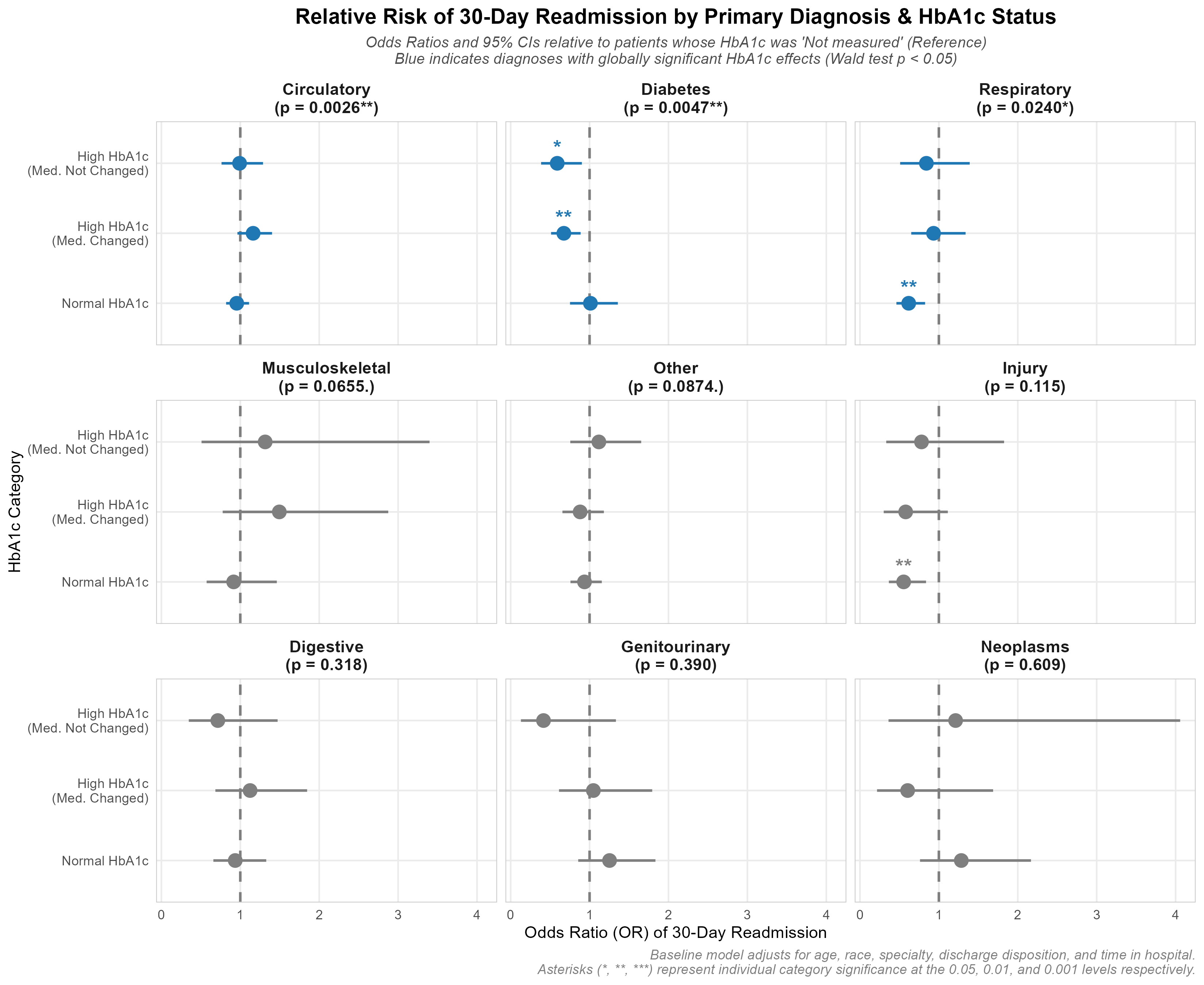
- Faceted Forest Plot of Odds Ratios (using Global 3-df Wald Tests)
- Findings & The Statistical Paradox
- ความย้อนแย้งในกลุ่มผู้ป่วยโรคระบบหมุนเวียนโลหิต
- ข้อค้นพบในกลุ่มเข้าโรงพยายาลจากการบาดเจ็บ
- ข้อค้นพบเกี่ยวกับโรคเบาหวานและโรคระบบทางเดินหายใจ
- การอภิปรายและแนวทางการพัฒนาเพิ่มเติมในอนาคต
- ข้อจำกัดของข้อมูลย้อนหลังและบริบทของกฎหมาย HITECH
- การจับคู่ข้อมูลด้วย Propensity Score
- Machine Learning & SHAP Interpretability
- Survival Analysis (Time-to-Event Cox Model)
- ข้อสรุปและสคริปต์สำหรับการจำลองผลฉบับเต็มบน GitHub
Introduction
ในฐานะผู้สนใจข้อมูลด้านสุขภาพ และวิทยาศาสตร์ข้อมูล (data science) ผมอยากทำ Project ที่ใช้ทักษะด้านการวิจัยทางคลินิกเข้ากับ data science จึงได้เลือก dataset ที่ถูกนำไปใช้ในงานวิจัยจาก Kaggle: the 2014 study by Strack et al มาทำซ้ำเพื่อศึกษาและฝึกฝนทักษะ จากงานวิจัยดังกล่าว สมมติฐานคือ:
การตรวจ HbA1c (glycated hemoglobin) ระหว่างผู้ป่วยในพักรักษาตัวในโรงพยาบาล (inpatient stay) มีความสัมพันธ์กับอัตราการกลับมารักษาซ้ำภายใน 30 วัน (30-day readmission) ที่ลดลงหรือไม่?
อัตราการกลับมารักษาซ้ำในผู้ป่วยเบาหวานคืออะไร?
อัตราการกลับมารักษาซ้ำภายใน 30 วัน (30-day readmission) คือดัชนีชี้วัดคุณภาพสำคัญของการดูแลผู้ป่วยใน (inpatient care) ภายใต้โปรแกรม HRRP โรงพยาบาลจะถูกปรับเงินหากมีอัตรา readmission ในโรคเฉพาะกลุ่ม (เช่น หัวใจล้มเหลว, COPD หรือภาวะแทรกซ้อนจากเบาหวาน) สูงเกินเกณฑ์ ดังนั้นการวางกลยุทธ์เพื่อลด readmission จึงสำคัญอย่างยิ่งต่อความปลอดภัยของผู้ป่วยและการบริหารจัดการต้นทุน
ผลการศึกษาในปี 2014 โดย Strack และคณะ
งานวิจัยนี้ได้วิเคราะห์ฐานข้อมูลทางคลินิกขนาดใหญ่ (Health Facts) ที่ติดตามข้อมูลของผู้ป่วยเบาหวานจำนวน 70,000 ราย ตลอดระยะเวลา 10 ปี (1999–2008) โดยคณะผู้ศึกษาตั้งสมมติฐานว่า การตรวจระดับน้ำตาลสะสม (HbA1c) เป็นตัวแทนที่แสดงถึง 'ความใส่ใจในการดูแลรักษาโรคเบาหวาน' ในระหว่างที่ผู้ป่วยนอนโรงพยาบาล ซึ่งนำไปสู่การควบคุมระดับน้ำตาลที่ดีขึ้น การปรับเปลี่ยนแนวทางการรักษา และช่วยลดอัตราการกลับมานอนโรงพยาบาลซ้ำในท้ายที่สุด
สิ่งที่คาดหวังจากการจำลองการศึกษานี้
ต้องการตรวจสอบว่าความสัมพันธ์ทางสถิติตามที่รายงานไว้นั้นมีความน่าเชื่อถือจริงไหม และตั้งใจจะวิจารณ์การเลือกวิธีแสดงผลข้อมูล (Data visualization) ของงานวิจัยต้นฉบับ พร้อมทั้งนำเสนอ Forest plot รูปแบบใหม่ที่ปรับปรุงให้ดีขึ้น ซึ่งจะช่วยเผยให้เห็นความย้อนแย้งทางสถิติ (Statistical paradox) ที่ซ่อนอยู่
ระเบียบวิธีวิเคราะห์ข้อมูล
Data analysis pipeline:

Data source
Dataset นี้ เป็นข้อมูลการเข้ารับการรักษาในโรงพยาบาล (Clinical encounters) จำนวน 101,766 ครั้ง จากโรงพยาบาล 130 แห่งในสหรัฐอเมริกา
ชุดข้อมูลมีให้ดาวน์โหลดบน Kaggle: Diabetes 130-US hospitals Schema.
การเตรียมและการทำความสะอาดข้อมูล
การคัดเลือกกลุ่มตัวอย่าง (Cohort)
Using R (preprocess.R), I applied the paper’s cohort selection filters:
- นำการเสียชีวิตและการ discarge ผู้ป่วยสู่ Hospice ออก: discharge codes 11, 13, 14, 19, 20 และ 21 เพื่อวิเคราะห์เฉพาะผู้ป่วยที่อาจได้รับการ readmit เท่านั้น (discharge codes แปลผลตาม metadata "IDS_mapping.csv")
- เลือก encounters ที่เป็นอิสระต่อกัน: เก็บเฉพาะ encounter แรกของผู้ป่วยแต่ละรายที่ไม่ซ้ำกัน (
min(encounter_id)) เพื่อรักษา statistical independence - กรองข้อมูลที่ไม่สมบูรณ์ (Invalid data): นำข้อมูลที่มีเพศไม่ถูกต้องออกจากการวิเคราะห์
cohort ที่ผ่านกระบวนการ preprocess แล้ว จำนวน 69,987 records ซึ่งใกล้เคียงกับต้นฉบับในงานวิจัย 69,984 records โดยมีความแตกต่างเพียง 3 records เท่านั้น ความแตกต่างเล็กน้อยนี้อาจเกิดจากผู้ป่วย 3 รายที่มีอายุเกิน 60 ปี ซึ่งเสียชีวิตระหว่าง encounter แรก แต่ pipeline ใหม่นี้ยังคง encounter ถัดไปของผู้ป่วยเหล่านั้นไว้
| Demographic Category | Replicated Cohort ($N=69,987$) | Stated Paper Cohort ($N=69,984$) | Discrepancy |
|---|---|---|---|
| Age: Under 30 | 1,808 | 1,808 | 0 |
| Age: 30 to 60 | 21,871 | 21,871 | 0 |
| Age: Over 60 | 46,308 | 46,305 | +3 |
| Discharged to Home | 44,320 | 44,339 | -19 |
| Otherwise Discharged | 25,667 | 25,645 | +22 |
| Admitted from ER | 37,271 | 37,277 | -6 |
| Admitted via Referral | 22,792 | 22,800 | -8 |
Feature Engineering & Standardization
- Discharge Disposition: ยุบ 29 หมวดหมู่ให้เหลือเป็น binary flag:
HomeและOther(การย้ายไปยัง rehab, nursing home, หรือ hospice) เพื่อใช้เป็นป้องกันความไม่เสถียรของ model จากข้อมูล Category ที่จำนวนน้อยเกินไป - Age: จัดกลุ่มช่วงอายุทุก 10 ปี เป็นสามหมวดหมู่ (
<30,[30, 60),[60, 100)) โดยอิงจาก risk inflection points ที่แสดง Figure 2 ของบทความ

logit ของอัตราการกลับมารักษาซ้ำที่พล็อตด้วย interval 10 ปี แสดงให้เห็นความชันที่แตกต่างกันสามช่วง: ความเสี่ยงต่ำคงที่ (60), ความเสี่ยงที่เพิ่มขึ้นในระดับปานกลาง (30-60), และความเสี่ยงสูงที่ชันขึ้น (>60)
- Race:
In this clinical dataset, the distribution of patient races is highly skewed:- Caucasian: ~74.7% (52,305 patients)
- African American: ~18.0% (12,627 patients)
- Missing: ~2.7% (1,917 patients)
- Other (combining Asian, Hispanic, and “Other”): ~4.5% (3,138 patients)
จัดกลุ่มข้อมูลประชากรที่มีจำนวนน้อย (Asian, Hispanic) เข้าในหมวดหมู่ Other เพื่อป้องกัน estimates ที่ไม่น่าเชื่อถือจากความ disproportion ของจำนวนในแต่ละ category และ quasi-complete separation ระหว่างการทำ regression modeling
- กลุ่ม HbA1c: จัดกลุ่มตามผล A1C และการเปลี่ยนแปลงยาสำหรับโรคเบาหวาน:
ไม่มีการวัด(Reference)ระดับ HbA1C ปกติ(Result normal or <8% with no medication changes)HbA1c สูง และเปลี่ยนยา(Result >8% and medication changed)HbA1c สูง ไม่เปลี่ยนยา(Result >8% and medication not changed)
2 encounter ได้แก่ Low, not changed และ Not measured, changed ไม่ถูกนำมาวิเคราะห์ เนื่องจากการเปลี่ยนยาในผู้ป่วยที่ไม่ได้รับการตรวจ HbA1c นั้นมักเกิดจากติดตาม fingerstick glucose monitoring ซึ่งเป็นอีก clinical pathway หนึ่ง ผู้เขียนต้องการแยกการตอบสนองต่อผลการตรวจที่ HbA1c ที่สูง (HbA1c > 8%) เท่านั้น
Technical Insight: การ Standardize ICD-9 Diagnosis
การวินิจฉัยหลัก (
diag_1) มี ICD-9 codes ที่แตกต่างกันกว่า 800 รหัส โดยได้เขียน custom mapper ที่อิงตามงานวิจัยต้นแบบ และตรวจสอบความถูกต้องกับเอกสารอ้างอิงcomplete_icd-9_manual.pdfเพื่อยุบรวมเป็น 9 กลุ่มการวินิจฉัยหลัก:
# Preprocessing snippet from preprocess.Rgroup_diagnosis <- function(diag_1) { diag_short <- substr(diag_1, 1, 3) diag_num <- suppressWarnings(as.numeric(diag_short)) case_when( !is.na(diag_num) & ((diag_num >= 390 & diag_num <= 459) | diag_num == 785) ~ "Circulatory", !is.na(diag_num) & ((diag_num >= 460 & diag_num <= 519) | diag_num == 786) ~ "Respiratory", !is.na(diag_num) & ((diag_num >= 520 & diag_num <= 579) | diag_num == 787) ~ "Digestive", !is.na(diag_num) & diag_num == 250 ~ "Diabetes", !is.na(diag_num) & (diag_num >= 800 & diag_num <= 999) ~ "Injury", !is.na(diag_num) & (diag_num >= 710 & diag_num <= 739) ~ "Musculoskeletal", !is.na(diag_num) & ((diag_num >= 580 & diag_num <= 629) | diag_num == 788) ~ "Genitourinary", !is.na(diag_num) & (diag_num >= 140 & diag_num <= 239) ~ "Neoplasms", TRUE ~ "Other" )}
การวิเคราะห์เชิงพรรณนา (Descriptive Profiling)
ตารางที่ 3 เปรียบเทียบ cohort ที่ผ่านการ preprocess กับต้นฉบับของงานวิจัย แสดงให้เห็นถึงความแม่นยำของการทำซ้ำงานวิจัยนี้:
| Demographic / Variable | Category | Replicated Count | Paper Count | Difference |
|---|---|---|---|---|
| Gender | Female | 37,239 | 37,234 | +5 |
| Male | 32,748 | 32,750 | -2 | |
| Age Group | Under 30 | 1,808 | 1,808 | 0 |
| 30-60 | 21,871 | 21,871 | 0 | |
| Older than 60 | 46,308 | 46,305 | +3 | |
| Discharge Status | Home | 44,320 | 44,339 | -19 |
| Otherwise (Other) | 25,667 | 25,645 | +22 | |
| HbA1c Group | Not measured | 57,141 | 57,080 | +61 |
| ระดับ HbA1C ปกติ | 6,607 | 6,637 | -30 | |
| High, changed | 4,058 | 4,071 | -13 | |
| High, not changed | 2,181 | 2,196 | -15 |
การสร้าง Logistic Regression Model และการทดสอบทางสถิติ
วิเคราะห์ 5 nested models เพื่อทดสอบผลกระทบของ covariates และ interactions:
Model 1: Core Model with Gender
ใน Model 1 ได้รวมตัวแปรทุกตัวใน dataset ยกเว้นกลุ่มการวัด HbA1c โดยทุก predictor group มีอย่างน้อยหนึ่งตัวแปรที่มีนัยสำคัญทางสถิติที่ระดับความเชื่อมั่น 0.05 ยกเว้น gender:
Gender Male (vs. Female): .
เนื่องจาก gender ไม่ได้เปลี่ยนแปลง deviance อย่างมีนัยสำคัญ จึงถูกตัดออกเพื่อกำหนด core baseline model ของเรา
Model 2: Core Baseline Model
Baseline model รวมตัวแปรสำคัญด้านข้อมูลประชากร (demographics), ความรุนแรงของโรค (severity), สาขาที่รับผู้ป่วย (admitting specialty), และระยะเวลาในโรงพยาบาล:
# Model 2 syntax in Rcore_model <- glm( readmitted_30 ~ age_group + race_group + admission_source + discharge_disposition + primary_diagnosis + medical_specialty_group + time_in_hospital, data = df_clean, family = binomial(link = "logit"))
Partial Results from Model 2
| Predictor Group | Reference | Replicated Estimate | Std. Error | z-value | p-value | Odds Ratio |
|---|---|---|---|---|---|---|
| Intercept | — | -2.8944 | 0.0876 | -33.04 | < 0.001 | 0.055 |
| Age: Over 60 | [30, 60) |
0.2045 | 0.0319 | 6.41 | < 0.001 | 1.227 |
| Discharge: Other | Home |
0.5406 | 0.0292 | 18.49 | < 0.001 | 1.717 |
| Diag: Respiratory | Diabetes |
-0.2830 | 0.0623 | -4.54 | < 0.001 | 0.753 |
| Time in Hospital | Continuous | 0.0309 | 0.0045 | 6.87 | < 0.001 | 1.031 |
Model 3: Core Baseline + HbA1c (Main Effect)
Model 3 ต่อยอดจาก Model 2 โดยเพิ่ม predictor hba1c_group เข้ามา โดยใช้กลุ่ม Not measured เป็น reference baseline เพื่อเปรียบเทียบกับอีกสามกลุ่มการวัด HbA1c และการเปลี่ยนแปลงยา ได้แก่: Normal, High, changed, และ High, not changed
ได้ทำการวิเคราะห์ Analysis of Deviance (likelihood ratio test) เพื่อประเมินว่าการเพิ่ม hba1c_group เข้ามาช่วยปรับปรุง model fit โดยรวมอย่างมีนัยสำคัญหรือไม่:
Comparison: Core Model vs. Core + HbA1c
- Simpler Model: Model 2 (Core predictors)
- Complex Model: Model 3 (Core predictors +
hba1c_group)
| Model | Resid. Df | Resid. Dev | Df Diff | Deviance Drop | p-value (Pr(>Chi)) | Significance |
|---|---|---|---|---|---|---|
| A Core Model | 69,964 | 41,482 | — | — | — | — |
| B Core + HbA1c | 69,961 | 41,474 | 3 | 8.6377 | 0.03452 | * ($p < 0.05$) |
สรุป: การเพิ่ม main effect ของ hba1c_group ช่วยปรับปรุง model fit ได้อย่างมีนัยสำคัญเมื่อเทียบกับ core model () แสดงให้เห็นว่าการวัด HbA1c มีความสัมพันธ์โดยรวมกับความเสี่ยงในการ readmission ที่ลดลง
Model 4: Core Baseline + Significant Interactions (without HbA1c)
ในการเพิ่มความสัมพันธ์ระหว่างลักษณะของผู้ป่วยลงใน model, Model 4 ได้เพิ่ม pairwise interaction terms ที่มีนัยสำคัญระหว่าง baseline covariates เข้ามา
การเลือก Interactions ที่มีนัยสำคัญ
เมื่อมี 7 กลุ่มตัวแปร baseline ใน core model จะมี pairwise combinations ที่เป็นไปได้ทั้งหมด 21 คู่ นักวิจัยเลือกเฉพาะ 7 interaction pairs ที่จำเพาะเจาะจง โดยอิงจาก clinical hypotheses และความมีนัยสำคัญทางสถิติโดยใช้ likelihood ratio tests (Analysis of Deviance)
แต่ผลจากการ Validate การเลือกนี้ แสดงให้เห็นว่า interactions ที่มีนัยสำคัญส่วนใหญ่ตรงกับผลของงานวิจัยต้นฉบับ ยกเว้น ความสัมพันธ์ต่อไปนี้: medical_specialty_group * time_in_hospital และ primary_diagnosis * medical_specialty_group
| Interaction Pair | Stated $p$-value (Paper) | Replicated $p$-value (Cohort) | Df | Significant in Paper ($p < 0.01$)? | Significant in Replication ($p < 0.01$)? | Status / Practical Interpretation |
|---|---|---|---|---|---|---|
primary_diagnosis * time_in_hospital |
$P < 0.001$ | 0.00006 |
8 | Yes | Yes | Perfect match. Readmission risk over time varies significantly depending on the clinical diagnosis. |
discharge_disposition * primary_diagnosis |
$P = 0.005$ | 0.00025 |
8 | Yes | Yes | Perfect match. The impact of discharge status (Home vs. Other) depends heavily on the primary diagnosis. |
age_group * medical_specialty_group |
$P < 0.001$ | 0.00028 |
10 | Yes | Yes | Perfect match. Patient age profile varies dramatically by the admitting physician’s specialty. |
discharge_disposition * time_in_hospital |
$P < 0.001$ | 0.00030 |
1 | Yes | Yes | Perfect match. The relationship between length of stay and discharge destination is highly significant. |
race_group * discharge_disposition |
$P < 0.001$ | 0.00208 |
3 | Yes | Yes | Perfect match. Demographics interact with discharge destination patterns. |
discharge_disposition * medical_specialty_group |
$P = 0.001$ | 0.00221 |
5 | Yes | Yes | Perfect match. Admitting specialty influences discharge patterns and associated frailty levels. |
medical_specialty_group * time_in_hospital |
$P = 0.001$ | 0.02692 |
5 | Yes | No | Slight Mismatch. Significant at $p < 0.05$, but fails the stricter $p < 0.01$ threshold in our replication. |
primary_diagnosis * medical_specialty_group |
Not included | 0.00035 |
40 | No | Yes | Excluded by authors. Although highly significant in both cohorts, including a term with 40 degrees of freedom risks overfitting the model. |
เหตุผลทางคลินิกและทางสถิติ:
- Discharge Destination Interactions: การจำหน่ายผู้ป่วยกลับบ้านเทียบกับสถานพยาบาลอื่น (rehab, nursing home, หรือ hospice) แสดงถึง clinical pathways และความเปราะบาง (frailty) ของผู้ป่วยที่แตกต่างกันอย่างมาก ดังนั้นจึงสมเหตุสมผลที่สถานที่จำหน่ายผู้ป่วย มี interaction กับความรุนแรงของอาการ (วัดโดย
time_in_hospital), ข้อมูลประชากรของผู้ป่วย (race_group), และความเชี่ยวชาญของแพทย์ที่ดูแลรักษา - เหตุผลในการเลือกใช้ฟังก์ชั่น
anova() ใน R: สำหรับ linear regression นั้น ANOVA เปรียบเทียบ Sum of Squared Errors (SSE) โดยใช้ F-test อย่างไรก็ตาม ใน logistic regression framework ของ R นั้นanova(..., test="Chisq")จะทำการวิเคราะห์ Analysis of Deviance (likelihood ratio test ไม่ใช่ F-test) โดยใช้ Chi-square distribution ของ deviance drop เพื่อประเมินว่า parameters เพิ่มเติมที่ถูกนำเข้ามาโดย interaction term ช่วยปรับปรุง model fit อย่างมีนัยสำคัญหรือไม่
การตั้งค่า Logistic Model ใน R
syntax ของ R ที่ทำการ fit ตัวแปร baseline และ 7 pairwise interaction terms ที่เลือกไว้:
# Model 4 setup in Rinteractions_model <- glm( readmitted_30 ~ age_group + race_group + admission_source + discharge_disposition + primary_diagnosis + medical_specialty_group + time_in_hospital + discharge_disposition:race_group + discharge_disposition:medical_specialty_group + discharge_disposition:primary_diagnosis + discharge_disposition:time_in_hospital + medical_specialty_group:time_in_hospital + medical_specialty_group:age_group + primary_diagnosis:time_in_hospital, data = df_clean, family = binomial(link = "logit"))
Model 4 Fit & Quality Summary
Model 4 ให้ผลการ model fit ที่ดีขึ้นอย่างมีนัยสำคัญเมื่อเทียบกับ core baseline models:
- Null Deviance: 42,283 (on 69,986 DF)
- Residual Deviance: 41,331 (on 69,924 DF) — a deviance drop of 151 compared to Model 2.
- AIC: 41,457 — a decrease from Model 2 (41,528) and Model 3 (41,526), confirming that the added complexity of these interactions is statistically justified.
- Fisher Iterations: 5 (converged successfully).
Model 5: The Final Model (Interactions + HbA1c)
Model 5 (Final Model) ต่อยอดจาก Model 4 โดยนำ main effect ของ hba1c_group กลับมาใส่อีกครั้ง พร้อมกับ interaction ที่สำคัญระหว่าง primary diagnosis ของผู้ป่วยและการวัด HbA1c: primary_diagnosis * hba1c_group
# Model 5 (Final Model) setup in Rfinal_model <- glm( readmitted_30 ~ age_group + race_group + admission_source + discharge_disposition + primary_diagnosis + medical_specialty_group + time_in_hospital + hba1c_group + discharge_disposition:race_group + discharge_disposition:medical_specialty_group + discharge_disposition:primary_diagnosis + discharge_disposition:time_in_hospital + medical_specialty_group:time_in_hospital + medical_specialty_group:age_group + primary_diagnosis:time_in_hospital + primary_diagnosis:hba1c_group, data = df_clean, family = binomial(link = "logit"))
การเปรียบเทียบโมเดลและการวิเคราะห์ค่าความแปรปรวนด้วย R
การวิเคราะห์ Analysis of Deviance (likelihood ratio test) ยืนยันการพัฒนาขึ้นของ model fit และตรวจสอบยืนยันว่าทั้ง baseline interactions และ HbA1c-specific interactions มีความสมเหตุสมผลทางสถิติ:
| Model Comparison | Resid. Df | Resid. Dev | Df Diff | Deviance Drop | $p$-value ($Pr(>\chi^2)$) |
|---|---|---|---|---|---|
| 1. Core Baseline (Model 2) | 69,964 | 41,482 | — | — | — |
| 2. Core + HbA1c (Model 3) (vs. Model 2) | 69,961 | 41,474 | 3 | 8.64 | 0.0345 * |
| 3. Baseline + Interactions (Model 4) (vs. Model 2) | 69,924 | 41,331 | 40 | 151.00 | < 0.001 *** |
| 4. Final Model with HbA1c Interactions (Model 5) (vs. Model 4) | 69,897 | 41,279 | 27 | 51.91 | 0.0027 ** |
Model Summary
Model 5 คือ final specification โดยไม่รวมตัวแปร gender ที่ไม่มีนัยสำคัญ ขณะที่รวม baseline covariates, main effect ของ hba1c_group, significant baseline interactions, และ interaction terms ระหว่าง primary diagnosis กับ HbA1c เข้าไว้ด้วยกัน Model นี้แสดงถึง model ที่ fit ดีที่สุดและผ่านการตรวจสอบทางสถิติ nested sequence
Data Visualization & Critique


การวิจารณ์ Stated Probability Plots (Figures 1 and 3)
งานวิจัยต้นฉบับแสดงกราฟเส้นแนวนอน โดยมีแกน y เป็นความน่าจะเป็นของอัตราการเข้าโรงพยาบาลซ้ำ, แกน x เป็นกลุ่ม HbA1c, แต่ละเส้นแยกตาม primary diagnosis แต่ละกราฟดังนี้:
- Figure 1: มุ่งเน้นเฉพาะ 3 การวินิจฉัยหลักที่พบบ่อยที่สุดและมีนัยสำคัญทางสถิติจากการทดสอบ three-degree-of-freedom (3-df): ได้แก่ Diabetes, Circulatory, Respiratory (แกน Y:
0.02 ถึง 0.11) - Figure 3: แสดงความน่าจะเป็นของการ readmission ที่คำนวณได้สำหรับทั้ง 9 หมวดหมู่ primary diagnosis ในการศึกษา โดยแบ่งออกเป็นสองกราฟ
- Figure 3a: Diabetes, Other, Digestive, Respiratory, Circulatory (แกน Y:
0.00 ถึง 0.12) - Figure 3b: Diabetes, Genitourinary, Injury, Musculoskeletal, Neoplasms (แกน Y:
0.00 ถึง 0.25)
ปัญหาของการแสดงผลข้อมูลนี้
การจัดวางแบบนี้ก่อให้เกิดความผิดเพี้ยนขแง scale เนื่องจากแกน Y มีช่วงที่แตกต่างกัน ทำให้ความชันของเส้น baseline curve เดียวกัน (Diabetes) ดูชันกว่ามากใน Figure 1 เมื่อเทียบกับ Figure 3b ซึ่งทำให้ผู้อ่านเข้าใจผิดเกี่ยวกับ effect sizes ที่แท้จริง
The Modernized Faceted Forest Plot
เพื่อแก้ไขปัญหาความผิดเพี้ยนของ scale เหล่านี้ จึงได้พัฒนา faceted forest plot ของ Odds Ratios (OR) โดยเปรียบเทียบโดยตรงกับกลุ่ม reference ที่ไม่ได้รับการตรวจ (Not measured) ภายในแต่ละการวินิจฉัย:

Dynamic Global & Individual Testing
- Global 3-df Wald test p-values คำนวณโดยใช้
car::linearHypothesis()และแสดงผลใน facet headers - กราฟที่มีนัยสำคัญ (p < 0.05) จะแสดงเป็นสีน้ำเงิน ในขณะที่กราฟที่ไม่มีนัยสำคัญจะแสดงเป็นสีเทา
- '*' แสดงนัยสำคัญของแต่ละหมวดหมู่ จะถูกพล็อตไว้เหนือจุดข้อมูลโดยตรง
Technical Insight: ทำความเข้าใจ Global 3-df Wald Test
เมื่อประเมินตัวแปรที่มีหลายหมวดหมู่อย่าง hba1c_group (ซึ่งมี 4 ระดับ: Not measured เป็น reference, Normal, High, changed, และ High, not changed) การตรวจสอบ p-values ของแต่ละหมวดหมู่แยกกันจะเพิ่มความเสี่ยงของ Type I error (false positives) เพื่อแก้ไขปัญหานี้ จึงใช้ joint hypothesis test หรือ Wald test เพื่อประเมินว่าตัวแปรมีผลกระทบอย่างมีนัยสำคัญในภาพรวมหรือไม่
- ทำไมถึงใช้ 3 Degrees of Freedom (3-df)?: เนื่องจาก
hba1c_groupมี 4 ระดับ regression model จึงประมาณค่า dummy coefficients ที่แตกต่างกัน 3 ค่า Wald test ทำการทดสอบ null hypothesis ร่วมกันว่า coefficients ทั้ง 3 ค่าเป็นศูนย์พร้อมกัน การทดสอบ parameters อิสระทั้ง 3 ตัวนี้ให้ค่าสถิติทดสอบที่เป็นไปตาม Chi-square distribution ที่มี 3 degrees of freedom พอดี - การทดสอบ Subgroup Interactions: สำหรับการวินิจฉัยที่ไม่ใช่ baseline (เช่น Circulatory) Wald test จะประเมินว่า interaction terms ที่จำเพาะต่อการวินิจฉัยทั้ง 3 ตัว:
เป็นศูนย์พร้อมกันหรือไม่ ซึ่งช่วยตรวจสอบว่า HbA1c effect สำหรับการวินิจฉัยนั้นๆ มีความแตกต่างทางสถิติจากกลุ่ม baseline Diabetes หรือไม่
Technical Insight: การคำนวณ Standard Error ด้วย Covariance Matrix
เนื่องจาก interaction terms ระหว่าง primary diagnosis $\times$ HbA1c ใน final model ทำให้ log-Odds Ratio สำหรับการวินิจฉัยที่ไม่ใช่ reference เป็น linear combination ของ coefficients: โดยคำนวณ standard error โดยใช้ covariance matrix:
# Covariance-based standard error calculation in R (visualization_improved.R)log_or <- coefs[coef_hba1c] + coefs[coef_interaction]# Var(A + B) = Var(A) + Var(B) + 2 * Cov(A, B)var_log_or <- vc_mat[coef_hba1c, coef_hba1c] + vc_mat[coef_interaction, coef_interaction] + 2 * vc_mat[coef_hba1c, coef_interaction]se_log_or <- sqrt(var_log_or)odds_ratio <- exp(log_or)ci_lower <- exp(log_or - 1.96 * se_log_or)ci_upper <- exp(log_or + 1.96 * se_log_or)# Individual two-tailed p-valueindiv_p <- 2 * pnorm(-abs(log_or / se_log_or))
Findings & The Statistical Paradox
Modernized forest plot เผยให้เห็นความย้อนแย้งทางสถิติ (statistical paradox) ที่น่าสนใจ: นัยสำคัญของ global interaction ไม่ได้สอดคล้องกับนัยสำคัญของแต่ละหมวดหมู่เสมอไป
1. ความย้อนแย้งในกลุ่มผู้ป่วยโรคระบบหมุนเวียนโลหิต
- Global Test: (Blue Panel)
- Individual Odds Ratios:
- High, changed:
- High, not changed:
- Normal:
- The Paradox: Even though Circulatory is globally significant, not a single individual HbA1c category is statistically different from the untested reference group (all 95% CIs cross 1.0). The global significance is driven entirely by the comparison to the Diabetes baseline: Circulatory patients’ readmission risk trends upward for high HbA1c, while Diabetes trends downward.
2. ข้อค้นพบในกลุ่มเข้าโรงพยายาลจากการบาดเจ็บ
- Global Test: (Grey Panel)
- Individual Category Estimates:
- Normal: (Highly Significant)
- แม้ว่าแนวโน้มโดยรวมของกลุ่ม Injury จะไม่แตกต่างจาก baseline มากพอที่จะผ่านนัยสำคัญของ global interaction แต่ผู้ป่วย Injury ที่ได้รับการตรวจ HbA1c และผลออกมาปกติ มีความเสี่ยงในการ readmission ต่ำกว่าถึง 45% () เมื่อเทียบกับผู้ที่ไม่ได้รับการตรวจ
กลุ่มการวินิจฉัย Injury มีผู้ป่วยทั้งหมด 4,649 ราย ในขณะที่หมวดหมู่ reference ที่ไม่ได้รับการตรวจ (Not measured) มี 4,117 ราย (88.56%) สัดส่วนผู้ป่วยที่ไม่ได้รับการตรวจที่สูงนี้ก่อให้เกิดความไม่สมสัดส่วนในข้อมูล (เหลือผู้ป่วยที่ได้รับการตรวจน้อยมาก) ซึ่งอาจนำไปสู่การประมาณค่าทางสถิติที่ไม่น่าเชื่อถือสำหรับกลุ่มย่อยที่ได้รับการตรวจ ดังนั้น ผลการวิจัยนี้จึงจำเป็นต้องมีการศึกษาเพิ่มเติมเพื่อยืนยันความถูกต้อง
3. ข้อค้นพบเกี่ยวกับโรคเบาหวาน
- Global Test: (Blue Panel)
- Individual Category Estimates:
- High, changed: (Highly Significant)
- High, not changed: (Significant)
- Normal: (Not significant)
- สำหรับการรับผู้ป่วยที่มีการวินิจฉัยหลักเป็น Diabetes นั้น การวัด HbA1c มีความสัมพันธ์กับการลดลงอย่างมีนัยสำคัญของการ readmission เฉพาะเมื่อผลออกมาสูง (ซึ่งกระตุ้นให้มีการเปลี่ยนแปลงยาอย่างแข็งขัน) การตรวจ HbA1c ที่ได้ผลปกติไม่ได้เปลี่ยนแปลงอัตราการ readmission
4. ข้อค้นพบเกี่ยวกับโรคคระบบทางเดินหายใจ
- Global Test: (Blue Panel)
- Individual Category Estimates:
- Normal: (Highly Significant)
- สำหรับผู้ป่วย Respiratory การลดลงของการ readmission จำกัดอยู่เฉพาะในกลุ่ม Normal HbA1c () ในขณะที่กลุ่ม HbA1c สูงไม่แสดงให้เห็นถึงประโยชน์ที่มีนัยสำคัญ
Discussions
Clinical Nuances & Cohort Context
- Preprocessing: จากข้อมูล clinical encounters ดิบกว่า 100,000 รายการ มีเพียง 69,987 records เท่านั้นที่ผ่านเกณฑ์การคัดเลือกที่เข้มงวด การกรองนี้มีความจำเป็นเพื่อมุ่งเน้นเฉพาะ encounters ที่เป็นอิสระและไม่ใช่ procedure-based สำหรับผู้ป่วยไม่เสียชีวิตจากการรักษาในโรงพยาบาล
- การตรวจ HbA1c ในอดีต: Cohort ของการศึกษานี้รวบรวมข้อมูลที่ล้าสมัย (ปี 1999–2008) การตรวจ HbA1c ถูกสั่งในเพียง 18.4% ของการพักรักษาในโรงพยาบาล ซึ่งบ่งชี้ว่าการ screening ผู้ป่วยใน น้อยเกินไปในอดีต แต่ระยะเวลาพักรักษาเฉลี่ย 4.27 วัน ถือเป็นช่วงเวลาที่เพียงพออย่างมากสำหรับการทำการตรวจและรับผลตรวจ HbA1c
- ข้อจำกัดของข้อมูล EHR: เป็นไปได้ว่าการตรวจ HbA1c ถูกประเมินในทางปฏิบัติแต่ไม่ได้ถูกบันทึกลงใน electronic health record (EHR) database หรือผู้ปฏิบัติงานอาจมีการเข้าถึงข้อมูล blood glucose metrics อื่นที่ไม่ได้บันทึกไว้ (เช่น fingerstick logs) ซึ่งมีผลต่อแนวทางในการปรับยา นอกจากนี้ แนวปฏิบัติมาตรฐานที่แนะนำให้หยุดยาเบาหวานสำหรับผู้ป่วยนอกเมื่อรับเข้าโรงพยาบาลนั้น เพิ่งจะนำมาใช้ในช่วงท้ายของระยะเวลาการศึกษาเท่านั้น
- บริบทในปัจจุบัน (The HITECH Act): นับตั้งแต่ HITECH Act ปี 2009 และการนำแรงจูงใจด้านคุณภาพของโรงพยาบาลมาใช้ (เช่น HEDIS/CMS measures) การ screening HbA1c ในผู้ป่วยในสมัยใหม่ได้เพิ่มสูงขึ้นอย่างรวดเร็วจกว่า 70–80% สำหรับผู้ป่วยในที่เป็นโรคเบาหวาน ซึ่งแสดงถึงการเปลี่ยนแปลงครั้งใหญ่ในมาตรฐานการดูแลรักษาเมื่อเทียบกับในอดีต
- ความใส่ใจต่อระดับน้ำตาลในเลือดและการ Readmission: ในแง่ของอัตราการ readmission การวัด HbA1c เพียงอย่างเดียวมีความสัมพันธ์กับอัตราการ readmission ที่ลดลงในผู้ป่วยที่มีการวินิจฉัยหลักเป็นโรคเบาหวาน ในขณะที่โรคระบบทางเดินหายใจและระบบไหลเวียนโลหิตไม่มีความสัมพันธ์ดังกล่าว ซึ่งบ่งชี้ว่าการให้ความสนใจกับการดูแลโรคเบาหวานมากขึ้นระหว่างการพักรักษาในโรงพยาบาล (โดยเฉพาะสำหรับผู้ป่วยกลุ่มเสี่ยงสูงเหล่านี้) สามารถส่งผลกระทบทาง clinical ที่สำคัญต่อผลลัพธ์การ readmission
Methodological Limitations
- การออกแบบการศึกษาแบบ Retrospective และไม่ได้ทำการสุ่ม: ต่างจาก randomized clinical trial (RCT) การศึกษานี้อาศัย retrospective observational database เนื่องจากแพทย์ไม่ได้สั่งตรวจ HbA1c แบบสุ่ม ผู้ป่วยที่ได้รับการตรวจจึงมีแนวโน้มที่จะมี baseline risks ที่แตกต่างกัน ซึ่งนำไปสู่ selection bias
- ความสัมพันธ์เชิงสถิติ vs. การอนุมานเชิงสาเหตุ: ด้วยเหตุนี้ การวิเคราะห์ regression นี้จึงเผยให้เห็นความสัมพันธ์ทางสถิติมากกว่าความสัมพันธ์เชิงสาเหตุโดยตรง อย่างไรก็ตาม ความสัมพันธ์เหล่านี้ให้พื้นฐานเชิงประจักษ์ที่แข็งแกร่งสำหรับการพัฒนาและทดสอบ clinical protocols ที่มีโครงสร้างชัดเจน
การอภิปรายและแนวทางการพัฒนาเพิ่มเติมในอนาคต
เพื่อก้าวผ่านข้อจำกัดที่มีอยู่ในการออกแบบการศึกษาปี 2014 และ nested logistic regression จึงมีการเสนอการขยายเชิงระเบียบวิธีที่สำคัญสามข้อ ดังนี้:
1. การจับคู่ข้อมูลด้วย Propensity Score
เนื่องจากการศึกาษานี้เป็น retrospective clinical database และไม่ใช่ randomized controlled trial แพทย์จึงไม่ได้สั่งตรวจ HbA1c แบบสุ่ม ผู้ป่วยที่ป่วยหนักกว่าหรือผู้ที่แสดงอาการควบคุมระดับน้ำตาลในเลือดได้ไม่ดีมักได้รับการตรวจบ่อยกว่า ซึ่งนำไปสู่ selection bias
- ข้อเสนอแนะ: การนำ Propensity Score Matching (PSM) มาใช้เพื่อจับคู่ผู้ป่วยที่ได้รับการตรวจและไม่ได้รับการตรวจที่มี baseline covariates เหมือนกัน (ข้อมูลประชากร, comorbidities, ระยะเวลาในโรงพยาบาล) จะช่วยให้สามารถแยกผลกระทบเชิงสาเหตุที่แท้จริงของการตรวจ HbA1c ในผู้ป่วยในต่อการ readmission ได้
2. Machine Learning & Model Interpretability
Logistic regression สันนิษฐานว่าความสัมพันธ์ของ log-odds เป็นเชิงเส้นตรง และประสบปัญหาในการจับ interactions ที่ซับซ้อนและมี order สูงโดยไม่ต้องระบุด้วยตนเอง
- ข้อเสนอแนะ: การ train tree-based machine learning model (เช่น XGBoost) และการสร้าง SHAP (Shapley Additive exPlanations) values จะช่วยให้เราสามารถจับ non-linear risks และระบุการมีส่วนร่วมที่แน่ชัดของยาและ comorbidity scores ต่อการ readmission ได้
3. Survival Analysis (Time-to-Event Modeling)
การวิเคราะห์การ readmission ในรูปแบบ binary 30-day flag จะมองข้ามช่วงเวลาของการ readmission และถือว่าผู้ป่วยที่ถูก readmit ในวันที่ 31 เหมือนกับผู้ป่วยที่ไม่เคยถูก readmit เลย
- ข้อเสนอแนะ: การเปลี่ยนไปใช้ Cox Proportional Hazards model ช่วยให้เราวิเคราะห์ผลลัพธ์แบบ time-to-event ได้ โดย model นี้จะถือว่าผู้ป่วยที่ไม่เคยถูก readmit (หรือได้รับการจำหน่ายอย่างปลอดภัยหลังจากช่วงเวลาการสังเกต) เป็น right-censored ซึ่งช่วยรักษารายละเอียดทางเวลาและ statistical power ไว้
Conclusion
- ประโยขน์ทางคลินิกของ Screening HbA1c: การวัด HbA1c ในผู้ป่วยในเป็น predictor ที่มีคุณค่าสูงสำหรับอัตราการ readmission ภายใน 30 วัน โดยเฉพาะอย่างยิ่งสำหรับผู้ป่วยที่รับเข้าโรงพยาบาลด้วยการวินิจฉัยหลักเป็นโรคเบาหวาน
- Reducing Rates & Healthcare Costs: By identifying poorly controlled glycemic status during hospital stays and prompting active treatment adjustments, inpatient screening serves as a powerful catalyst for reducing costly readmissions and improving diabetic patient care.
- รากฐานเชิงประจักษ์: แม้ว่าการศึกษาจะมีข้อจำกัดจากการออกแบบแบบ retrospective และไม่ได้ทำการสุ่ม แต่ผลการวิจัยให้รากฐานเชิงประจักษ์ที่แข็งแกร่งสำหรับการพัฒนา hospital protocols เพื่อทดสอบ clinical hypothesis นี้โดยตรง
Scripts
Full scripts are available at 
preprocess.R: Data filtering, ICD-9 diagnosis mapping, and cohort cleaning.analysis.R: Fits nested logistic regression models and calculates ANOVA deviance tables.visualization.R: Replicates the original paper’s Figures 1, 2, and 3.visualization_improved.R: The modernized visualization script implementing Wald tests and the faceted forest plot.run_pipeline.R: Master orchestrator script that runs the entire pipeline end-to-end and outputs a verification summary report.
ขอบคุณที่อ่านจนจบ โปรเจกต์นี้แสดงให้เห็นถึงพลังของการแปลงข้อมูลดิบที่ซับซ้อนให้กลายเป็น clinical insights ที่ละเอียดและนำไปปฏิบัติได้จริง คอยติดตาม data science project ถัดไปของผมด้วยนะครับ

 Python (xml.tree)
 PostgreSQL
 R (Tidyverse, DBI, RPostgres)
 ggplot,
  Plotly


