Medytic

Data, art, and the science of being curious

Category: Healthcare Analysis

  • Replicating and Modernizing Clinical Data Science: A Deep Dive into HbA1c Screening and Hospital Readmissions

    Replicating and Modernizing Clinical Data Science: A Deep Dive into HbA1c Screening and Hospital Readmissions

    Disclaimer

    1. This project was developed independently with AI assistance for educational purposes. I utilized agentic AI to help plan and comprehend the analysis, while actively monitoring the pipeline, checking and validating the scripts, researching concepts for clarification, editing the writeup, and learning biostatistics throughout the process.
    2. In finalizing this article, I have personally reviewed, selected, and approved all content, figures, and statistical interpretations presented.
    3. The replication scripts are provided at the end of this page for learning purposes and should not be used in production environments without further verification.

    What you will find in this project

    1. What is hospital readmission in diabetic patients?
    2. The landmark 2014 study by Strack et al.
    3. Inpatient readmission data analysis methodology
      • Data Preprocessing & Cohort Reconstruction using R
      • Nested Logistic Regression Modeling (Models 1 to 5) using R
      • Nested Model Comparisons & Analysis of Deviance using R
    4. Critique & Modernization of Data Visualization
      • Covariance-Based Standard Error Calculation with Interaction Terms
      • Faceted Forest Plot of Odds Ratios (using Global 3-df Wald Tests)
    5. Findings & The Statistical Paradox
      • The Circulatory Paradox (Globally Significant, Individually Non-Significant)
      • The Injury Discovery (Globally Non-Significant, Individually Significant)
      • The Diabetes & Respiratory Stories
    6. Discussions & Proposed Future Improvements
      • Retrospective Data Limitations & HITECH Act Context
      • Propensity Score Matching (Causal Inference)
      • Machine Learning & SHAP Interpretability
      • Survival Analysis (Time-to-Event Cox Model)
    7. Conclusions & full replication scripts on GitHub

    Introduction

    As a health data enthusiast interested in data science, I wanted to combine clinical research with modern data science methods to improve my skills. I chose to replicate the 2014 study by Strack et al because it offers a rich tabular dataset with a clear clinical hypothesis:

    does performing an HbA1c (glycated hemoglobin) test during an inpatient stay associate with a lower risk of 30-day readmission? This replication project is a perfect fit for my interests in statistical modeling.

    What is hospital readmission?

    Hospital readmission within 30 days is a major quality indicator for inpatient care. Under the Hospital Readmissions Reduction Program (HRRP), hospitals face financial penalties if their readmission rates for specific conditions (such as heart failure, COPD, or diabetes complications) are too high. Finding strategies to reduce these readmissions is crucial for patient safety and cost management.

    What is the 2014 Strack et al. study?

    The study analyzed a massive clinical database (Health Facts) tracking 70,000 diabetic patient records across 10 years (1999–2008). The authors hypothesized that performing an HbA1c test acts as a representative for “attention to diabetes care” during hospitalization, leading to better glycemic control, treatment changes, and ultimately fewer readmissions.

    What would be expected from this replication?

    By replicating this paper, I seek to confirm if the reported statistical associations are robust. More importantly, I aim to critique the original paper’s data visualization choices and present an improved forest plot that uncovers a hidden statistical paradox.


    Methodology

    Replication and modernization pipeline workflow:

    Data source

    The raw dataset contains 101,766 clinical encounters from 130 US hospitals.

    Data is available on Kaggle: Diabetes 130-US hospitals Schema.

    Data preprocessing and cleaning

    Cohort Selection

    Using R (preprocess.R), I applied the paper’s cohort selection filters:

    1. Remove deaths and hospice discharges: Excluded lethal discharge codes 11, 13, 14, 19, 20, and 21 to focus only on survivors who could be readmitted. (discard codes according to metadata “IDS_mapping.csv”)
    2. Select independent encounters: Retained only the first encounter for each unique patient (min(encounter_id)) to maintain statistical independence.
    3. Filter invalid data: Excluded records with invalid gender entries.

    My preprocessed cohort size is 69,987 records, matching the paper’s original cohort of 69,984 with a difference of just 3 records. This tiny difference is due to 3 patients over 60 who expired during their first encounter but had subsequent encounters retained by our pipeline.

    Demographic Category Replicated Cohort ($N=69,987$) Stated Paper Cohort ($N=69,984$) Discrepancy
    Age: Under 30 1,808 1,808 0
    Age: 30 to 60 21,871 21,871 0
    Age: Over 60 46,308 46,305 +3
    Discharged to Home 44,320 44,339 -19
    Otherwise Discharged 25,667 25,645 +22
    Admitted from ER 37,271 37,277 -6
    Admitted via Referral 22,792 22,800 -8

    Feature Engineering & Standardization

    • Discharge Disposition: Collapsed 29 categories into a binary flag: Home vs. Other (transfer to rehab, nursing home, or hospice) to serve as a proxy for patient frailty and prevent sparse-cell model instability.
    • Age: Grouped 10-year brackets into three mathematically justified categories (<30, [30, 60), [60, 100)) based on risk inflection points visualized on figure 2 of the article.

    The logit of readmission rates plotted across 10-year intervals shows three distinct slopes: a flat low risk (<30), a moderately increasing risk (30-60), and a steep high-risk slope (>60).

    • Race:
      In this clinical dataset, the distribution of patient races is highly skewed:
      • Caucasian: ~74.7% (52,305 patients)
      • African American: ~18.0% (12,627 patients)
      • Missing: ~2.7% (1,917 patients)
      • Other (combining Asian, Hispanic, and “Other”): ~4.5% (3,138 patients)

    Grouped minor demographics (Asian, Hispanic) into the Other category to prevent unstable estimates and quasi-complete separation during regression modeling.

    • HbA1c Group: Grouped based on A1C result and diabetic medication changes:
    1. Not measured (Reference)
    2. Normal (Result normal or <8% with no medication changes)
    3. High, changed (Result >8% and medication changed)
    4. High, not changed (Result >8% and medication not changed)

    These two encounter: Low, not changed and Not measured, changed are not included because medication changes for untested patients are guided by daily fingerstick glucose monitoring, which is a different clinical pathway. The authors wanted to isolate the response to a highly abnormal test (HbA1c > 8%) specifically.

    Technical Insight: Standardizing High-Cardinals with ICD-9 Diagnosis Grouping

    The primary diagnosis (diag_1) contained over 800 distinct ICD-9 codes. I wrote a custom mapper based on clinical chapters that cross checked with complete_icd-9_manual.pdf to collapse these into 9 major diagnostic groups:

    # Preprocessing snippet from preprocess.R
    group_diagnosis <- function(diag_1) {
    diag_short <- substr(diag_1, 1, 3)
    diag_num <- suppressWarnings(as.numeric(diag_short))
    case_when(
    !is.na(diag_num) & ((diag_num >= 390 & diag_num <= 459) | diag_num == 785) ~ "Circulatory",
    !is.na(diag_num) & ((diag_num >= 460 & diag_num <= 519) | diag_num == 786) ~ "Respiratory",
    !is.na(diag_num) & ((diag_num >= 520 & diag_num <= 579) | diag_num == 787) ~ "Digestive",
    !is.na(diag_num) & diag_num == 250 ~ "Diabetes",
    !is.na(diag_num) & (diag_num >= 800 & diag_num <= 999) ~ "Injury",
    !is.na(diag_num) & (diag_num >= 710 & diag_num <= 739) ~ "Musculoskeletal",
    !is.na(diag_num) & ((diag_num >= 580 & diag_num <= 629) | diag_num == 788) ~ "Genitourinary",
    !is.na(diag_num) & (diag_num >= 140 & diag_num <= 239) ~ "Neoplasms",
    TRUE ~ "Other"
    )
    }

    Descriptive profiling

    Comparing my preprocessed cohort distributions against the paper’s original Table 3 demonstrates the high fidelity of this replication:

    Demographic / Variable Category Replicated Count Paper Count Difference
    Gender Female 37,239 37,234 +5
    Male 32,748 32,750 -2
    Age Group Under 30 1,808 1,808 0
    30-60 21,871 21,871 0
    Older than 60 46,308 46,305 +3
    Discharge Status Home 44,320 44,339 -19
    Otherwise (Other) 25,667 25,645 +22
    HbA1c Group Not measured 57,141 57,080 +61
    Normal 6,607 6,637 -30
    High, changed 4,058 4,071 -13
    High, not changed 2,181 2,196 -15

    Logistic Regression Modeling & Statistical Tests

    I fitted five nested models to test the impact of covariates and interactions:

    Model 1: Core Model with Gender

    In Model 1, I included every variable in the dataset except the HbA1c measurement groups. Every predictor group contained at least one variable that was statistically significant at the 0.05 confidence level, except for gender:

    Gender Male (vs. Female): Estimate=0.0287,SE=0.0270,z=1.06,p=0.288\text{Estimate} = 0.0287, \text{SE} = 0.0270, z = 1.06, p = 0.288.

    Because gender did not significantly change the deviance or improve model fit, it was dropped to establish our core baseline model.

    Model 2: Core Baseline Model

    The baseline model controls for key demographics, severity, admitting specialty, and time in hospital:

    # Model 2 syntax in R
    core_model <- glm(
    readmitted_30 ~ age_group + race_group + admission_source +
    discharge_disposition + primary_diagnosis + medical_specialty_group + time_in_hospital,
    data = df_clean,
    family = binomial(link = "logit")
    )

    Partial Results from Model 2

    Predictor Group Reference Replicated Estimate Std. Error z-value p-value Odds Ratio
    Intercept — -2.8944 0.0876 -33.04 < 0.001 0.055
    Age: Over 60 [30, 60) 0.2045 0.0319 6.41 < 0.001 1.227
    Discharge: Other Home 0.5406 0.0292 18.49 < 0.001 1.717
    Diag: Respiratory Diabetes -0.2830 0.0623 -4.54 < 0.001 0.753
    Time in Hospital Continuous 0.0309 0.0045 6.87 < 0.001 1.031

    Model 3: Core Baseline + HbA1c (Main Effect)

    Model 3 builds on Model 2 by adding the hba1c_group predictor. The Not measured category serves as the reference baseline, comparing it against the other three HbA1c measurement/medication change groups: Normal, High, changed, and High, not changed.

    I performed an Analysis of Deviance (likelihood ratio test) to evaluate if adding hba1c_group significantly improves the overall model fit:

    Comparison: Core Model vs. Core + HbA1c

    • Simpler Model: Model 2 (Core predictors)
    • Complex Model: Model 3 (Core predictors + hba1c_group)
    Model Resid. Df Resid. Dev Df Diff Deviance Drop p-value (Pr(>Chi)) Significance
    A Core Model 69,964 41,482 — — — —
    B Core + HbA1c 69,961 41,474 3 8.6377 0.03452 * ($p < 0.05$)

    Conclusion: Adding the main effect of hba1c_group significantly improved the fit over the core model (p=0.0345∗p = 0.0345^*), showing that HbA1c measurement is globally associated with lower readmission risk.

    Model 4: Core Baseline + Significant Interactions (without HbA1c)

    To account for complex interdependencies among patient characteristics, Model 4 introduces significant pairwise interaction terms between baseline covariates.

    Relationship Selection for Interactions

    With 7 baseline variable groups in the core model, there are 21 possible pairwise combinations. The researchers selected only 7 specific interaction pairs based on clinical hypotheses and statistical significance using likelihood ratio tests (Analysis of Deviance).

    Our replication validates this selection, showing high fidelity to the paper’s original findings:

    Interaction Pair Stated $p$-value (Paper) Replicated $p$-value (Cohort) Df Significant in Paper ($p < 0.01$)? Significant in Replication ($p < 0.01$)? Status / Practical Interpretation
    primary_diagnosis * time_in_hospital $P < 0.001$ 0.00006 8 Yes Yes Perfect match. Readmission risk over time varies significantly depending on the clinical diagnosis.
    discharge_disposition * primary_diagnosis $P = 0.005$ 0.00025 8 Yes Yes Perfect match. The impact of discharge status (Home vs. Other) depends heavily on the primary diagnosis.
    age_group * medical_specialty_group $P < 0.001$ 0.00028 10 Yes Yes Perfect match. Patient age profile varies dramatically by the admitting physician’s specialty.
    discharge_disposition * time_in_hospital $P < 0.001$ 0.00030 1 Yes Yes Perfect match. The relationship between length of stay and discharge destination is highly significant.
    race_group * discharge_disposition $P < 0.001$ 0.00208 3 Yes Yes Perfect match. Demographics interact with discharge destination patterns.
    discharge_disposition * medical_specialty_group $P = 0.001$ 0.00221 5 Yes Yes Perfect match. Admitting specialty influences discharge patterns and associated frailty levels.
    medical_specialty_group * time_in_hospital $P = 0.001$ 0.02692 5 Yes No Slight Mismatch. Significant at $p < 0.05$, but fails the stricter $p < 0.01$ threshold in our replication.
    primary_diagnosis * medical_specialty_group Not included 0.00035 40 No Yes Excluded by authors. Although highly significant in both cohorts, including a term with 40 degrees of freedom risks overfitting the model.

    Clinical and Statistical Rationale:

    • Discharge Destination Interactions: Discharging a patient to home versus an alternative facility (rehab, nursing home, or hospice) represents very different clinical pathways and patient frailty levels. This status interacts strongly with the severity of their condition (measured by time_in_hospital), their demographic profile (race_group), and the specialty of the physician managing their care.
    • Methodological Choice of anova(): In linear regression, ANOVA compares the Sum of Squared Errors (SSE) using the F-test. However, in R’s logistic regression framework, anova(..., test="Chisq") performs an Analysis of Deviance (likelihood ratio test) using Chi-square distribution of the deviance drop, assessing whether the extra parameters introduced by the interaction term significantly improve model fit.

    Logistic Model Setup in R

    The R syntax fits the baseline variables and the 7 selected pairwise interaction terms:

    # Model 4 setup in R
    interactions_model <- glm(
    readmitted_30 ~ age_group + race_group + admission_source +
    discharge_disposition + primary_diagnosis + medical_specialty_group + time_in_hospital +
    discharge_disposition:race_group +
    discharge_disposition:medical_specialty_group +
    discharge_disposition:primary_diagnosis +
    discharge_disposition:time_in_hospital +
    medical_specialty_group:time_in_hospital +
    medical_specialty_group:age_group +
    primary_diagnosis:time_in_hospital,
    data = df_clean,
    family = binomial(link = "logit")
    )

    Model 4 Fit & Quality Summary

    Model 4 results in a substantial improvement in fit compared to the core baseline models:

    • Null Deviance: 42,283 (on 69,986 DF)
    • Residual Deviance: 41,331 (on 69,924 DF) — a deviance drop of 151 compared to Model 2.
    • AIC: 41,457 — a decrease from Model 2 (41,528) and Model 3 (41,526), confirming that the added complexity of these interactions is statistically justified.
    • Fisher Iterations: 5 (converged successfully).

    Model 5: The Final Model (Interactions + HbA1c)

    Model 5 (Final Model) builds on Model 4 by re-introducing the main effect of hba1c_group along with the crucial interaction between the patient’s primary diagnosis and their HbA1c measurement: primary_diagnosis * hba1c_group.

    # Model 5 (Final Model) setup in R
    final_model <- glm(
    readmitted_30 ~ age_group + race_group + admission_source +
    discharge_disposition + primary_diagnosis + medical_specialty_group + time_in_hospital +
    hba1c_group +
    discharge_disposition:race_group +
    discharge_disposition:medical_specialty_group +
    discharge_disposition:primary_diagnosis +
    discharge_disposition:time_in_hospital +
    medical_specialty_group:time_in_hospital +
    medical_specialty_group:age_group +
    primary_diagnosis:time_in_hospital +
    primary_diagnosis:hba1c_group,
    data = df_clean,
    family = binomial(link = "logit")
    )

    Nested Model Comparison and Analysis of Deviance

    An Analysis of Deviance (likelihood ratio test using R’s anova()) confirms the progressive improvements in fit, validating that both the baseline interactions and the HbA1c-specific interactions are statistically warranted:

    Model Comparison Resid. Df Resid. Dev Df Diff Deviance Drop $p$-value ($Pr(>\chi^2)$)
    1. Core Baseline (Model 2) 69,964 41,482 — — —
    2. Core + HbA1c (Model 3) (vs. Model 2) 69,961 41,474 3 8.64 0.0345 *
    3. Baseline + Interactions (Model 4) (vs. Model 2) 69,924 41,331 40 151.00 < 0.001 ***
    4. Final Model with HbA1c Interactions (Model 5) (vs. Model 4) 69,897 41,279 27 51.91 0.0027 **

    Model Summary

    Model 5 is the final specification. It excludes the non-significant gender variable while incorporating baseline covariates, the main effect of hba1c_group, significant baseline interactions, and the primary diagnosis-to-HbA1c interaction terms. It represents the best-fitting, statistically validated model in our nested sequence.


    Data Visualization & Critique

    Critique of Stated Probability Plots (Figures 1 and 3)

    The original paper presented readmission probabilities across HbA1c groups for selected diagnoses across separate plots:

    • Figure 1: Focus exclusively on the 3 most prevalent and statistically significant from three-degree-of-freedom (3-df) tests: primary diagnoses Diabetes, Circulatory, Respiratory (Y-axis: 0.02 to 0.11).
    • Figure 3: displays predicted readmission probabilities for all 9 primary diagnosis categories in the study, split across two panels.
    • Figure 3a: Diabetes, Other, Digestive, Respiratory, Circulatory (Y-axis: 0.00 to 0.12).
    • Figure 3b: Diabetes, Genitourinary, Injury, Musculoskeletal, Neoplasms (Y-axis: 0.00 to 0.25).

    Problems with this visualization

    This layout creates visual scale distortions. Because the Y-axes have different ranges, the slope of the same baseline curve (Diabetes) looks much steeper in Figure 1 than in Figure 3b, misleading readers about the relative effect sizes.

    The Modernized Faceted Forest Plot

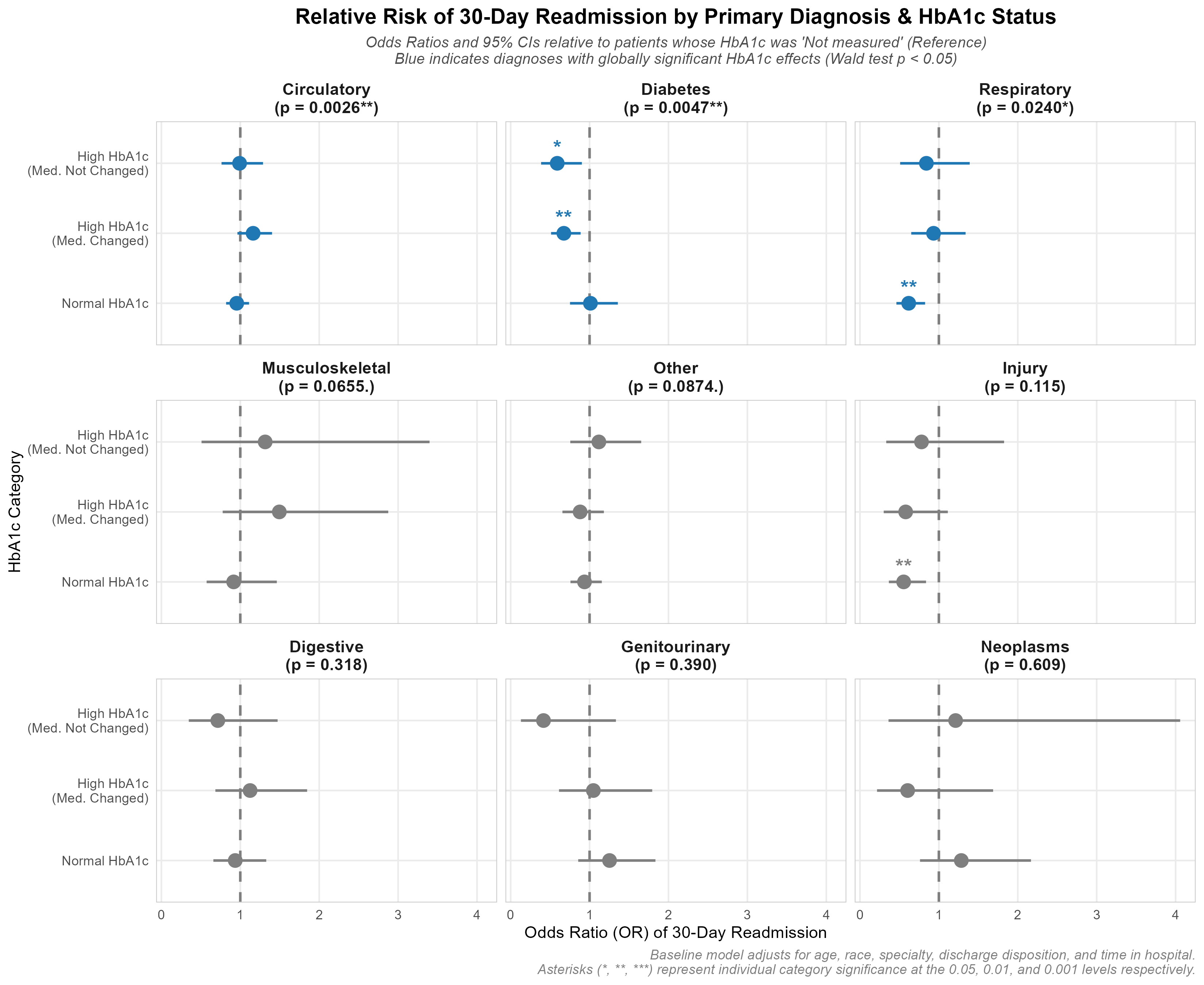
    To resolve these visual scaling issues, I developed a faceted forest plot of Odds Ratios (OR) compared directly to the untested reference group (Not measured) within each diagnosis:

    Dynamic Global & Individual Testing

    1. Global 3-df Wald test p-values are calculated using car::linearHypothesis() and printed in the facet headers.
    2. Significant panels (p < 0.05) are painted Blue, while non-significant ones are Grey.
    3. Individual category significance stars are plotted directly above the points.

    Technical Insight: Understanding the Global 3-df Wald Test
    When evaluating multi-categorical variables like hba1c_group (which has 4 levels: Not measured as reference, Normal, High, changed, and High, not changed), checking individual category p-values separately increases the risk of Type I error (false positives). To resolve this, we use a joint hypothesis test—the Wald test—to evaluate if the variable has a significant effect globally.

    • Why 3 Degrees of Freedom (3-df)?: Since hba1c_group has 4 levels, the regression model estimates 3 distinct dummy coefficients. The Wald test jointly tests the null hypothesis that all 3 coefficients are simultaneously zero H0:βNormal=βHigh, changed=βHigh, not changed=0H_0: \beta_{\text{Normal}} = \beta_{\text{High, changed}} = \beta_{\text{High, not changed}} = 0. Testing these 3 independent parameters yields a test statistic that follows a Chi-square distribution with exactly 3 degrees of freedom.
    • Testing Subgroup Interactions: For non-baseline diagnoses (e.g., Circulatory), the Wald test evaluates whether the 3 diagnosis-specific interaction terms:
      βNormal×Diag\beta_{\text{Normal} \times \text{Diag}}
      βHigh, changed×Diag\beta_{\text{High, changed} \times \text{Diag}}
      βHigh, not changed×Diag\beta_{\text{High, not changed} \times \text{Diag}}
      They are simultaneously zero. This verifies whether the HbA1c effect for that particular diagnosis is statistically different from the baseline Diabetes group.

    Technical Insight: Standard Error Calculation with Covariance Matrix
    Because of the primary diagnosis $\times$ HbA1c interaction terms in the final model, the log-Odds Ratio for non-reference diagnoses is a linear combination of coefficients: βHbA1c+βHbA1c×Diagnosis\beta_{\text{HbA1c}} + \beta_{\text{HbA1c} \times \text{Diagnosis}}. I calculate the standard error utilizing the covariance matrix:

    # Covariance-based standard error calculation in R (visualization_improved.R)
    log_or <- coefs[coef_hba1c] + coefs[coef_interaction]
    # Var(A + B) = Var(A) + Var(B) + 2 * Cov(A, B)
    var_log_or <- vc_mat[coef_hba1c, coef_hba1c] +
    vc_mat[coef_interaction, coef_interaction] +
    2 * vc_mat[coef_hba1c, coef_interaction]
    se_log_or <- sqrt(var_log_or)
    odds_ratio <- exp(log_or)
    ci_lower <- exp(log_or - 1.96 * se_log_or)
    ci_upper <- exp(log_or + 1.96 * se_log_or)
    # Individual two-tailed p-value
    indiv_p <- 2 * pnorm(-abs(log_or / se_log_or))

    Findings & The Statistical Paradox

    My modernized forest plot uncovers a fascinating statistical paradox: global interaction significance does not always align with individual category significance.

    1. The Circulatory Paradox (Globally Significant, Individually Non-Significant)

    • Global Test: χ2(3)=14.26,p=0.0026∗∗\chi^2(3) = 14.26, p = 0.0026^{**}(Blue Panel)
    • Individual Odds Ratios:
    • High, changed: OR=1.16,p=0.116\text{OR} = 1.16, p = 0.116
    • High, not changed: OR=0.99,p=0.946\text{OR} = 0.99, p = 0.946
    • Normal: OR=0.96,p=0.550\text{OR} = 0.96, p = 0.550
    • The Paradox: Even though Circulatory is globally significant, not a single individual HbA1c category is statistically different from the untested reference group (all 95% CIs cross 1.0). The global significance is driven entirely by the comparison to the Diabetes baseline: Circulatory patients’ readmission risk trends upward for high HbA1c, while Diabetes trends downward.

    2. The Injury Discovery (Globally Non-Significant, Individually Significant)

    • Global Test: χ2(3)=5.94,p=0.1148\chi^2(3) = 5.94, p = 0.1148 (Grey Panel)
    • Individual Category Estimates:
    • Normal: OR=0.55,p=0.0051∗∗\text{OR} = 0.55, p = 0.0051^{**} (Highly Significant)
    • The Story: Although the overall trend for Injury does not differ enough from baseline to pass global interaction significance, Injury patients who received an HbA1c test that came back Normal had a 45% lower risk of readmission (OR=0.55\text{OR} = 0.55) than those who were not tested.
      The injury diagnosis group has a total of 4,649 patients, while the untested reference category (Not measured) contains 4,117 patients (88.56%). This high proportion of untested patients causes a disproportionality in the data (leaving very few tested cases), which can lead to less reliable statistical estimates for the tested subgroups. Consequently, this finding needs further investigation to confirm its validity.

    3. The Diabetes Story (Globally and Individually Significant)

    • Global Test: χ2(3)=12.97,p=0.0047∗∗\chi^2(3) = 12.97, p = 0.0047^{**} (Blue Panel)
    • Individual Category Estimates:
    • High, changed: OR=0.67,p=0.0048∗∗\text{OR} = 0.67, p = 0.0048^{**} (Highly Significant)
    • High, not changed: OR=0.59,p=0.0148∗\text{OR} = 0.59, p = 0.0148^* (Significant)
    • Normal: OR=1.01,p=0.944\text{OR} = 1.01, p = 0.944 (Not significant)
    • The Story: For primary Diabetes admissions, measuring HbA1c is associated with a significant reduction in readmissions only if the result is high (prompting active medication changes). Testing normal HbA1c does not change readmission rates.

    4. The Respiratory Story (Globally and Individually Significant)

    • Global Test: χ2(3)=9.43,p=0.0240∗\chi^2(3) = 9.43, p = 0.0240^* (Blue Panel)
    • Individual Category Estimates:
    • Normal: OR=0.62,p=0.0011∗∗\text{OR} = 0.62, p = 0.0011^{**} (Highly Significant)
    • The Story: For Respiratory patients, the reduction in readmission is isolated entirely to the Normal HbA1c group (OR=0.62\text{OR} = 0.62), while high HbA1c groups show no significant benefit.

    Discussions

    Clinical Nuances & Cohort Context

    • Cohort Selection: Out of over 100,000 raw clinical encounters, only 69,987 records met the strict inclusion criteria. This filtering was necessary to focus on independent, non-procedure-based encounters for patients surviving their hospital stay.
    • Low Historical Prevalence: In this historical cohort (1999–2008), the HbA1c test was ordered in only 18.4% of inpatient stays. This indicates that inpatient screening was historically underutilized. However, the average length of stay of 4.27 days represents a highly sufficient clinical window for performing the test and receiving results.
    • EHR Data Limitations: It is possible that HbA1c tests were evaluated in practice but not documented in the electronic health record (EHR) database, or that practitioners had access to other unrecorded blood glucose metrics (e.g., fingerstick logs) that guided medication adjustments. Additionally, standard guidelines recommending the discontinuation of outpatient diabetic medications upon admission were only adopted late in the study period.
    • Modern Context (The HITECH Act): Since the 2009 HITECH Act and the introduction of hospital quality incentives (e.g., HEDIS/CMS measures), modern inpatient HbA1c screening has skyrocketed to exceed 70–80% for diabetic inpatients, representing a massive shift in standards of care compared to the historical baseline.
    • Glycemic Attention & Readmission: With respect to readmission rates, simply measuring HbA1c is associated with a lower rate of readmission in individuals with diabetes as a primary diagnosis, whereas respiratory and circulatory diseases as primary diagnoses are not. This suggests that greater attention to diabetes care during hospitalization (specifically for these high-risk individuals) can have a significant clinical impact on readmission outcomes.

    Methodological Limitations

    • Retrospective, Nonrandomized Design: Unlike a randomized clinical trial (RCT), this study relies on a retrospective observational database. Because clinicians do not order HbA1c tests randomly, tested patients likely had different baseline risks, introducing selection bias.
    • Association vs. Causal Inference: Consequently, this regression analysis reveals statistical associations rather than direct cause-and-effect relationships. However, these associations provide a strong empirical basis for developing and testing structured clinical protocols.

    Proposed Future Improvements

    To overcome the inherent limitations of the 2014 study design and nested logistic regression, three major methodological extensions are proposed:

    1. Causal Inference (Selection Bias & Propensity Score Matching)

    Because this is a retrospective clinical database and not a randomized controlled trial, physicians do not order HbA1c tests randomly. Sicker patients or those showing poor glycemic control are tested more frequently, introducing selection bias.

    • Proposed Enhancement: Implementing Propensity Score Matching (PSM) to match tested and untested patients with identical baseline covariates (demographics, comorbidities, time in hospital) will allow us to isolate the true causal effect of inpatient HbA1c testing on readmissions.

    2. Machine Learning & Model Interpretability

    Logistic regression assumes linear log-odds relations and struggles to capture complex, high-order interactions without manual specification.

    • Proposed Enhancement: Training a tree-based machine learning model (such as XGBoost) and generating SHAP (Shapley Additive exPlanations) values will allow us to capture non-linear risks and identify the exact contribution of medications and comorbidity scores to readmission.

    3. Survival Analysis (Time-to-Event Modeling)

    Analyzing readmissions as a binary 30-day flag ignores the timing of the readmission and treats a patient readmitted on day 31 identically to one who was never readmitted.

    • Proposed Enhancement: Transitioning to a Cox Proportional Hazards model allows us to analyze the time-to-event outcome. This treats patients who were never readmitted (or discharged safely beyond the observation window) as right-censored, preserving temporal detail and statistical power.

    Conclusion

    • Clinical Value of HbA1c Screening: Inpatient HbA1c measurement is a highly valuable predictor of 30-day readmission rates, particularly for patients admitted with a primary diagnosis of Diabetes.
    • Reducing Rates & Healthcare Costs: By identifying poorly controlled glycemic status during hospital stays and prompting active treatment adjustments, inpatient screening serves as a powerful catalyst for reducing costly readmissions and improving diabetic patient care.
    • Empirical Foundation: Although the study is limited by its retrospective, nonrandomized design, the findings provide a strong empirical foundation for developing hospital protocols to test this clinical hypothesis directly.

    Scripts

    Full scripts are available at

    • preprocess.R: Data filtering, ICD-9 diagnosis mapping, and cohort cleaning.
    • analysis.R: Fits nested logistic regression models and calculates ANOVA deviance tables.
    • visualization.R: Replicates the original paper’s Figures 1, 2, and 3.
    • visualization_improved.R: The modernized visualization script implementing Wald tests and the faceted forest plot.
    • run_pipeline.R: Master orchestrator script that runs the entire pipeline end-to-end and outputs a verification summary report.

    Thank you for making it this far! This project demonstrates the power of transforming complex raw tabulations into granular, actionable clinical insights. Stay tuned for my next data science project!

  • Pharmacovigilance Pipeline: FAERS Data Analysis

    Pharmacovigilance Pipeline: FAERS Data Analysis


    Disclaimer:

    1. The findings from this project are for educational purposes only and should not be used for clinical decision-making.
    2. Analysis scripts are provided at the bottom of the page and are written for the purpose of learning and should not be used for production without further testing

    Key Achievements 🏆​

    • Processed 20+ years of FAERS XML data (2004–2025) across 84 quarterly releases
    • Detected 111,918 drug-reaction signals; identified GLP-1 class-wide GI safety profile
    • Built multi-dimensional interactive visualizations filterable by gender, age, and indication

    Tools & Skills

    LayerTools
    1. ETL Python (xml.tree)
    2. Data CleaningPostgreSQL
    3. Analysis R (Tidyverse, DBI, RPostgres)
    4. Visualizationggplot, Plotly
    5. MethodsPRR, ROR, Chi-square, IC

    What you will find in this project

    1. What is pharmacovigilance?

    2. Introducing to the US crucial database for Pharmacovigilance: FAERS

    3. FAERS data analysis methodology.

    • ETL (Extract, Transform, Load) using Python
    • Data cleaning using PostgreSQL
    • Descriptive profiling using R (tidyverse, DBI, RPostgres)
    • Signal detection using R

    4. Findings & Conclusion

    • Discriptive profiling findings
    • Statistical signal detection findings using R (ggplot2+plotly)
      • Heatmaps to explore drug-reaction matrices
      • Interactive volcano plots of the Information Component lower bound (IC025) against the Log10 Chi-square statistic
      • Interactive GLP-1 Safety Signals forest plot
      • Interactive GLP-1 Safety Signals by sub-population

    5. Discussions

    • Limitations and future work

    6. Full analysis scripts on GitHub


    Introduction

    This project applies ent-to-end pharmacovigilance analysis to the FDS’s FAERS database, 20+ years of real-world adverse event data to detect and characterize drug safety signals

    As a pharmacist transitioning into healthcare data, I built this pipeline from scratch: raw XML ingestion, SQK-based normalization, and signal detection in R,culninating in interactive clinical visualizations.

    What is pharmacovigilance?

    Pharmacovigilance is the science of monitoring the safety of medicines after they reach the market. As part of this, the U.S. Food and Drug Administration (FDA) maintains the Adverse Event Reporting System (FAERS), a massive database tracking reported drug side effects.

    What is FAERS database?

    The FDA Adverse Event Reporting System (FAERS) is a publicly available, national database containing millions of reports on adverse events (side effects) and medication errors.

    These reports are submitted voluntarily by healthcare professionals and consumers, as well as mandatorily by pharmaceutical manufacturers.

    What would be expected from this analysis?

    FAERS data can uncover hidden safety patterns that wern’t caught during initial clinical trials. For example, drug combination side effects or rare side effects in specific demographics. But this analysis focuses solely on drug-reaction pairs. Because I want to start with simple task first, which will lead to more complex analysis later on.


    Methodology

    FAERS Analysis pipeline workflow:

    Data source

    The raw data comes from the FDA’s FAERS quarterly data releases, provided as massive, deeply nested XML files containing millions of patient and drug records from 2004Q1-2025Q4.

    Data available here: FAERS Database

    Data preprocessing and cleaning

    1. ETL (Extract, Transform, Load)

    I started with reading related documentations and sampling XML files to understand the structure and content of the data. Then, with the help of AIs, I developed `faers_etl.py` script using `xml.etree.ElementTree` library. I tested it on small subsets of the data first, and increased the data size to handle the massive XML files without crashing. Finally, I loaded the processed data into a structured PostgreSQL database.

    The primary challenge with FAERS XML files is their size (2.2 GBs in total). Loading the entire DOM into memory would cause a crash (I had already crashed and burned my quota on Colab). My solution uses `iterparse` to process the file report-by-report, clearing the memory immediately after each insertion:

    def process_file(xml_path: Path, conn):
    # Stream-parse one XML file — memory-safe for large files
    context = ET.iterparse(xml_path, events=("end",))
    for event, elem in context:
    if elem.tag != "safetyreport":
    continue
    # Parse and insert into DB
    report = parse_safety_report(elem)
    _insert(cur, "safety_report", report)
    # CRITICAL: Discard the element from memory immediately
    elem.clear()

    2. Data cleaning

    Utilizing SQL (`faers_clean.sql`), I performed extensive data normalization and cleaning:

    1. Date & Age Standardization: Converted string dates to standard formats, handled low-precision dates, and normalized various age units (months, days) into a single `ageyears` column.
    2. Label Decoding: Translated cryptic numeric codes into readable text (e.g., patient sex, reaction outcomes).
    3. Drug & Indication Normalization: Extracted missing active ingredients from product names using regex, stripped chemical salt suffixes, and standardized medical indications.
    4. Sender Normalization: Consolidated various pharmaceutical company subsidiaries into standardized parent company names.
    5. Severity Reconciliation: Created a reliable master “seriousness” flag to fix logical inconsistencies in the raw FDA data.
    6. Deduplication: Built a clinical “fingerprint” (matching demographics, dates, drugs, and reactions) to identify and remove duplicate reports submitted by multiple sources.
    7. Final Analytical View: Compiled all the cleaned and filtered data into a final view (`v_analysis`) to serve as a reliable source of truth for the next statistical phase.

    One of the most complex tasks was identifying duplicate reports sent by different sources (e.g., a doctor and a manufacturer). I developed a “clinical fingerprint” strategy that matches reports based on a combination of demographics and medical data:

    -- 10.1 Create a clinical fingerprint for each safety_report
    -- A fingerprint consists of demographics, country, date, and aggregated suspect drugs + reactions.
    CREATE TEMP TABLE report_fingerprint AS
    SELECT
    sr.safetyreportid,
    sr.occurcountry,
    sr.receivedate,
    p.patientsex,
    p.ageyears,
    -- Aggregate suspect drugs into a single sorted string
    (SELECT STRING_AGG(DISTINCT d.substance_std, '|' ORDER BY d.substance_std)
    FROM drug d
    WHERE d.safetyreportid = sr.safetyreportid AND d.drugcharacterization = 1) AS suspect_drugs,
    -- Aggregate reactions into a single sorted string
    (SELECT STRING_AGG(DISTINCT r.reactionmeddrapt, '|' ORDER BY r.reactionmeddrapt)
    FROM reaction r
    WHERE r.safetyreportid = sr.safetyreportid) AS reactions
    FROM safety_report sr
    JOIN patient p ON sr.safetyreportid = p.safetyreportid
    WHERE sr.duplicate IS NULL; -- Ignore already flagged duplicates

    Descriptive profiling

    I utilized R with packages (tidyverse, DBI, RPostgres) to plot descriptive profiling for better understanding of the dataset. Key insights from the data profiling include:

    • Sex Distribution: Females report adverse events significantly more often than males (47.3% vs 31.0%). A notable portion (21.8%) of reports are missing sex data.
    • Age Distribution: Among reports with known ages, Adults (18-64) are the largest affected group (31.3%), followed by the Elderly (65-74) and Very elderly (>75). A large proportion (41.9%) of reports unfortunately lack age data.
    • Geographic Mapping: Since FAERS database collects data in the US, the vast majority of adverse event reports originate from the United States, with secondary reporting clusters in Europe and East Asia.
    • Severity Breakdown: While many serious reports fall under a non-specific “Other” category (38.8%), a substantial portion resulted in Hospitalization (18.6%) and Death (6.5%), emphasizing the critical nature of the reported events.
    • Top Senders: Pharmaceutical companies SANOFI and ABBVIE are the top reporting organizations by a wide margin in this dataset. Sanofi and AbbVie top FAERS reporting primarily due to their massive patient volumes and market dominance in biologics, particularly with flagship drugs like Dupixent and Humira.
    • Fatal Reactions: The most frequent reactions associated with fatal outcomes range from severe acute conditions like “Duodenal ulcer perforation” and broader systemic issues like “Systemic lupus erythematosus”.

    Signal detection

    In pharmacovigilance, we look for “disproportionate signals”: when a specific side effect is reported for a drug more often than expected by chance.

    For readers who are not familiar with pharmacovigilance, here is a quick guide:

    Signal detection principle

    Important question: Is this drug-event combination reported more than expected?

    To answer this, we construct a 2×2 contingency table:

    Drug-event pairTarget ReactionOther ReactionsTotal
    Target Drugaba +b
    Other Drugscdc + d
    Totala + cb + dn

    Where:

    • a: Number of reports for the target drug with the target reaction
    • b: Number of reports for the target drug with other reactions
    • c: Number of reports for other drugs with the target reaction
    • d: Number of reports for other drugs with other reactions
    • n: Total number of reports

    Let’s apply these variables to the metrics for signal detection.

    Metrics for signal detection

    1. PRR (Proportional Reporting Ratio)

    PRR asks: “Is this side effect reported proportionally more for this drug than for all others?”

    PRR=a(a+b)÷c(c+d)PRR=\frac{a}{(a+b)}\div\frac{c}{(c+d)}

    PRR is the ratio between:

    • Proportion of reports for a specific drug-event pair
    • Proportion of reports for other drugs with the same event

    Interpret as:

    • PRR = 1: No association
    • PRR > 1: signal detected
    • PRR < 1: signal not detected/protective effect (rare)

    2. ROR (Reporting Odds Ratio)

    ROR asks: “How much more likely is this drug-reaction pair to appear in the data compared to any other drug-reaction combination?”

    ROR=ab÷cdROR=\frac{a}{b}\div\frac{c}{d}
    • Is a cross-product ratio
    • From the case-control perspective
    • Interpret as:
      • ROR = 1: No association
      • ROR > 1: signal detected
      • ROR < 1: signal not detected/protective effect (rare)

    3. Chi-square χ² (with Yates’ continuity correction): Test of independence

    χ² asks: “Is the association between this drug and this reaction statistically real, or could it just be random chance?”

    χ2=N×(|ad−bc|−N/2)2(a+b)(c+d)(a+c)(b+d)χ² = \frac{N × (|ad – bc| – N/2)²}{(a+b)(c+d)(a+c)(b+d)}
    • Test whether a,b,c,d are independent (null hypothesis)
    • Interpret as:
      • χ² <= 4: fail to reject null hypothesis at ~95% confidence level -> signal is not statistically significant
      • χ² > 4: reject null hypothesis at ~95% confidence level -> signal is statistically significant

    4. Information Component (IC; with Bayesian correction): Test of disproportionality

    IC asks: “How much more often is this drug-reaction pair reported than we’d expect if the two were completely unrelated?”

    IC=log2[(a+0.5)/(a+b+0.5)×(a+c+0.5)N+1]IC = log₂[(a + 0.5) / \frac{(a+b+0.5) × (a+c+0.5)}{N+1}]
    • Measures information gain from the observation (Log2 ratio between observed and expected counts of the event-drug pair)
    • Interpret as:
      • IC = 0: no information gain (Observed = Expected)
      • IC > 0: signal detected, IC = 1: 2x more than expected, IC = 2: 4x more than expected, …
      • IC < 0: signal not detected/protective effect (rare)

    5. IC025: Signal Stability

    IC025 asks: “Even in the worst-case statistical scenario, is this signal still strong enough to be considered real and not a random chance from small sample sizes?”

    ICvar=1log(2)2×1a+0.5−1N+1IC_{var} = \frac{1}{log(2)²} × \frac{1}{a+0.5} – \frac{1}{N+1}
    IC0.025=IC−1.96×ICvarIC₀.₀₂₅ = IC – 1.96 × \sqrt{IC_{var}}
    • Lower bound of 95% Confidence Interval of IC
    • Interpret as:
      • IC025 < 0: signal are not statistically significant at 95% confidence level
      • IC025 >= 0: signal detected with 95% confidence level

    For signal detection methods selection, I borrowed methodology from many organizations for robustness:

    • PRR, ROR, and χ² from European Medicines Agency (EMA)
    • IC/BCPNN, and IC025 from WHO Uppsala Monitoring Centre (VigiBase)
    • Thresholds: PRR ≥ 2, χ² ≥ 4 from UK MHRA (Medicines and Healthcare products Regulatory Agency), added: a >= 3 & IC025 > 0 in this analysis

    I utilized R to apply these statistical methods to find strong associations.

    Confounding control

    Confouding by indication is when the indication of the drug is filled as an adverse effect of the drug. For example, a diabetes drug will have high reports of high blood sugar simply because the patients have diabetes. I built a filter to significantly reduce these logical overlaps so we only flag unexpected side effects.

    To ensure the detection of new safety signals rather than symptoms of the underlying disease, I implemented a string-matching filter in R. This removes any case where the reported reaction is already mentioned as the reason for taking the drug:

    # Indication Overlap Logic (Confounding Control)
    df_filtered <- df_raw %>%
    mutate(
    rxn_clean = str_to_lower(str_trim(reactionmeddrapt)),
    ind_clean = str_to_lower(str_trim(indication_std))
    ) %>%
    filter(
    is.na(ind_clean) |
    (rxn_clean != ind_clean & !str_detect(ind_clean, fixed(rxn_clean)))
    )

    Visualization & Findings

    I created interactive visualizations using R (ggplot, Plotly) to make the findings accessible. This includes:

    1. Heatmaps of drug-reaction matrices

    The Safety Signal Intensity Heatmap visualizes the association strength (IC025) between the top 40 drugs and the top 40 reported adverse reactions. Darker blue cells indicate a higher lower bound of the Information Component (IC), representing a statistically robust signal. Findings from this heatmap include:

    • GLP-1 Agonist Cluster: The heatmap highlights a distinct gastrointestinal (GI) safety profile for GLP-1 receptor agonists like Semaglutide and Tirzepatide. Both drugs show strong positive associations with Nausea, Vomiting, Diarrhoea, Constipation, and Abdominal pain.
    • Tirzepatide & Injection Site Reactions: While sharing the GI profile, Tirzepatide stands out with a particularly intense signal for Injection site pain, reflecting its delivery method and potentially higher localized reactivity compared to other substances in the top 40.
    • Disease-Signal Overlap: The dark signals for Type 2 diabetes mellitus associated with these drugs exemplify ‘Confounding by Indication’ where the underlying condition being treated is reported as an adverse event. Although ‘Indication Filtering’ step is applied, there are still some signals for underlying conditions left.

    2. Interactive volcano plots

    This visualization displays safety signals by plotting the Information Component lower bound (IC025) against the Log10 Chi-square statistic.

    • Signal Stability (X-axis): The IC025 represents the Bayesian lower bound of signal strength; values above 0 indicate a stable signal.
    • Statistical Significance (Y-axis): The Chi-square statistic identifies signals that deviate significantly from expected background reporting.
    • Magnitude & Risk: Bubble size represents the total case count, while the color gradient (from wheat to indianred) represents the Proportional Reporting Ratio (PRR).
    • Interactive Filtering: Users can filter signals by WHO ATC Level 1 drug classes using the built-in dropdown menu.

    Key Findings: The plot clearly isolates a “Strong Signals” quadrant (top-right) where drug-reaction pairs meet both rigorous Bayesian and Frequentist criteria. By filtering for the “Alimentary tract and metabolism” ATC class, GLP-1 receptor agonists (such as Semaglutide and Tirzepatide) stand out in the upper-right quadrant. Their data points appear as massive, red bubbles representing high case volumes and PRR values for gastrointestinal adverse events. This immediate visual confirmation justifies selecting GLP-1 agonists for a targeted deep-dive analysis.

    3. Interactive GLP-1 Safety Signals

    The Interactive GLP-1 Safety Signal Forest Plot provides a granular, drug-by-drug comparison of safety signals within the GLP-1 agonist class. This visualization utilizes the Information Component (IC): A Bayesian measure of disproportionate reporting, along with its 95% Confidence Interval to illustrate signal stability.

    • Comparative Profiling: A built-in dropdown menu allows users to toggle between different reactions (e.g., Nausea, Vomiting, Constipation), revealing how drugs like Semaglutide, Tirzepatide, and Dulaglutide perform relative to one another.
    • Hover Metadata: The interactive Plotly interface allows users to hover over data points to see exact IC values, confidence bounds (IC025 to IC975), and specific case counts, making it a powerful tool for deep-dive safety assessment.
    • Precision & Volume: For common GI reactions like ‘Nausea’, ‘Diarrhoea’, ‘Vomiting’, and ‘Constipation’, Semaglutide, Liraglutide, Dulaglutide and Tirzepatide show high-intensity, stable signals (IC 1 – 3.5), while some newer agents show insufficient reporting volumes. For injection site pain, Tirzepatide shows the highest intensity, stable signal (IC > 4), followed by dulaglutide (IC ~ 3), while other GLP-1 agonists show 0 reports for this reaction. This finding agree with adverse reaction information from Lexidrug showing 3-8% of mild injection site pain in Tirzepatide users, but no such adverse reaction in Semaglutide and Liraglutide users.

    4. Interactive GLP-1 Safety Signals by sub-population

    The Sub-population Safety Signal Heatmap is a multi-dimensional tool designed to uncover how safety signals vary across different patient demographics.

    • Multi-Dimensional Filtering: Three dropdown menus allow users to slice the data by Gender, Age Group (e.g., Adult 18-64 vs. Elderly 65+), and Clinical Indication (e.g., Diabetes vs. Weight Management).
    • Evidence-Based Visualization: Each cell displays the IC025 value, with visual markers denoting statistical significance levels. (***: IC025>2, **:IC025>1, *:IC025>0)
    • Demographic Insights:
      • Weight Management Cohort: For patients taking medications for weight loss, signals for “Impaired gastric emptying” and “Abdominal pain” are significantly more pronounced compared to those taking the same drugs for diabetes, especially for Dulaglutide.
      • Injection-Site Cluster: Tirzepatide displays a uniquely intense and consistent cluster of injection-site reactions (pain, bruising, erythema) that persists across all age and gender filters, distinguishing it from other GLP-1s.
      • Indication-Driven Reporting: In the diabetes population, signals like “Blood glucose increased” and “Drug ineffective” often appear, reflecting clinical reporting patterns where uncontrolled underlying disease is flagged as an adverse event.

    Conclusion

    This FAERS data analysis pipeline effectively demonstrates how statistical pharmacovigilance techniques combined with interactive visualizations can isolate and interpret genuine drug safety signals from background noise.

    By applying both Bayesian (IC) and Frequentist methods (PRR, ROR), I identified GLP-1 receptor agonists as a drug class of exceptionally high interest due to their overwhelmingly strong safety signals. Through our targeted deep-dive visualizations, several key clinical insights emerged:

    1. Class-wide Gastrointestinal Signals: GLP-1 agonists (particularly Semaglutide, Tirzepatide, Liraglutide, and Dulaglutide) consistently exhibit high-intensity, stable signals for GI adverse events like nausea, vomiting, diarrhoea, and constipation.
    2. Drug-Specific Variances: While sharing the GI profile, Tirzepatide and Dulaglutide present uniquely intense, robust signals for injection-site reactions (such as pain, bruising, and erythema) that are virtually absent in reports for other GLP-1 drugs, a finding that corroborates established medical literature.
    3. Sub-population Differences: The adverse event profile shifts significantly based on the patient’s clinical indication. Notably, patients utilizing these medications for weight management report pronounced rates of impaired gastric emptying and abdominal pain compared to those treating diabetes, especially with Dulaglutide.
    4. Confounding by Indication: Despite applying logical filtering steps, the persistent overlap of disease symptoms (e.g., increased blood glucose in diabetes patients) being reported as adverse events highlights the inherent complexities of analyzing real-world, post-marketing data.

    Ultimately, this project showcases the power of transforming massive, complex raw data into granular, actionable clinical insights that can inform personalized patient care and enhance drug safety monitoring.


    Discussion

    While this pipeline successfully extracts actionable insights from raw FAERS data, analyzing real-world pharmacovigilance data presents several inherent challenges that leave room for future improvement:

    Drug Name Standardization

    Raw adverse event reports use tens of thousands of different names, misspellings, or abbreviations for the same drug. In this iteration, I implemented a custom fuzzy matching algorithm to standardize medicinal product names into generic active substances. Initial explorations using external APIs (like OpenFDA and RxNorm) yielded inconsistent results: such as erroneously mapping “0.9 % Normal saline” to “tolnaftate”. Moving forward, integrating flexible methods like Retrieval-Augmented Generation (RAG) or Large Language Models (LLMs) could provide the contextual understanding necessary for highly accurate, automated drug mapping.

    Cross-sender deduplication

    The FAERS database frequently contains duplicate reports submitted by different entities (e.g., a physician, a pharmacist, and the manufacturer reporting the same single event). Although this project employs duplication flag and clinical fingerprinting to identify and exclude overlapping reports across different senders, this deduplication strategy is not perfect due to sparse patient-specific identifiers such as age, bodyweight, etc. This may lead to inflated case counts and biased statistical signals. Future enhancements could explore probabilistic record linkage to improve accuracy.

    Indication Filtering and Confounding

    “Confounding by indication” is a persistent hurdle. While my custom Indication filtering successfully reduces direct logical overlaps. However, some disease-driven signals still occasionally slip through (such as “Blood glucose increased” or “Drug ineffective”). Developing more nuanced clinical ontologies to filter downstream disease complications, or accurately accounting for off-label usage, would help isolate only the truly unexpected adverse drug reactions.

    Advanced Signal Detection Methods

    The current pipeline utilizes a robust blend of Frequentist (PRR, ROR, Chi-square) and Bayesian (Information Component via BCPNN) methodologies. However, the signal detection capabilities can be further enhanced by incorporating more sophisticated empirical Bayes methods, such as the Multi-item Gamma Poisson Shrinker (MGPS) to calculate the Empirical Bayes Geometric Mean (EBGM). These algorithms, frequently utilized by the FDA, are particularly effective at minimizing false positives in extremely sparse data and detecting complex multi-drug interactions (polypharmacy).


    Analysis scripts

    My GitHub repo

    Thank you for making it this far, this is my first complete health data analysis project. This project taught me many things. I will make sharper analysis, stay tuned for my next project!


    Disclaimer (again!?): This project is for educational purposes. Findings should not be used for clinical decision-making.

  • Personal project: A Data-Driven Search for Biosimilar Opportunities in Thailand

    Personal project: A Data-Driven Search for Biosimilar Opportunities in Thailand

    This project is a labor of passion: a fusion of my clinical background as a pharmacist and my growing passion for data analysis.

    My goal was simple: to use data to identify which crucial Monoclonal Antibodies (mAbs) are missing from the Thai market despite being available as affordable biosimilars in the US.

    Project Technical Stack

    To bring this analysis to life, I utilized a mix of clinical domain knowledge and technical tools:

    • Data acquisition: Python (Scrapy) for web scraping Thai FDA data.
    • Data engineering: Power Query and Excel for cleaning and joining international datasets.
    • Data modeling: Relational database design in Power BI.
    • Analytics & Visualization: DAX for scoring logic and Power BI for storytelling.
    • Clinical Frameworks: NLEM criteria, and Thai Health Data Center (HDC) data.

    I’ve combined storytelling and data visualization to summarize this journey. Each page represent a core step in the analytical process, moving from raw data to actionable clinical insights. I hope you find this process as fascinating as I did!

    How I made this?

    Inspiration

    As a pharmacist in Thailand, I see the innovation lag firsthand. Advanced biologic therapies (mAbs) are transforming medicine, but their high costs often keep them them out of reach for most Thai patients. While, In the US, Biosimilars, a safe, interchangeable , affordable versions of these drug launch as soon as patents expire.

    I wanted to find the answer: Which critical molecules are we missing in Thailand that are already available in the US?

    Methodology: Data analysis

    1. Data preparation

    1.1 Prepare US mAbs data from Purple Book

    I started with the US FDA Purple Book. I prefer using the data transformation pane in Power BI for initial exploration. The automatic column profiles and quality distributions give me an instant glimpse of the data.

    I cleaned the generic name (Proper Names) by stripping manufacturer suffixes (e.g., changing “Adalimumab-atto” to “Adalimumab”) to create a clean list for cross-referencing.

    A part of the head of data:

    the table schema:

    1.2 Prepare Thai mAbs data from Thai FDA scraping

    While the US data was a simple CSV, the Thai data was a different story. Since no public dataset existed, I built a Scrapy crawler in Python to navigate the Thai FDA search portal and build a mirrored dataset.

    • I used Google Colab and Pandas to manage my search list, then deployed the Scrapy crawler to capture product names, license holders, and registration statuses.
    • I used Power BI to join these two datasets. This allowed me to identify “mismatches” which are mAbs registered in the US but absent in Thailand.

    My codes for scraping are:

    %%writefile med_spider.py
    import scrapy
    class MedSpider(scrapy.Spider):
        name = "meds"
        # 1. Added a User-Agent
        custom_settings = {
            'USER_AGENT': 'Mozilla/5.0 (Windows NT 10.0; Win64; x64) Chrome/119.0.0.0 Safari/537.36',
            'COOKIES_ENABLED': True, # ASP.NET sites NEED cookies to track your session
            'DOWNLOAD_DELAY': 5,        # Wait 5 seconds between drugs
            'CONCURRENT_REQUESTS': 1,   # One at a time to stay under the radar
            'USER_AGENT': 'Mozilla/5.0 (Windows NT 10.0; Win64; x64) Chrome/119.0.0.0 Safari/537.36',
            'FEEDS': {
                'med_results.csv': {
                    'format': 'csv',
                    'encoding': 'utf-8-sig',
                    'overwrite': True,
                }
            }
        }
        
        start_urls = ['Thai FDA drug searching URL']
        usmed_list = [list of mAb generic names from Purple Book]
        # 1. This replaces the default start_urls behavior
        def start_requests(self):
            for drug in self.usmed_list:
                # visit the landing page once for each drug to get a fresh ViewState
                yield scrapy.Request(
                    url=self.start_urls[0],
                    callback=self.parse,
                    meta={'search_term': drug}, # save the drug name
                    dont_filter=True # for hitting the same URL multiple times
                )
        def parse(self, response):
            # retrieve the drug name saved in meta
            drug_to_search = response.meta['search_term']
            # from_response: handle the hidden ASP.NET ViewState
            return scrapy.FormRequest.from_response(
                response,
                formdata={
                    'ctl00$ContentPlaceHolder1$txt_substance': drug_to_search,
                    'ctl00$ContentPlaceHolder1$btn_sea_drug': 'ค้นหา'
                },
                callback=self.parse_results,
                meta={'search_term': drug_to_search} # Pass it forward again to the results
            )  
        def parse_results(self, response, ):
            search_term = response.meta['search_term']
            rows = response.css('tr.rgRow, tr.rgAltRow')
            self.logger.info(f"Found {len(rows)} rows on the page!") # show logs
            for row in rows:
                # gets text inside <span> or <a> tags.
                data = row.css('td:not([style]) ::text').getall()
                # Clean up the list (keep empty strings)
                clean_data = [item.strip() if item else "" for item in data]
                if len(clean_data) > 0:
                    yield {
                        'searched_drug': search_term,
                        'registration_no': clean_data[1] if len(clean_data) > 0 else None,
                        'trade_name': clean_data[3] if len(clean_data) > 3 else None,
                        'licensee': clean_data[4] if len(clean_data) > 4 else None,
                        'drug_type': clean_data[5] if len(clean_data) > 5 else None,
                        'status': clean_data[7] if len(clean_data) > 5 else None
                    }
                    
    !scrapy runspider med_spider.py

    1.3 Identifying hidden gaps

    Initial results showed that most of absent drugs were orphan drugs or for rare diseases. To find the “real” opportunities, I needed more information. These are what I started with:

    • Market Demand: Top 20 Global Sales data (via Pharmashots) to identify clinical demand and physician trust worldwide.
    • Prevalence data: Which disease are crucial in Thailand?
      • HDC website shows prevalence data of crucial diseases with ICD-10 code related to those diseases (2025).
      • It also show diseases in “Service plan” which are the group of diseases that intensively monitored by Thailand’s Ministry of Public Health (MOPH).
      • WHO Top cause of death of Thai population (2021).
    • Reimbursement Barriers: National List of Essential Medicines (NLEM) is the “optimum list” of fundamental treatments. It serves as the official reference for reimbursement across public health insurance scheme. there are 7 mAbs in this list.
    • Biosimilar gap: I used “BLA type” column, a original/biosimilar label from Purple Book to evaluate a status of Thai mAbs list.

    2. Modeling

    Building this database was an iterative process. This dataset is not perfect. It’s grew organically as I added data one-by-one, but it taught me lessons for my next project:

    1. Whenever possible, collect all data before designing the schema.
    2. Establishing strict naming rules early to prevent inconsistent naming.
    3. Moving toward a star schema and database normalization makes the system much more robust as data piles up.

    3. Visualization

    3.1 Top 20 Monoclonal Antibodies by Global Sales

    I discovered that the Top 20 mAbs account for 60% of total global mAb sales. This is a massive concentration of value!

    By highlighting which of these 20 have zero biosimilar competition in Thailand, I identified the most significant market gaps.

    3.2 Clinical Impact

    Prevalence data can be “noisy”. Disease are grouped to a big categories like “heart disease” consisting of many ICM-10 codes which make the prevalence illogically high. So, I came up with the decision tree for categorizing each mAbs in to three tiers, inspired by inclusion criteria of the NELM. Categorization was derived from the MOPH 2025 National Health Priorities and the HITAP Burden of Disease framework(Issue 26).

    • Tier 3 (High): Aligned with the Thai MOPH “Service Plan” (e.g., Cancer, Stroke).
    • Tier 2 (Medium): Prevalence is higher that rare disease threshold (>10,000 case/year).
    • Tier 1 (Specialized): The leftovers: Rare or specialized indications.

    3.3 NLEM gap

    I created bar chart showing count of each mAbs in NLEM list biosimilars in Thailand. The data show 2 mAbs don’t have biosimilar yet, which is a huge market gap.

    3.4 Biosimilar availability gap

    I compared the number of US biosimilars (Blue for positivity/opportunity) against Thai biosimilars (Orange for competition/saturation). This visual logic allowed me to assign scores for my final index.

    Visualizations helps me create scoring:

    VariableScored Value
    1. World Top 20 Revenue2 pts if yes 0 pts if No
    2. High-Impact Disease3 pts if High impact
    2 pts if Medium impact
    1 pt if Specialized impact
    3. NLEM Status2 pts if NO
    0 pts if YES
    4. Biosimilar Gap3 pts if US Yes; TH No
    2 pts if US Yes; 1-2 biosimilar TH
    1 pt if US No; TH No
               or 3 TH 0 pts else

    Formulation for evaluate potential of mAbs:

    TMOI = Rev + Tier + NLEM Gap + Biosimilar gap

    4. Analyzing

    I synthesized all variables into a 10-point scale: the TMOI. Our mAbs for potential market entry and production feasibility are:

    1. Tocilizumab (9 pts)
    2. Omalizumab (7 pts)
    3. Pertuzumab (7 pts)
      After identified potential molecules, I would recommend the team to prioritize these three molecules for comprehensive feasibility and production studies.

    Claims & Cautions

    • Global revenue data is from private industry reports and should be treated as an estimate.
    • This impact tiering is a simplified version of NLEM criteria. In a real-world scenario, Cost-Effectiveness and HTA (Health Technology Assessment) would require much deeper modeling.
    • Many mAb manufacturers located outside the US are not included in this project.